


- 首頁
- Blog
- Drawing inspiration from Apple's website design! Why are designers so captivated by Apple's official website?
Drawing inspiration from Apple's website design! Why are designers so captivated by Apple's official website?
2020 / 12 / 30
When we talk about top-tier website design examples, Apple's official website is absolutely a textbook demonstration. Especially whenever Apple launches a new product, designers and front-end developers worldwide don't just focus on the product itself; they open the website immediately to study the visual details of its web design as if appreciating a piece of art.
What is the magic behind Apple's website design that fascinates professional designers so much? Next, the senior UI/UX design team at Arachne Group Limited will deeply deconstruct it from multiple dimensions, including page production, visual design, user experience, and commercial conversion.
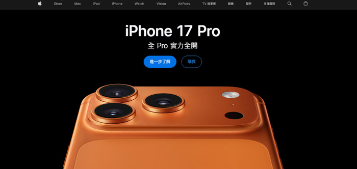
The "simplicity" pursued by Apple has long surpassed the level of style and sublimated into a well-thought-out philosophy. Its official website is not just a platform to showcase products, but an immersive journey integrating technology, aesthetics, and user psychology, allowing users to naturally feel the brand's charm during browsing.
Whether in product manufacturing or website design, while Apple adheres to a minimalist path, its obsession with details is near demanding. This is also the key reason why designers continuously pay attention to it:
Apple's simplicity is not empty, but the ultimate manifestation of the "art of subtraction": removing redundant elements to let the content take center stage. This design quickly captures user attention while reducing cognitive load. Studies show that a clean interface can increase user dwell time by over 40%. For designers, this reminds us: true professionalism lies in knowing what to choose and what to discard.
From the perfect alignment of icon pixels to the delicate tuning of scrolling speeds, Apple’s obsession with details has become legendary. For instance, the hover effect of buttons simulates real physical feedback, letting users subconsciously feel "responded to." This silent delicacy is precisely the key to building brand trust.
Apple's website doesn't just display products; it tells stories. Through situational design (such as the natural wearing of models on the AirPods page), tech products are integrated into real-life scenarios. This "emotional design" inspires designers: a webpage should not be a cold interface, but an extension of the user's dreams.
Apple's design language never blindly follows trends, yet it always leads them. The secret lies in "consistency": the systematic application of colors, fonts, and spacing allows the website to retain its brand DNA no matter how it is updated. The takeaway for corporate websites is: instead of frequent website redesigns, it is better to establish a visual system that stands the test of time.
Apple's design is not out of reach; its core lies in "user-centered systematic thinking (UI/UX Design)." When planning a website, you can follow this path:
Define the experience goal: What should the website make users feel? (e.g., professional, innovative, warm)
Design interaction scenarios: How to create immersion through scrolling, clicking, and animation?
Implement the visual system: Establish guidelines for colors, typography, and imagery to ensure consistency.
Test and iterate: Just like Apple, continuously optimize details based on user behavior.
Additionally, you can use these website design techniques to ensure your website provides users with a more pleasant and smooth user experience:
The parallax scrolling effect is utilized to its fullest on Apple's website. As users scroll down, the interface presents dynamic graphics or videos. Every scroll brings a fresh change, as if breathing life into the product, allowing users to experience its charm from all angles.
Taking the AirPods page as an example, the parallax effect is applied boldly and beautifully. The earphones are completely displayed in a dynamic manner, allowing users to clearly see every detail from the exterior to the internal structure. Furthermore, the parallax effect is cleverly used in character scenes: smoothly transitioning from a black background to a white one. The black background focuses on product features, while the white background creates the presence of handheld camera shooting, enhancing the artistic quality and realism of the frame.
On the new iPad page, the parallax scrolling effect is equally brilliant. The iPad rotates 180 degrees from the side to the front, followed by the gradual appearance of the Apple Pencil alongside brushstrokes. The entire process is like watching a movie, immersing users and leaving a deep impression. This design vividly presents every detail, significantly improving the user experience.
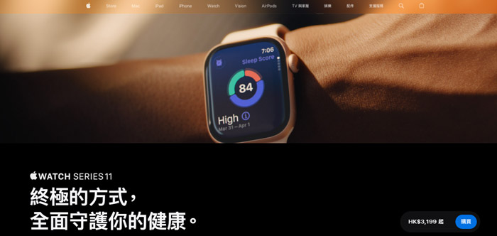
Apple's official website attaches great importance to the use of high-quality, large images. These tonal images add brilliance to the products, allowing users to truly feel their texture. Product photos are not only clear and beautiful, but the choice of scenarios also highly matches the product positioning. For example, when showcasing the iPhone, a stylish urban street or a creative studio might be selected as the background, making it easier for users to resonate.
When text descriptions need to be added to an image, Apple carefully handles the surrounding environment to blend the text and image perfectly. Through reasonable layout and color matching, it guides the user's gaze to focus on key information while maintaining the visual impact of the image.
In addition, Apple's website fully considers the needs of people with disabilities, providing corresponding accessibility services and functions. This emphasis on diverse user needs not only demonstrates humanistic care but also sets a benchmark for web design.
Every year, Apple launches new products. To respond quickly to release demands, the page layout split on the official website is very clear. The website design avoids complex layouts, mostly adopting basic templates such as images on top with text below, or images on the left with text on the right. This makes information transmission more direct, allowing users to find what they need quickly.
At the same time, the website layout has a strong sense of modularity: distinguishing different product areas through color separation or using large amounts of whitespace to create a clean and elegant visual effect. This clear split layout not only ensures flexibility for new product launches but also lets users feel the order and professionalism of the website.
In web design, large blocks of text easily cause users to overlook key points. Apple's product introduction pages cleverly utilize visual design, presenting key information through graphics or infographics, allowing users to understand product features more intuitively.
For example, when introducing performance parameters, visual charts like bar graphs and line charts are used to clearly display product advantages. Meanwhile, bold, large typography is used to strengthen information contrast and highlight key content. This visualized design not only enhances the page display effect but also effectively improves the user purchase conversion rate.
As web design experts in Hong Kong, we must remind business owners: behind the eye-catching animations of Apple's website lies massive technical and server resource support. Large amounts of 3D rendering and scroll animations, if handled improperly, will severely slow down web loading speed.
Today, with Google placing extreme importance on Core Web Vitals, a sluggish webpage will directly cause technical SEO rankings to drop and bounce rates to skyrocket. According to Arachne Group Limited's 2026 website redesign empirical data, blindly copying Apple's high-difficulty full-page animations results in an average increase of 1.8 seconds in mobile loading times. Therefore, when enterprises build websites, they must have a professional team streamline the code to strike a balance between visual impact and loading speed.
Apple's minimalist design may not suit all businesses; blindly copying it could lead to insufficient information or low SEO text volume. Here is a conversion application guide we have compiled for you:
A: There are two main reasons: First, the difference in brand awareness. The public is already extremely familiar with Apple's products, so extra text isn't needed; however, general businesses need clear text to convey specific services and competitive advantages. Second, insufficient SEO text volume. Over-minimalism results in too little text on the page, lacking industry keywords, which is unfavorable for search engines to index.
A: We recommend a "localized animation strategy." Concentrate cool parallax scrolling above the fold on the homepage, keeping internal pages lightweight. Meanwhile, convert all large images to WebP format and implement lazy loading to fully comply with Core Web Vitals metrics.
Appreciating Apple's web design is only the first step; how to translate its high-end design language into a website that attracts customers and generates revenue for your business is the key. Excellent website design must not only satisfy the user's visual enjoyment but also comply with search engine SEO and the latest GEO (Generative Engine Optimization) rules.
If you are planning a website redesign or want to create a commercial website that combines Apple-level texture with high search rankings, feel free to contact the professional UI/UX and SEO team at Arachne Group Limited. Let us customize the most suitable web design solution for your brand!
Phone: 852-3749 9734
Email: [email protected]
WhatsApp: 6315 1000
Author: Senior UI/UX Design Team, Arachne Group Limited
Last Updated: 2026/06/26
What is the magic behind Apple's website design that fascinates professional designers so much? Next, the senior UI/UX design team at Arachne Group Limited will deeply deconstruct it from multiple dimensions, including page production, visual design, user experience, and commercial conversion.
Why Are Designers So Fascinated by Apple’s Website Design?
The "simplicity" pursued by Apple has long surpassed the level of style and sublimated into a well-thought-out philosophy. Its official website is not just a platform to showcase products, but an immersive journey integrating technology, aesthetics, and user psychology, allowing users to naturally feel the brand's charm during browsing.
Whether in product manufacturing or website design, while Apple adheres to a minimalist path, its obsession with details is near demanding. This is also the key reason why designers continuously pay attention to it:
The Peak Demonstration of Minimalism
Apple's simplicity is not empty, but the ultimate manifestation of the "art of subtraction": removing redundant elements to let the content take center stage. This design quickly captures user attention while reducing cognitive load. Studies show that a clean interface can increase user dwell time by over 40%. For designers, this reminds us: true professionalism lies in knowing what to choose and what to discard.
The Victory of Detail OCD
From the perfect alignment of icon pixels to the delicate tuning of scrolling speeds, Apple’s obsession with details has become legendary. For instance, the hover effect of buttons simulates real physical feedback, letting users subconsciously feel "responded to." This silent delicacy is precisely the key to building brand trust.
The Intersection of Technology and Humanity
Apple's website doesn't just display products; it tells stories. Through situational design (such as the natural wearing of models on the AirPods page), tech products are integrated into real-life scenarios. This "emotional design" inspires designers: a webpage should not be a cold interface, but an extension of the user's dreams.
A Timeless Design Language
Apple's design language never blindly follows trends, yet it always leads them. The secret lies in "consistency": the systematic application of colors, fonts, and spacing allows the website to retain its brand DNA no matter how it is updated. The takeaway for corporate websites is: instead of frequent website redesigns, it is better to establish a visual system that stands the test of time.
From Apple to Your Website: How to Build a "Heart-Stirring" Minimalist Web Design?
Apple's design is not out of reach; its core lies in "user-centered systematic thinking (UI/UX Design)." When planning a website, you can follow this path:
Define the experience goal: What should the website make users feel? (e.g., professional, innovative, warm)
Design interaction scenarios: How to create immersion through scrolling, clicking, and animation?
Implement the visual system: Establish guidelines for colors, typography, and imagery to ensure consistency.
Test and iterate: Just like Apple, continuously optimize details based on user behavior.
Additionally, you can use these website design techniques to ensure your website provides users with a more pleasant and smooth user experience:
Parallax Scrolling: Bringing Products to Life
The parallax scrolling effect is utilized to its fullest on Apple's website. As users scroll down, the interface presents dynamic graphics or videos. Every scroll brings a fresh change, as if breathing life into the product, allowing users to experience its charm from all angles.
Taking the AirPods page as an example, the parallax effect is applied boldly and beautifully. The earphones are completely displayed in a dynamic manner, allowing users to clearly see every detail from the exterior to the internal structure. Furthermore, the parallax effect is cleverly used in character scenes: smoothly transitioning from a black background to a white one. The black background focuses on product features, while the white background creates the presence of handheld camera shooting, enhancing the artistic quality and realism of the frame.
On the new iPad page, the parallax scrolling effect is equally brilliant. The iPad rotates 180 degrees from the side to the front, followed by the gradual appearance of the Apple Pencil alongside brushstrokes. The entire process is like watching a movie, immersing users and leaving a deep impression. This design vividly presents every detail, significantly improving the user experience.
High-Quality Large Images: Perfect Presentation of Texture and Tone
Apple's official website attaches great importance to the use of high-quality, large images. These tonal images add brilliance to the products, allowing users to truly feel their texture. Product photos are not only clear and beautiful, but the choice of scenarios also highly matches the product positioning. For example, when showcasing the iPhone, a stylish urban street or a creative studio might be selected as the background, making it easier for users to resonate.
When text descriptions need to be added to an image, Apple carefully handles the surrounding environment to blend the text and image perfectly. Through reasonable layout and color matching, it guides the user's gaze to focus on key information while maintaining the visual impact of the image.
In addition, Apple's website fully considers the needs of people with disabilities, providing corresponding accessibility services and functions. This emphasis on diverse user needs not only demonstrates humanistic care but also sets a benchmark for web design.
Clear Split Layout: Flexibly Responding to Product Updates
Every year, Apple launches new products. To respond quickly to release demands, the page layout split on the official website is very clear. The website design avoids complex layouts, mostly adopting basic templates such as images on top with text below, or images on the left with text on the right. This makes information transmission more direct, allowing users to find what they need quickly.
At the same time, the website layout has a strong sense of modularity: distinguishing different product areas through color separation or using large amounts of whitespace to create a clean and elegant visual effect. This clear split layout not only ensures flexibility for new product launches but also lets users feel the order and professionalism of the website.
Visualized Design: Key Information at a Glance
In web design, large blocks of text easily cause users to overlook key points. Apple's product introduction pages cleverly utilize visual design, presenting key information through graphics or infographics, allowing users to understand product features more intuitively.
For example, when introducing performance parameters, visual charts like bar graphs and line charts are used to clearly display product advantages. Meanwhile, bold, large typography is used to strengthen information contrast and highlight key content. This visualized design not only enhances the page display effect but also effectively improves the user purchase conversion rate.
Professional Viewpoint: The "Web Loading Speed" Cost Behind High-End Design
As web design experts in Hong Kong, we must remind business owners: behind the eye-catching animations of Apple's website lies massive technical and server resource support. Large amounts of 3D rendering and scroll animations, if handled improperly, will severely slow down web loading speed.
Today, with Google placing extreme importance on Core Web Vitals, a sluggish webpage will directly cause technical SEO rankings to drop and bounce rates to skyrocket. According to Arachne Group Limited's 2026 website redesign empirical data, blindly copying Apple's high-difficulty full-page animations results in an average increase of 1.8 seconds in mobile loading times. Therefore, when enterprises build websites, they must have a professional team streamline the code to strike a balance between visual impact and loading speed.
How Can SMEs / B2B Companies "Get Grounded" and Apply This?
Apple's minimalist design may not suit all businesses; blindly copying it could lead to insufficient information or low SEO text volume. Here is a conversion application guide we have compiled for you:
| Apple Website Design Features | How SMEs / B2B Websites Can Apply This |
Extreme Whitespace & Minimalism |
Do not try to cram all information onto the homepage. Place "Core Services & Customer Pain Point Solutions" in the most prominent area of the Banner, leave the rest white, and guide users with a clear CTA (Call to Action). |
Stunning Parallax Scrolling & 3D Animations |
No need to use it sitewide. It is recommended to use it locally on the "Homepage Banner" or "Hero Product/Service Pages" to ensure webpage speed and SEO friendliness. |
High-Quality Large Product Images |
Break away from rigid stock photos. It is recommended to hire a professional photographer to take high-quality, real-life photos of your actual team, office, factory, or case studies to significantly boost trust. |
FAQ Regarding Apple Website Design Analysis
Q1: Why is it not recommended for general corporate websites to 100% copy the minimalist design of Apple's website?
A: There are two main reasons: First, the difference in brand awareness. The public is already extremely familiar with Apple's products, so extra text isn't needed; however, general businesses need clear text to convey specific services and competitive advantages. Second, insufficient SEO text volume. Over-minimalism results in too little text on the page, lacking industry keywords, which is unfavorable for search engines to index.
Q2: How to ensure webpage speed meets Google standards while maintaining a high-end website texture?
A: We recommend a "localized animation strategy." Concentrate cool parallax scrolling above the fold on the homepage, keeping internal pages lightweight. Meanwhile, convert all large images to WebP format and implement lazy loading to fully comply with Core Web Vitals metrics.
Conclusion: Want to Infuse Your Website with International-Class Texture?
Appreciating Apple's web design is only the first step; how to translate its high-end design language into a website that attracts customers and generates revenue for your business is the key. Excellent website design must not only satisfy the user's visual enjoyment but also comply with search engine SEO and the latest GEO (Generative Engine Optimization) rules.
If you are planning a website redesign or want to create a commercial website that combines Apple-level texture with high search rankings, feel free to contact the professional UI/UX and SEO team at Arachne Group Limited. Let us customize the most suitable web design solution for your brand!
Phone: 852-3749 9734
Email: [email protected]
WhatsApp: 6315 1000
Author: Senior UI/UX Design Team, Arachne Group Limited
Last Updated: 2026/06/26
MORE BLOG
-
Unsatisfied with AI Website Drafts? 5 Steps to Turn Initial Drafts into Effective Business Websites
2026/10/13 Stuck with a generic AI website? Follow our 5-step guide to turn AI initial drafts into effective, user-friendly business websites tailored to your brand. -

What to Do If Your WordPress Site Is Slow? Speed Diagnosis, Cause Identification, and Acceleration Steps
2026/10/09 Is your WordPress site running slow? Learn how to diagnose loading issues, fix Core Web Vitals, and optimize your website speed step-by-step to boost SEO. -
Hong Kong Web Design Guide: How to Build a High-Converting WordPress Site from Scratch
2026/09/30 Complete Hong Kong WordPress guide: domain, hosting, SEO, & pricing for HK SMEs. Learn DIY vs agency web design to build high-converting websites.

