


- 首頁
- Blog
- Is Your Dark Background Website Stunning but Hard to Read? A Complete Color Guide from WCAG to SEO
Is Your Dark Background Website Stunning but Hard to Read? A Complete Color Guide from WCAG to SEO
2026 / 04 / 22
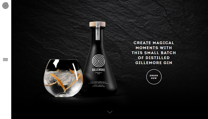
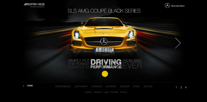
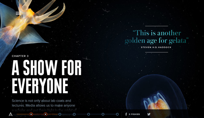
In today’s web design trends, "Dark Mode" and dark-background visuals have become synonymous with sophistication, a high-tech feel, and artistic expression. From Apple’s product pages to top-tier design agency websites, dark backgrounds effortlessly create an immersive visual experience.
However, many business owners, in their pursuit of "aesthetics," often overlook a critical flaw: readability.
Statistics show that websites failing to meet accessibility guidelines experience bounce rates more than 35% higher than average. Even more importantly, Google’s algorithms (such as Core Web Vitals) place increasing emphasis on user experience. Websites that do not meet accessibility standards face a natural disadvantage in search rankings.
For this vast group of potential users, low-contrast dark designs are effectively a "rejection letter." When contrast between text and background is insufficient, text edges become blurry — a phenomenon often described as "text bleeding into the background." This not only hampers reading efficiency but may directly drive these users away from your site.
When using dark mode in low-light environments, the human pupil naturally dilates to allow more light in. If text brightness on a dark background is improperly set — whether overly bright pure white (#FFFFFF) or excessively dark gray — visual fatigue intensifies, causing users to leave the page quickly. In other words, poor contrast leads to a sharp drop in retention.
When users struggle to read text, click the wrong links, or quickly close the page due to confusion, these negative behavioral signals are captured by Google’s algorithms, leading to a lower ranking for your site due to poor user experience.
Therefore, promoting accessible design is not an act of "charity" but a smart business investment. A high-contrast, easy-to-read dark background website not only serves a broader audience but also improves SEO performance — a true win-win for user experience and search traffic.
To solve the readability problem of dark background websites, we must turn to the international standard for web design: WCAG (Web Content Accessibility Guidelines), established by the W3C (World Wide Web Consortium). These guidelines ensure people with disabilities can access web content without barriers.
The guidelines include three levels of success criteria: Level A, Level AA, and Level AAA. Level A represents the most basic accessibility requirements, while Level AAA is the highest standard.
For more details on WCAG 2.2 Level A requirements, visit: What Are the Key Components of WCAG 2.2 A Level Success Criteria?
This is the target for most businesses and government websites, and the level we strongly recommend:
Normal text: At least 4.5:1 contrast between text and background.
Large text: (18pt or larger, or 14pt bold) at least 3:1 contrast.
UI components: Such as button borders and input fields, at least 3:1 contrast.
For more details on WCAG 2.2 Level AA requirements, visit: Specific Requirements of WCAG 2.2 AA Level Success Criteria
This is the highest level, requiring at least 7:1 contrast for normal text. While most friendly for visually impaired users, it imposes significant design constraints. Typically recommended only for medical or educational websites with specific needs.
For more details on WCAG 2.2 Level AAA requirements, visit: What Are the Key Components of WCAG 2.2 AAA Level Success Criteria?

Successful color schemes rely not on "feeling" but on luminance difference. Many mistakenly believe "black background with white text" is the only solution, but that often causes another problem — glare. For dark background designs, follow these principles:
Contrast ratio = (L1 + 0.05) / (L2 + 0.05), where L1 is the relative luminance of the lighter color and L2 is the relative luminance of the darker color.
Simple conclusion: The darker the background and the brighter the text, the higher the contrast.
Avoid pure black (#000000): Pure black backgrounds feel too harsh. Use deep grays like #121212 or #1A1A1B to reduce visual strain and add depth for design elements like shadows.
Avoid pure white (#FFFFFF) text: On dark backgrounds, pure white creates excessive contrast strain. Use slightly muted whites like #F0F0F0 or #E0E0E0.
Applying brand colors: If your brand color is deep blue or purple, it will disappear on a black background. Increase its saturation and brightness to ensure it still achieves at least 4.5:1 contrast against dark backgrounds.
Many designers see colors looking "premium" in Figma, only to fail once live. Here are frequent pitfalls:
Mistake 1: Dead Zone Colors (Black on Dark Gray)
Some designers, chasing "understated luxury," use #1A1A1A with #4A4A4A. This might look fine on professional monitors but becomes a disaster on regular phones or in sunlight.
Solution: Always test with the WebAIM Contrast Checker. If contrast is below 4.5:1, brighten the text color decisively.
Mistake 2: Ignoring Environmental Differences Between Large and Small Screens
Dark background sites may look comfortable on desktop, but when users are outdoors with their phones, screen reflections make dark-background content extremely hard to read.
Solution: Follow a step-by-step process:
Color selection: Choose brand and background colors.
WCAG testing: Verify values in Figma or online tools.
Context testing: Test under bright light, low light, and on devices with different brightness levels.
Mistake 3: Highly Saturated "Neon Colors"
Some designers take bright reds and blues from light mode and use them as primary text on black backgrounds. On dark backgrounds, high-saturation colors create optical vibration, blurring text edges.
Solution: Reduce color saturation or add glow/shadow effects to stabilize the visual appearance.
With technological advances, web design in 2026 is no longer static but increasingly dynamic:
Next-generation design tools (e.g., Pixso AI) can automatically generate WCAG-compliant color systems through semantic recognition. Simply input "tech feel, dark mode, high readability," and AI will eliminate non-compliant color combinations for you.
Future websites will support fully automatic dark mode switching — not just a manual toggle but intelligent response based on prefers-color-scheme. Using ambient light sensors, the system will automatically fine-tune text brightness and contrast for optimal reading in both bright sunlight and late-night darkness.
In dark themes, traditional drop shadows are nearly invisible. The 2026 trend uses "brightness by elevation" — background layers are darkest (#121212), floating cards slightly brighter (#1E1E1E), and pop-ups brightest (#2D2D2D) — creating spatial hierarchy through luminance differences rather than shadows.
A1: The dark background itself does not affect SEO. However, if poor color choices lead to low readability or high bounce rates, Google’s algorithms will interpret this as poor user experience and lower rankings. A WCAG-compliant dark background website can actually receive positive evaluation.
A2: You can keep the original brand color for logos or accent elements, but for long-form reading text, buttons, or navigation bars, use a "high-brightness variant" of that color to meet the AA-level requirement of 4.5:1.
A3: Highly recommended. Providing a toggle meets different users’ physiological needs and environmental preferences, and by 2026, this is considered a standard feature of quality user experience.
A4: The main difference lies in contrast requirements. AA requires 4.5:1, suitable for most commercial websites. AAA requires 7:1, intended for specific fields with extremely high readability demands.
A5: Use the WebAIM Contrast Checker for online testing, or use the Contrast plugin in Figma for real-time monitoring during the design phase.
A successful website must achieve a perfect balance between visual impact and usability. Following WCAG Level AA standards, ensuring at least 4.5:1 contrast on dark background websites, is not only a sign of respect for visually impaired users but also a direct investment in SEO rankings and business conversion rates.
Does your website’s color scheme pass the test? Don’t let potential customers flee to competitors because they can’t read your content. We offer professional website color scheme and accessibility auditing services to help you create a high-quality website that is both beautiful and Google-friendly.
Consult us today — let us help your brand shine in the digital world!
However, many business owners, in their pursuit of "aesthetics," often overlook a critical flaw: readability.
Statistics show that websites failing to meet accessibility guidelines experience bounce rates more than 35% higher than average. Even more importantly, Google’s algorithms (such as Core Web Vitals) place increasing emphasis on user experience. Websites that do not meet accessibility standards face a natural disadvantage in search rankings.
Why Do Dark Background Websites Need Strict Color Contrast?
Reason 1: Addressing the Real Needs of Visually Impaired and Low-Vision Users
According to the World Health Organization (WHO), approximately 2.2 billion people worldwide have visual impairments or blindness, with at least 1 billion cases that could have been prevented or have yet to be addressed.For this vast group of potential users, low-contrast dark designs are effectively a "rejection letter." When contrast between text and background is insufficient, text edges become blurry — a phenomenon often described as "text bleeding into the background." This not only hampers reading efficiency but may directly drive these users away from your site.
Reason 2: Physiological Challenges in Dark Mode
When using dark mode in low-light environments, the human pupil naturally dilates to allow more light in. If text brightness on a dark background is improperly set — whether overly bright pure white (#FFFFFF) or excessively dark gray — visual fatigue intensifies, causing users to leave the page quickly. In other words, poor contrast leads to a sharp drop in retention.
Reason 3: An Invisible SEO Boost
When users struggle to read text, click the wrong links, or quickly close the page due to confusion, these negative behavioral signals are captured by Google’s algorithms, leading to a lower ranking for your site due to poor user experience.
Therefore, promoting accessible design is not an act of "charity" but a smart business investment. A high-contrast, easy-to-read dark background website not only serves a broader audience but also improves SEO performance — a true win-win for user experience and search traffic.
The "Golden Rule" of Web Design: Understanding WCAG Standards
To solve the readability problem of dark background websites, we must turn to the international standard for web design: WCAG (Web Content Accessibility Guidelines), established by the W3C (World Wide Web Consortium). These guidelines ensure people with disabilities can access web content without barriers.
The guidelines include three levels of success criteria: Level A, Level AA, and Level AAA. Level A represents the most basic accessibility requirements, while Level AAA is the highest standard.
Level A: Basic Entry
This is the minimum requirement. Websites must ensure all content can be read by assistive technology (e.g., screen readers). However, color contrast requirements at this level are relatively lenient and insufficient for a quality user experience.For more details on WCAG 2.2 Level A requirements, visit: What Are the Key Components of WCAG 2.2 A Level Success Criteria?
Level AA: The "Standard" for Commercial Websites
This is the target for most businesses and government websites, and the level we strongly recommend:
Normal text: At least 4.5:1 contrast between text and background.
Large text: (18pt or larger, or 14pt bold) at least 3:1 contrast.
UI components: Such as button borders and input fields, at least 3:1 contrast.
For more details on WCAG 2.2 Level AA requirements, visit: Specific Requirements of WCAG 2.2 AA Level Success Criteria
Level AAA: Extreme Accessibility
This is the highest level, requiring at least 7:1 contrast for normal text. While most friendly for visually impaired users, it imposes significant design constraints. Typically recommended only for medical or educational websites with specific needs.
For more details on WCAG 2.2 Level AAA requirements, visit: What Are the Key Components of WCAG 2.2 AAA Level Success Criteria?
Practical Guide to Dark Background Website Color Design: From Disaster to Stunning
Successful color schemes rely not on "feeling" but on luminance difference. Many mistakenly believe "black background with white text" is the only solution, but that often causes another problem — glare. For dark background designs, follow these principles:
• Core Formula
Contrast ratio = (L1 + 0.05) / (L2 + 0.05), where L1 is the relative luminance of the lighter color and L2 is the relative luminance of the darker color.
Simple conclusion: The darker the background and the brighter the text, the higher the contrast.
• Recommended Dark-Background Color Palettes
Avoid pure black (#000000): Pure black backgrounds feel too harsh. Use deep grays like #121212 or #1A1A1B to reduce visual strain and add depth for design elements like shadows.
Avoid pure white (#FFFFFF) text: On dark backgrounds, pure white creates excessive contrast strain. Use slightly muted whites like #F0F0F0 or #E0E0E0.
Applying brand colors: If your brand color is deep blue or purple, it will disappear on a black background. Increase its saturation and brightness to ensure it still achieves at least 4.5:1 contrast against dark backgrounds.
• Visual Aid: AA-Level Compliant Color Examples
| Background Color (HEX) |
Text Color (HEX) |
Contrast Ratio |
WCAG Status |
| #121212 (Dark Gray) |
#FFFFFF (Pure White) |
15.8:1 |
Pass AAA |
| #121212 (Dark Gray) |
#BB86FC (Purple-Pink) |
9.4:1 |
Pass AAA |
| #121212 (Dark Gray) |
#03DAC6 (Cyan) |
12.7:1 |
Pass AAA |
| #000000 (Pure Black) |
#757575 (Medium Gray) |
4.6:1 |
Pass AA |
| #000000 (Pure Black) |
#424242 (Dark Gray) |
2.1:1 |
Fail |
3 Common Fatal Mistakes in Dark-Background Color Schemes
Many designers see colors looking "premium" in Figma, only to fail once live. Here are frequent pitfalls:
Mistake 1: Dead Zone Colors (Black on Dark Gray)
Some designers, chasing "understated luxury," use #1A1A1A with #4A4A4A. This might look fine on professional monitors but becomes a disaster on regular phones or in sunlight.
Solution: Always test with the WebAIM Contrast Checker. If contrast is below 4.5:1, brighten the text color decisively.
Mistake 2: Ignoring Environmental Differences Between Large and Small Screens
Dark background sites may look comfortable on desktop, but when users are outdoors with their phones, screen reflections make dark-background content extremely hard to read.
Solution: Follow a step-by-step process:
Color selection: Choose brand and background colors.
WCAG testing: Verify values in Figma or online tools.
Context testing: Test under bright light, low light, and on devices with different brightness levels.
Mistake 3: Highly Saturated "Neon Colors"
Some designers take bright reds and blues from light mode and use them as primary text on black backgrounds. On dark backgrounds, high-saturation colors create optical vibration, blurring text edges.
Solution: Reduce color saturation or add glow/shadow effects to stabilize the visual appearance.
2026 Dark Background Design Trends: AI and Dynamic Accessibility
With technological advances, web design in 2026 is no longer static but increasingly dynamic:
Trend 1: AI-Assisted Color Schemes
Next-generation design tools (e.g., Pixso AI) can automatically generate WCAG-compliant color systems through semantic recognition. Simply input "tech feel, dark mode, high readability," and AI will eliminate non-compliant color combinations for you.
Trend 2: Dynamic Contrast
Future websites will support fully automatic dark mode switching — not just a manual toggle but intelligent response based on prefers-color-scheme. Using ambient light sensors, the system will automatically fine-tune text brightness and contrast for optimal reading in both bright sunlight and late-night darkness.
Trend 3: Elevation-Based Layering Instead of Shadows
In dark themes, traditional drop shadows are nearly invisible. The 2026 trend uses "brightness by elevation" — background layers are darkest (#121212), floating cards slightly brighter (#1E1E1E), and pop-ups brightest (#2D2D2D) — creating spatial hierarchy through luminance differences rather than shadows.
FAQ: Dark Background Website Color Design
Q1: Do dark background websites really affect SEO?
A1: The dark background itself does not affect SEO. However, if poor color choices lead to low readability or high bounce rates, Google’s algorithms will interpret this as poor user experience and lower rankings. A WCAG-compliant dark background website can actually receive positive evaluation.
Q2: What if my brand color has insufficient contrast on a dark background?
A2: You can keep the original brand color for logos or accent elements, but for long-form reading text, buttons, or navigation bars, use a "high-brightness variant" of that color to meet the AA-level requirement of 4.5:1.
Q3: Is a Dark Mode toggle button necessary?
A3: Highly recommended. Providing a toggle meets different users’ physiological needs and environmental preferences, and by 2026, this is considered a standard feature of quality user experience.
Q4: What’s the specific difference between WCAG AA and AAA?
A4: The main difference lies in contrast requirements. AA requires 4.5:1, suitable for most commercial websites. AAA requires 7:1, intended for specific fields with extremely high readability demands.
Q5: What tools can quickly test my website’s color scheme?
A5: Use the WebAIM Contrast Checker for online testing, or use the Contrast plugin in Figma for real-time monitoring during the design phase.
Conclusion: Don’t Let Color Choices Kill Your Conversions!
A successful website must achieve a perfect balance between visual impact and usability. Following WCAG Level AA standards, ensuring at least 4.5:1 contrast on dark background websites, is not only a sign of respect for visually impaired users but also a direct investment in SEO rankings and business conversion rates.
Does your website’s color scheme pass the test? Don’t let potential customers flee to competitors because they can’t read your content. We offer professional website color scheme and accessibility auditing services to help you create a high-quality website that is both beautiful and Google-friendly.
Consult us today — let us help your brand shine in the digital world!
MORE BLOG
-

Hotel Website Has Traffic but No Bookings? 5 Key Web Design Strategies to Capture Travelers' Hearts in 10 Seconds
2026/07/17 Struggling with high traffic but no hotel bookings? Discover 5 web design secrets to bridge the 10-second trust gap, beat OTAs, and drive direct reservations. -

Enterprise-Grade Cloud Security Guide: How Hong Kong Companies Can Prevent Data Breach Crises
2026/07/14 Protect your HK business from cloud data breaches. Arachne Group shares essential security tips on compliance, 2FA, encryption & cloud provider choice. -

20-Minute Ultra-Simple Web Development Guide: How to Build Websites and Landing Pages Using Codex
2026/07/10 Learn how to use Codex and AI Agents to build custom, high-converting websites and landing pages in 20 minutes without coding. Guide by Arachne Group.
