


How to Design a Magazine-Style Website: A Practical Guide to Layouts, Fonts, and Images
2021 / 04 / 26
With flat design everywhere, it can feel difficult to create a truly eye-catching website. If you are looking for a style that balances visual design with content depth, and you want your site to be more than a generic template – more like a story-driven magazine – then a “magazine-style website design” is a great choice.
This kind of design is not just about how it looks. From layout and typography to imagery, everything is planned around the reading experience and brand personality, making it especially suitable for businesses and individuals who value content marketing and brand image.

As the name suggests, magazine-style web design brings the layout logic and visual language of print magazines into the website interface.
Traditional corporate websites usually focus on “company introduction, service list, contact information,” with more rigid page structures and highly repetitive modules. A magazine-style website, on the other hand, is more like an online publication. With bold headlines, high-quality images, multi-column layouts and sectional dividers, visitors naturally scroll down as if they were flipping through a magazine, which in turn increases time on site and affinity for the brand.

Magazine-style web design is not limited to media or publishing. As long as your brand cares about image, storytelling and content, it can be a powerful way to present your value.
Here are some website types that are especially suitable for magazine-style layouts:
Brand corporate websites
Highly recommended for:
• Design-related brands (design studios, creative agencies, photographers, illustrators)
• Fashion, beauty, luxury and lifestyle brands
• Architecture, interior design, furniture and spatial planning companies
These brands already value visuals and quality. By using a magazine-style layout, you can wrap your case studies, brand stories and special features into a more distinctive presentation, instead of just listing service items.
Content-heavy sites and blogs
• Personal or corporate blogs
• Online magazines, review platforms, feature-reporting sites
• Knowledge-based sites (education, consulting, advisory services)
For websites built around articles, a magazine-style design gives clearer hierarchy to post listings, category pages and single-article pages. From titles and feature images to body copy layout, everything becomes easier to read and feels “editorially curated” compared with standard templates.
Landing pages or campaign pages that need strong visual storytelling
Pages such as new product launch pages, annual campaign pages, brand story pages or project introduction pages are all perfect for magazine-style design. By combining large visuals, narrative sections and key highlight blocks, you guide visitors step by step to understand the brand and finally lead them to submit a form, book a consultation or join WhatsApp.

To create a sophisticated magazine-style web design, the key is not to cram in images or special effects, but to know how to structure the layout. The following elements and techniques are essential when planning magazine-style layouts.
In practice, you can:
• Use a large, bold main heading at the top of the homepage or other key pages, paired with a concise, powerful subheading and short description to create a “cover” feel.
• Create hierarchy through font size, weight, letter spacing and line height, for example: H1 as the main topic, H2 for sections, H3 for subheadings.
• Make sure every section has a clear heading so that when users scan the page, they can quickly understand what each block is about.
• Good headline design is not just a visual element; it is also part of your information architecture. It helps users grasp your content structure in a short time and also benefits Search Engine Optimization.
When implementing this on the web, pay attention to:
• Making good use of multi-column layouts: for example, two-column sections (text plus image) or three-column blocks (key points or card-based modules) to introduce content with rhythm.
• Managing column width and spacing: leave sufficient gap between columns to prevent content from sticking together and creating reading pressure.
• Maintaining consistent alignment: align headings, text and image edges to the same invisible grid lines so the page looks more orderly and professional.
With a well-planned grid system, you can mix different layout modules on the same page (hero image areas, card sections, editorial text columns) while still keeping a consistent overall rhythm.
Proper white space can:
• Make the main visual and headlines stand out without distractions from a noisy background.
• Separate different content sections, making pages easier to read and less cluttered.
• Give users room to “breathe,” so they do not feel overwhelmed or want to close the page immediately.
Keep one principle in mind when designing: it is better to use fewer elements than to cram every inch of the screen with text and images. Give each key message enough space to shine.
Practical tips:
• Use a full-width hero image or background visual in the first view, paired with a concise heading and CTA button to create a cover-like experience.
• Insert cross-column images and wide banner photos inside content pages to break up long text and create a more comfortable visual rhythm.
• Prioritize branded photography, product lifestyle shots or real environment photos, and avoid relying too much on generic stock images so your brand style remains unique.
The quality and consistency of your imagery directly affect the professionalism of a magazine-style site. When planning your budget, it is worth including photography or visual asset production.
• Text overlaid on images with semi-transparent color blocks, preserving the photo while keeping text readable.
• Images, color blocks and title frames arranged in slightly offset positions to evoke a dynamic, magazine-cover-like feel.
• Subtle animation effects like parallax scrolling, image fade-ins or text sliding in from the side to make browsing more layered and immersive.
These effects do not need to be flashy. Adding them at key points is enough to avoid a template-like feel while preserving both the editorial look and readability.
In reality, magazine-style web design may look effortless, but balancing visual aesthetics, layout, user experience, responsive design, loading speed and Search Engine Optimization is not easy. If you only rely on off-the-shelf templates, you may quickly run into the following issues:
Chaotic layouts on mobile, with tiny text and cropped images that hurt readability.
Too many elements without a unified grid system, making the page look messy.
Poor heading hierarchy, weak internal linking and missing Meta settings, which waste SEO opportunities.
How Arachne Group Limited can help
Arachne Group Limited has several strengths in web development and design to help you build a magazine-style website that truly fits your brand positioning:
Strategy starting from brand and content
We do more than just plug content into a template. We begin by understanding your brand positioning, audience profile and goals (such as enhancing brand image, promoting services or increasing enquiries). Then we design from the level of information architecture and content planning, ensuring every page and section has a clear communication purpose.
Professional design and front-end integration for both aesthetics and performance
Our design team understands magazine-style layouts, font usage and image composition, and can tailor a unique magazine-style UI for you. Our front-end engineers then convert this into a responsive website compatible with various devices while also optimizing loading speed and interaction smoothness.
Built-in SEO structure and content-marketing-friendly layouts
During development, we also set up heading hierarchy (H1–H3), URL structure, Meta Title and Description, image alt tags and internal links. This way your magazine-style website not only looks good but also has a better chance of ranking for keywords such as “magazine-style web design,” “brand website design” and “custom web design.”
Scalable content management system
Depending on your needs, we can integrate a CMS (content management system) so you can easily add new articles, features and case studies. You will not need a developer for every small content change, which makes long-term blogging and content marketing much easier.
If you are planning a brand-new corporate site or content-driven website, or if you want to redesign your existing site into a more refined magazine-style layout, feel free to contact us. Let us help you build a magazine-style website that combines strong visual design with real conversion power for your brand.
This kind of design is not just about how it looks. From layout and typography to imagery, everything is planned around the reading experience and brand personality, making it especially suitable for businesses and individuals who value content marketing and brand image.
What is a magazine-style website?
As the name suggests, magazine-style web design brings the layout logic and visual language of print magazines into the website interface.
Traditional corporate websites usually focus on “company introduction, service list, contact information,” with more rigid page structures and highly repetitive modules. A magazine-style website, on the other hand, is more like an online publication. With bold headlines, high-quality images, multi-column layouts and sectional dividers, visitors naturally scroll down as if they were flipping through a magazine, which in turn increases time on site and affinity for the brand.
Which industries and website types does a magazine-style site suit?
Magazine-style web design is not limited to media or publishing. As long as your brand cares about image, storytelling and content, it can be a powerful way to present your value.
Here are some website types that are especially suitable for magazine-style layouts:
Brand corporate websites
Highly recommended for:
• Design-related brands (design studios, creative agencies, photographers, illustrators)
• Fashion, beauty, luxury and lifestyle brands
• Architecture, interior design, furniture and spatial planning companies
These brands already value visuals and quality. By using a magazine-style layout, you can wrap your case studies, brand stories and special features into a more distinctive presentation, instead of just listing service items.
Content-heavy sites and blogs
• Personal or corporate blogs
• Online magazines, review platforms, feature-reporting sites
• Knowledge-based sites (education, consulting, advisory services)
For websites built around articles, a magazine-style design gives clearer hierarchy to post listings, category pages and single-article pages. From titles and feature images to body copy layout, everything becomes easier to read and feels “editorially curated” compared with standard templates.
Landing pages or campaign pages that need strong visual storytelling
Pages such as new product launch pages, annual campaign pages, brand story pages or project introduction pages are all perfect for magazine-style design. By combining large visuals, narrative sections and key highlight blocks, you guide visitors step by step to understand the brand and finally lead them to submit a form, book a consultation or join WhatsApp.
How to design a refined magazine-style website
To create a sophisticated magazine-style web design, the key is not to cram in images or special effects, but to know how to structure the layout. The following elements and techniques are essential when planning magazine-style layouts.
Large typography and clear heading hierarchy
On magazine covers and inside pages, the most striking elements are usually the bold headlines. The same is true for websites: the main Hero Title is the first step to grabbing attention and conveying the core message.In practice, you can:
• Use a large, bold main heading at the top of the homepage or other key pages, paired with a concise, powerful subheading and short description to create a “cover” feel.
• Create hierarchy through font size, weight, letter spacing and line height, for example: H1 as the main topic, H2 for sections, H3 for subheadings.
• Make sure every section has a clear heading so that when users scan the page, they can quickly understand what each block is about.
• Good headline design is not just a visual element; it is also part of your information architecture. It helps users grasp your content structure in a short time and also benefits Search Engine Optimization.
Grid system and column layout
The soul of a magazine-style layout is the grid system. What looks like a free, flexible layout is in fact built on a rigorous framework of columns and alignment.When implementing this on the web, pay attention to:
• Making good use of multi-column layouts: for example, two-column sections (text plus image) or three-column blocks (key points or card-based modules) to introduce content with rhythm.
• Managing column width and spacing: leave sufficient gap between columns to prevent content from sticking together and creating reading pressure.
• Maintaining consistent alignment: align headings, text and image edges to the same invisible grid lines so the page looks more orderly and professional.
With a well-planned grid system, you can mix different layout modules on the same page (hero image areas, card sections, editorial text columns) while still keeping a consistent overall rhythm.
White space and breathing room
Many people worry that “too much empty space” on a site is a waste, but in magazine-style design, white space is actually the key to making your content look good.Proper white space can:
• Make the main visual and headlines stand out without distractions from a noisy background.
• Separate different content sections, making pages easier to read and less cluttered.
• Give users room to “breathe,” so they do not feel overwhelmed or want to close the page immediately.
Keep one principle in mind when designing: it is better to use fewer elements than to cram every inch of the screen with text and images. Give each key message enough space to shine.
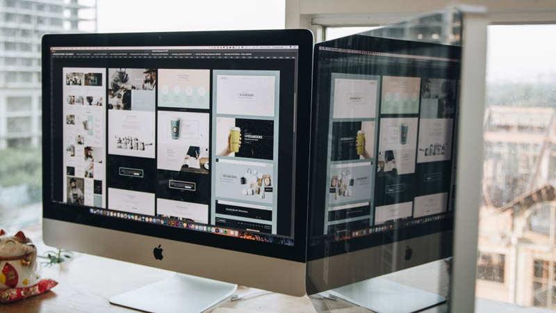
Large imagery and high-quality photos
Magazine-style layouts rely heavily on the expressive power of images. Using hero images, full-bleed visuals and cross-column photos can dramatically enhance first impressions and set the emotional tone of the site.Practical tips:
• Use a full-width hero image or background visual in the first view, paired with a concise heading and CTA button to create a cover-like experience.
• Insert cross-column images and wide banner photos inside content pages to break up long text and create a more comfortable visual rhythm.
• Prioritize branded photography, product lifestyle shots or real environment photos, and avoid relying too much on generic stock images so your brand style remains unique.
The quality and consistency of your imagery directly affect the professionalism of a magazine-style site. When planning your budget, it is worth including photography or visual asset production.
Overlapping layouts and staggered effects
To create more depth and motion, magazine-style web design often uses overlapping and staggered composition, such as:• Text overlaid on images with semi-transparent color blocks, preserving the photo while keeping text readable.
• Images, color blocks and title frames arranged in slightly offset positions to evoke a dynamic, magazine-cover-like feel.
• Subtle animation effects like parallax scrolling, image fade-ins or text sliding in from the side to make browsing more layered and immersive.
These effects do not need to be flashy. Adding them at key points is enough to avoid a template-like feel while preserving both the editorial look and readability.
If you want to build a magazine-style website, consider working with a professional web design company in Hong Kong!
Chaotic layouts on mobile, with tiny text and cropped images that hurt readability.
Too many elements without a unified grid system, making the page look messy.
Poor heading hierarchy, weak internal linking and missing Meta settings, which waste SEO opportunities.
How Arachne Group Limited can help
Arachne Group Limited has several strengths in web development and design to help you build a magazine-style website that truly fits your brand positioning:
Strategy starting from brand and content
We do more than just plug content into a template. We begin by understanding your brand positioning, audience profile and goals (such as enhancing brand image, promoting services or increasing enquiries). Then we design from the level of information architecture and content planning, ensuring every page and section has a clear communication purpose.
Professional design and front-end integration for both aesthetics and performance
Our design team understands magazine-style layouts, font usage and image composition, and can tailor a unique magazine-style UI for you. Our front-end engineers then convert this into a responsive website compatible with various devices while also optimizing loading speed and interaction smoothness.
Built-in SEO structure and content-marketing-friendly layouts
During development, we also set up heading hierarchy (H1–H3), URL structure, Meta Title and Description, image alt tags and internal links. This way your magazine-style website not only looks good but also has a better chance of ranking for keywords such as “magazine-style web design,” “brand website design” and “custom web design.”
Scalable content management system
Depending on your needs, we can integrate a CMS (content management system) so you can easily add new articles, features and case studies. You will not need a developer for every small content change, which makes long-term blogging and content marketing much easier.
If you are planning a brand-new corporate site or content-driven website, or if you want to redesign your existing site into a more refined magazine-style layout, feel free to contact us. Let us help you build a magazine-style website that combines strong visual design with real conversion power for your brand.
MORE BLOG
-
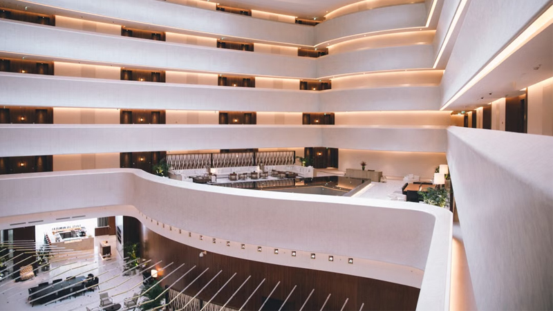
Hotel Website Has Traffic but No Bookings? 5 Key Web Design Strategies to Capture Travelers' Hearts in 10 Seconds
2026/07/17 Struggling with high traffic but no hotel bookings? Discover 5 web design secrets to bridge the 10-second trust gap, beat OTAs, and drive direct reservations. -
Enterprise-Grade Cloud Security Guide: How Hong Kong Companies Can Prevent Data Breach Crises
2026/07/14 Protect your HK business from cloud data breaches. Arachne Group shares essential security tips on compliance, 2FA, encryption & cloud provider choice. -

20-Minute Ultra-Simple Web Development Guide: How to Build Websites and Landing Pages Using Codex
2026/07/10 Learn how to use Codex and AI Agents to build custom, high-converting websites and landing pages in 20 minutes without coding. Guide by Arachne Group.
