


- 首頁
- Blog
- How to Boost Mobile E-Commerce Conversion Rates? 6 Steps to Let Customers Complete Orders at Their Fingertips
How to Boost Mobile E-Commerce Conversion Rates? 6 Steps to Let Customers Complete Orders at Their Fingertips
2026 / 07 / 03
When building online stores, many small and medium-sized enterprise (SME) owners tend to design their mobile sites with a desktop mindset. Consequently, when consumers pull out their phones ready to shop, they face disastrous experiences: fonts as tiny as ants, ultra-slow image loading times, and call-to-action buttons that are nowhere to be found.
Arachne Group Limited points out that mobile users mostly browse websites during fragmented pockets of time. They generally exhibit traits of a "fast pace, low patience, and high visual reliance." If they cannot understand "what this is," "why it's worth buying," and "how to pay/order" within a few seconds, they will leave without hesitation and never return.
Because mobile devices and desktops are completely different in design principles and User Experience (UX), mobile storefront design must break traditional frameworks. It needs to be rebuilt into a powerful sales engine that allows consumers to "understand faster, trust faster, and order faster."
To optimize the mobile e-commerce experience, you must first gain insights into three core behavior traits of mobile users:
Trait 1: Extremely Fast Scanning Speed.
Mobile screens are small, and users swipe far faster than they scroll with a desktop mouse. If a page fails to present the core point within the first 3 seconds, they won't scroll down—they will simply leave.
Trait 2: Zero Patience.
Studies show that if a mobile page takes more than 3 seconds to load, the bounce rate skyrockets. Users have a much lower tolerance on mobile than on desktop; any stutter, delay, or hard-to-find information will cause them to decisively close the window.
Trait 3: Reliance on Visual Decision-Making.
Mobile users rarely spend time reading long blocks of text on small screens; they rely heavily on visual intuition. If the images are clear and show realistic usage scenarios, they feel confident enough to order. Conversely, blurry images or plain white-background product shots leave them hesitant.
Evidently, designing a mobile online store that aligns with user habits must follow the "less is more" principle. The most critical, decision-making information must be placed at the very front and center to capture attention and drive conversions during those golden initial seconds.
In mobile store design, the "golden above-the-fold" space is incredibly precious because it dictates whether a user stays or leaves. A truly high-converting above-the-fold design must accurately answer four core questions before a user even swipes a finger:
What is this? (Clear Product Name): The product name must be intuitive and easy to understand. Avoid obscure, overly poetic, or self-indulgent branding terms.
How much is it? (Transparent Pricing): The price must be clearly displayed. If there is a promotion, the discount magnitude and the amount saved should pop instantly.
Is it worth it? (Trust Endorsement): Star ratings, total sales volume, or trust badges should make a strategic appearance above the fold to build immediate trust.
Where do I buy? (Intuitive Navigation): A visually prominent, large, and action-oriented "Add to Cart" or "Buy Now" button must be readily available.
When shopping in a physical brick-and-mortar store, customers can touch materials and see the physical product. In an online store, however, "selling products" is essentially "selling visuals." Therefore, mobile product image logic must be sharper and more direct:
Ditch plain white backgrounds: While large e-commerce platforms (like Amazon or HKTVmall) require white backgrounds for main images, brand websites are better off using contextual images. This allows users to instantly visualize how the product fits into their daily lives.
Adapt to mobile browsing habits: Mobile screens are vertical. If your product images use the desktop 16:9 widescreen ratio, they will look tiny on mobile. We recommend moving to a 1:1 (square) or 4:5 (vertical) ratio to fill the screen and maximize visual impact.
Introduce 15-second short videos: Mobile users have limited patience. Instead of making them read paragraphs, embed a 15-to-20-second short clip showcasing the product. This boosts purchase intent and aligns perfectly with modern "snackable video" viewing habits.
Because mobile screens are small, users won't spend time reading long-winded "instruction manuals." Product copy must focus on: "What problem does this product solve for the consumer?" To write copy that sells like crazy, apply the antidote to information overload—benefit-driven writing:
1. Keep titles concise and keyword-focused: Titles should contain core keywords. Keep Traditional Chinese titles within 15–20 characters (English within 8–12 words) to prevent them from getting truncated on mobile screens.
2. Bullet points and bold text: Avoid walls of text. Break selling points into bullet lists where each point stays within a single line if possible. Use bold text on key terms so users can grasp the core message instantly while scanning.
3. Subheadings with conclusions: Throw away generic subheadings like "Product Introduction." Use conclusion-style subheadings that highlight massive benefits instead, such as: "【Waterproof & Drop-resistant】Designed Specifically for Outdoor Enthusiasts."
4. Add Product FAQs: Address hidden customer objections (e.g., size compatibility, fading after washing, warranty details) directly below the product copy. Proactively eliminating doubts drastically reduces the "purchase friction" that causes users to leave and search elsewhere.
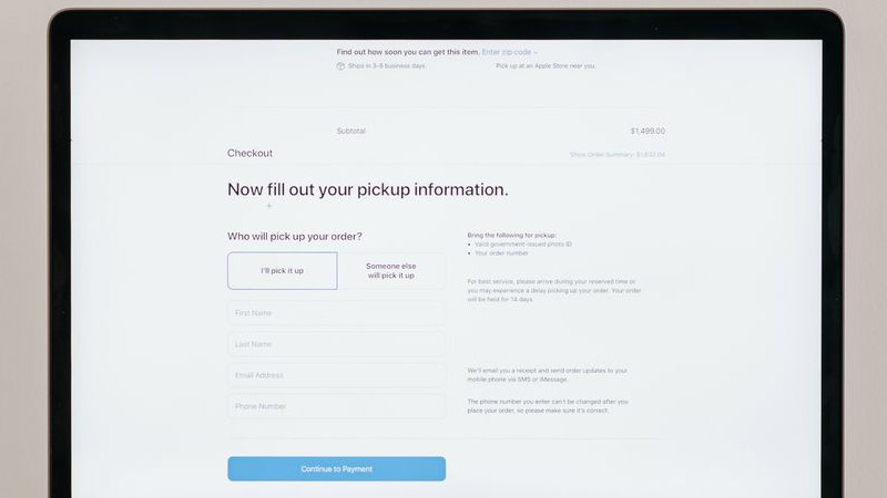
When consumers are hooked, they want to buy immediately. Yet, many businesses design CTA buttons that are too small or create checkout paths that are too tedious, leading to massive cart abandonment at the final hurdle. To facilitate frictionless buying, mobile CTAs and user paths must be "brainless":
Use Sticky CTAs: Design an "Add to Cart" or "Buy Now" button that floats at the bottom of the screen. No matter how far down the user scrolls, they can complete the purchase with a single tap the moment impulse strikes.
The Thumb Zone Principle: Vital buttons (like Checkout or Add to Cart) must be large enough (at least 44 to 48px in height) and positioned in the middle or lower section of the screen where thumbs naturally rest.
Provide Real-Time Customer Service: Integrating a one-click "WhatsApp Inquiry" or "Line Customer Service" button on the product page effectively captures hesitant shoppers who are right on the fence, tightening your e-commerce marketing net.
On desktops, users easily open multiple tabs to compare prices and reviews. On mobile, switching windows is tedious. If your product page cannot deliver peace of mind right on the spot, consumers will abandon the journey. You can secure conversions using four key trust elements:
Front-load reviews for social proof: Display star ratings and review counts right next to the price and specifications. Allow users to tap them to view details via a light box (pop-up) so authentic feedback hits home immediately.
Iconize service information: Delivery times, return policies, payment methods, and warranty information should never be buried in walls of text. Instead, use intuitive icons + concise phrases for quick scanning.
Highlight applicable offers next to variants: Whether it’s a member discount, a threshold-based price cut, or a free shipping tier, make sure these offers are clearly marked near the variant selectors or purchase button to act as powerful conversion catalysts.
Display Trust Badges: Below the purchase button, use clear icons for "7-Day Return Policy," "100% Authentic Guaranteed," "Free Shipping," or "Fast Delivery." Displaying recognizable payment logos and courier icons alleviates any lingering anxiety regarding security and logistics.
An online store can look gorgeous, but if a user on a 4G/5G mobile connection has to wait 5 seconds just for images to render, they will leave long before seeing your offer.
How do you optimize mobile e-commerce performance?
Strictly compress images: Fully convert store images to next-generation formats like WebP, which reduces file sizes by over 30% without sacrificing quality.
Enable Lazy Loading: Prioritize loading above-the-fold content first, and only load subsequent product images as the user scrolls down, significantly shortening initial page-load times.
Streamline source code: Avoid cluttering your site with too many inactive Shopify Apps or WordPress plugins to keep the architecture lightweight.
Through our website optimization and e-commerce consulting work with various brands, we have identified 5 common design blind spots that act as silent killers for conversion rates:
Directly copy-pasting desktop banners: Shoving a desktop banner onto a mobile view squishes the graphic into a vertical screen, rendering the text completely unreadable and destroying its promotional value.
Pop-up overload: Bombarding users with newsletter sign-ups, discount pop-ups, and cookie consents the second they land on your site. These pop-ups block the entire mobile screen, and because the close button (×) is usually microscopic, it ruins user experience.
Checkout fields like lengthy surveys: Demanding non-essential details like company names, fax numbers, or gender at checkout. Typing on mobile is tedious; every extra required field means losing a customer who was ready to buy.
Long paragraphs without formatting: Text-heavy descriptions without bullet points or paragraph breaks look like an unreadable textbook on mobile. It causes instant visual fatigue and kills the desire to read or shop.
Inverted information hierarchy: Web layouts that lack logic—such as pinning expired promo banners at the top of the page while burying critical product specifications at the very bottom.
A: The core of increasing mobile orders is eliminating friction. You need to optimize above-the-fold information, shorten checkout steps (by offering express checkouts like Apple Pay/Google Pay), employ sticky CTA buttons, and ensure mobile loading times stay under 2 seconds.
A: The primary task is optimizing visuals and trust. Adjust product images to a mobile-friendly 1:1 or vertical ratio, and leverage short video content. Concurrently, position authentic user reviews, free shipping tags, and secure payment badges right next to the purchase button to lower consumer defenses.
A: Avoid listing just features or technical specs. Mobile users respond to benefit-driven copy. You must clearly state how the product solves their pain points (e.g., instead of writing "100% Waterproof," write "Stay perfectly dry even in heavy downpours—your phone and bag are fully protected"). Keep paragraphs short and use bullet points frequently.
A: This usually indicates your web design is not truly Mobile-First. Common culprits include oversized image files causing slow mobile loading speeds, buttons that are too small to tap accurately, or pop-up ads blocking primary content, driving up mobile abandonment rates.
Optimizing your online store's mobile product pages is never a one-off aesthetic makeover. It is a strategic conversion engine that blends data analysis, User Experience (UX), and consumer psychology. A smaller screen means you must present your most valuable, compelling content to consumers at lightning speed.
While your competitors are still running their storefronts with a traditional desktop mindset, whoever masters mobile optimization first will capture the absolute upper hand in the battle for mobile conversions.
▍ Want to break through your sales bottleneck? Let us run a comprehensive audit for your online store!
As a professional digital marketing agency, Arachne Group Limited deeply understands the foundational logic of e-commerce marketing and conversion rate optimization. Our team doesn't just build websites; we focus on how to make websites sell better. Whether you need a mobile product page redesign, overall website SEO optimization, or long-term e-commerce marketing consulting, our professional team can tailor high-converting solutions for you.
>> [Contact us today to book your preliminary online store conversion rate audit], and let's turn those clicks into real revenue!
Tel: 852-3749 9734
Email: [email protected]
WhatsApp: 6315 1000
Arachne Group Limited points out that mobile users mostly browse websites during fragmented pockets of time. They generally exhibit traits of a "fast pace, low patience, and high visual reliance." If they cannot understand "what this is," "why it's worth buying," and "how to pay/order" within a few seconds, they will leave without hesitation and never return.
Building a Mobile Sales Engine: First, Understand How Mobile Users "Browse" Online Stores
Because mobile devices and desktops are completely different in design principles and User Experience (UX), mobile storefront design must break traditional frameworks. It needs to be rebuilt into a powerful sales engine that allows consumers to "understand faster, trust faster, and order faster."
To optimize the mobile e-commerce experience, you must first gain insights into three core behavior traits of mobile users:
Trait 1: Extremely Fast Scanning Speed.
Mobile screens are small, and users swipe far faster than they scroll with a desktop mouse. If a page fails to present the core point within the first 3 seconds, they won't scroll down—they will simply leave.
Trait 2: Zero Patience.
Studies show that if a mobile page takes more than 3 seconds to load, the bounce rate skyrockets. Users have a much lower tolerance on mobile than on desktop; any stutter, delay, or hard-to-find information will cause them to decisively close the window.
Trait 3: Reliance on Visual Decision-Making.
Mobile users rarely spend time reading long blocks of text on small screens; they rely heavily on visual intuition. If the images are clear and show realistic usage scenarios, they feel confident enough to order. Conversely, blurry images or plain white-background product shots leave them hesitant.
Evidently, designing a mobile online store that aligns with user habits must follow the "less is more" principle. The most critical, decision-making information must be placed at the very front and center to capture attention and drive conversions during those golden initial seconds.
How to Boost Mobile E-Commerce Conversion Rates? 6 Steps to Let Customers Complete Orders at Their Fingertips
Step 1: Grab the Golden 3 Seconds – Mobile Above-the-Fold Design Determines Buying Intent
In mobile store design, the "golden above-the-fold" space is incredibly precious because it dictates whether a user stays or leaves. A truly high-converting above-the-fold design must accurately answer four core questions before a user even swipes a finger:
What is this? (Clear Product Name): The product name must be intuitive and easy to understand. Avoid obscure, overly poetic, or self-indulgent branding terms.
How much is it? (Transparent Pricing): The price must be clearly displayed. If there is a promotion, the discount magnitude and the amount saved should pop instantly.
Is it worth it? (Trust Endorsement): Star ratings, total sales volume, or trust badges should make a strategic appearance above the fold to build immediate trust.
Where do I buy? (Intuitive Navigation): A visually prominent, large, and action-oriented "Add to Cart" or "Buy Now" button must be readily available.
Step 2: Visuals Drive Buying Power – Master Product Images and Short Videos
When shopping in a physical brick-and-mortar store, customers can touch materials and see the physical product. In an online store, however, "selling products" is essentially "selling visuals." Therefore, mobile product image logic must be sharper and more direct:
Ditch plain white backgrounds: While large e-commerce platforms (like Amazon or HKTVmall) require white backgrounds for main images, brand websites are better off using contextual images. This allows users to instantly visualize how the product fits into their daily lives.
Adapt to mobile browsing habits: Mobile screens are vertical. If your product images use the desktop 16:9 widescreen ratio, they will look tiny on mobile. We recommend moving to a 1:1 (square) or 4:5 (vertical) ratio to fill the screen and maximize visual impact.
Introduce 15-second short videos: Mobile users have limited patience. Instead of making them read paragraphs, embed a 15-to-20-second short clip showcasing the product. This boosts purchase intent and aligns perfectly with modern "snackable video" viewing habits.
Step 3: Copywriting is Not an Instruction Manual – Write Benefits, Not Just Features
Because mobile screens are small, users won't spend time reading long-winded "instruction manuals." Product copy must focus on: "What problem does this product solve for the consumer?" To write copy that sells like crazy, apply the antidote to information overload—benefit-driven writing:
1. Keep titles concise and keyword-focused: Titles should contain core keywords. Keep Traditional Chinese titles within 15–20 characters (English within 8–12 words) to prevent them from getting truncated on mobile screens.
2. Bullet points and bold text: Avoid walls of text. Break selling points into bullet lists where each point stays within a single line if possible. Use bold text on key terms so users can grasp the core message instantly while scanning.
3. Subheadings with conclusions: Throw away generic subheadings like "Product Introduction." Use conclusion-style subheadings that highlight massive benefits instead, such as: "【Waterproof & Drop-resistant】Designed Specifically for Outdoor Enthusiasts."
4. Add Product FAQs: Address hidden customer objections (e.g., size compatibility, fading after washing, warranty details) directly below the product copy. Proactively eliminating doubts drastically reduces the "purchase friction" that causes users to leave and search elsewhere.
Step 4: CTA Buttons and Purchase Paths – Make Buying Effortless
When consumers are hooked, they want to buy immediately. Yet, many businesses design CTA buttons that are too small or create checkout paths that are too tedious, leading to massive cart abandonment at the final hurdle. To facilitate frictionless buying, mobile CTAs and user paths must be "brainless":
Use Sticky CTAs: Design an "Add to Cart" or "Buy Now" button that floats at the bottom of the screen. No matter how far down the user scrolls, they can complete the purchase with a single tap the moment impulse strikes.
The Thumb Zone Principle: Vital buttons (like Checkout or Add to Cart) must be large enough (at least 44 to 48px in height) and positioned in the middle or lower section of the screen where thumbs naturally rest.
Provide Real-Time Customer Service: Integrating a one-click "WhatsApp Inquiry" or "Line Customer Service" button on the product page effectively captures hesitant shoppers who are right on the fence, tightening your e-commerce marketing net.
Step 5: Indispensable Trust Elements – Give Consumers Peace of Mind
On desktops, users easily open multiple tabs to compare prices and reviews. On mobile, switching windows is tedious. If your product page cannot deliver peace of mind right on the spot, consumers will abandon the journey. You can secure conversions using four key trust elements:
Front-load reviews for social proof: Display star ratings and review counts right next to the price and specifications. Allow users to tap them to view details via a light box (pop-up) so authentic feedback hits home immediately.
Iconize service information: Delivery times, return policies, payment methods, and warranty information should never be buried in walls of text. Instead, use intuitive icons + concise phrases for quick scanning.
Highlight applicable offers next to variants: Whether it’s a member discount, a threshold-based price cut, or a free shipping tier, make sure these offers are clearly marked near the variant selectors or purchase button to act as powerful conversion catalysts.
Display Trust Badges: Below the purchase button, use clear icons for "7-Day Return Policy," "100% Authentic Guaranteed," "Free Shipping," or "Fast Delivery." Displaying recognizable payment logos and courier icons alleviates any lingering anxiety regarding security and logistics.
Step 6: Technology is Conversion Rate – Page Speed and Structural Optimization
An online store can look gorgeous, but if a user on a 4G/5G mobile connection has to wait 5 seconds just for images to render, they will leave long before seeing your offer.
How do you optimize mobile e-commerce performance?
Strictly compress images: Fully convert store images to next-generation formats like WebP, which reduces file sizes by over 30% without sacrificing quality.
Enable Lazy Loading: Prioritize loading above-the-fold content first, and only load subsequent product images as the user scrolls down, significantly shortening initial page-load times.
Streamline source code: Avoid cluttering your site with too many inactive Shopify Apps or WordPress plugins to keep the architecture lightweight.
Must-Read for Store Owners: 5 "Self-Sabotaging" Mobile Product Page Errors
Through our website optimization and e-commerce consulting work with various brands, we have identified 5 common design blind spots that act as silent killers for conversion rates:
Directly copy-pasting desktop banners: Shoving a desktop banner onto a mobile view squishes the graphic into a vertical screen, rendering the text completely unreadable and destroying its promotional value.
Pop-up overload: Bombarding users with newsletter sign-ups, discount pop-ups, and cookie consents the second they land on your site. These pop-ups block the entire mobile screen, and because the close button (×) is usually microscopic, it ruins user experience.
Checkout fields like lengthy surveys: Demanding non-essential details like company names, fax numbers, or gender at checkout. Typing on mobile is tedious; every extra required field means losing a customer who was ready to buy.
Long paragraphs without formatting: Text-heavy descriptions without bullet points or paragraph breaks look like an unreadable textbook on mobile. It causes instant visual fatigue and kills the desire to read or shop.
Inverted information hierarchy: Web layouts that lack logic—such as pinning expired promo banners at the top of the page while burying critical product specifications at the very bottom.
Frequently Asked Questions (FAQ) about Mobile Product Page Optimization
Q1: How can product pages increase mobile ordering rates?
A: The core of increasing mobile orders is eliminating friction. You need to optimize above-the-fold information, shorten checkout steps (by offering express checkouts like Apple Pay/Google Pay), employ sticky CTA buttons, and ensure mobile loading times stay under 2 seconds.
Q2: How do mobile product pages improve conversion rates?
A: The primary task is optimizing visuals and trust. Adjust product images to a mobile-friendly 1:1 or vertical ratio, and leverage short video content. Concurrently, position authentic user reviews, free shipping tags, and secure payment badges right next to the purchase button to lower consumer defenses.
Q3: How do I write highly enticing e-commerce product copy?
A: Avoid listing just features or technical specs. Mobile users respond to benefit-driven copy. You must clearly state how the product solves their pain points (e.g., instead of writing "100% Waterproof," write "Stay perfectly dry even in heavy downpours—your phone and bag are fully protected"). Keep paragraphs short and use bullet points frequently.
Q4: Why does my store convert well on desktop but fail to sell on mobile?
A: This usually indicates your web design is not truly Mobile-First. Common culprits include oversized image files causing slow mobile loading speeds, buttons that are too small to tap accurately, or pop-up ads blocking primary content, driving up mobile abandonment rates.
Conclusion: Mobile Product Page Optimization is an Ongoing Profit-Generating Engine
Optimizing your online store's mobile product pages is never a one-off aesthetic makeover. It is a strategic conversion engine that blends data analysis, User Experience (UX), and consumer psychology. A smaller screen means you must present your most valuable, compelling content to consumers at lightning speed.
While your competitors are still running their storefronts with a traditional desktop mindset, whoever masters mobile optimization first will capture the absolute upper hand in the battle for mobile conversions.
▍ Want to break through your sales bottleneck? Let us run a comprehensive audit for your online store!
As a professional digital marketing agency, Arachne Group Limited deeply understands the foundational logic of e-commerce marketing and conversion rate optimization. Our team doesn't just build websites; we focus on how to make websites sell better. Whether you need a mobile product page redesign, overall website SEO optimization, or long-term e-commerce marketing consulting, our professional team can tailor high-converting solutions for you.
>> [Contact us today to book your preliminary online store conversion rate audit], and let's turn those clicks into real revenue!
Tel: 852-3749 9734
Email: [email protected]
WhatsApp: 6315 1000
MORE BLOG
-
What Is Chamber of Commerce Web Design? From Brochure Site to Full-Scale Operating Platform
2026/06/23 Chamber websites now act as hubs for engagement, events, and marketing. Professional design drives digital transformation in Hong Kong chambers, boosting retention and brand influence. -

Elementary/Secondary vs. University Website Design Differences: Why Can’t School Websites Use a One-Size-Fits-All Template?
2026/06/16 Discover why primary/secondary school and university websites require distinct designs. Learn key differences in audience, structure, visuals, and SEO strategies to boost enrollment and build trust effectively. -

【Your 24-Hour Star Salesperson】Why Websites Have Become the Core Lead Generation Tool for Trading Companies?
2026/06/12 Discover why a high-converting website is crucial for trading companies to attract global buyers, reduce B2B platform dependence, and boost RFQs through strategic web design.
