


- 首頁
- Blog
- How to Design Website Navigation? 8 Key Points to Create a Smooth, Uninterrupted User Experience Guide
How to Design Website Navigation? 8 Key Points to Create a Smooth, Uninterrupted User Experience Guide
2023 / 12 / 12
In web design, navigation acts like signage in a building, influencing not only the user's first impression but also their willingness to explore further. In other words, a smooth and user-friendly navigation design can perfectly present product features while guiding users to achieve their goals effortlessly, avoiding distractions and frustrations.

Navigation design is not just a common module in web design; it is the core bridge connecting various pages within a product. It integrates information architecture, interaction design, and visual design, aiming to enhance website usability and user experience. A fluid and intuitive navigation design effectively showcases product functionality, guides users to accomplish tasks seamlessly, and minimizes interference with their choices. Simply put, navigation design serves as the "dialogue window" between the user and the website, determining whether users can successfully complete their tasks.
To maximize the effectiveness of navigation design, we need to focus on two aspects:
First, understanding the different types of navigation designs.
Second, mastering their practical application points.
Next, we will break down these elements one by one.

Navigation design comes in various forms, each with its unique application scenarios, advantages, and disadvantages. Below are eight common types of navigation design to help you make the best choice based on your product requirements.
Bottom Navigation Bar: A Classic Design, Simple and Usable
The bottom navigation bar is typically used for frequently accessed functions that persist throughout the product experience, usually with no more than five options. This design aligns with user habits and is particularly suitable for mobile devices, allowing easy thumb-tapping to switch pages. For instance, many social media apps place core functions like "Home," "Search," "Notifications," and "Profile" in the bottom navigation bar for quick access.
Rudder Navigation Bar: An Intelligent Choice for Expanded Functionality
The rudder navigation bar adds a prominent action entry point (like a central button) to the standard bottom navigation, often used to accommodate more options or secondary navigation tabs. This design suits pages with multiple peer-level content sections while needing to emphasize a frequently used function (e.g., a publish button). Its advantage lies in maintaining interface cleanliness while offering more operational possibilities.
Top Tab Navigation Bar: A Versatile Design for Flexible Switching
The top tab navigation bar allows switching between different pages via horizontal swiping, with selected and unselected tabs usually distinguished by style. This design is highly scalable and suitable for content-rich websites or applications. However, due to the potentially higher number of options, users might spend more time switching pages and could forget previously viewed content. Therefore, it's crucial to control the number of options to avoid user confusion.
Segmented Control Navigation Bar: A Design Specific to iOS Conventions
Segmented control navigation is a unique component within iOS design guidelines, switching options via tap interactions—the key difference from top tab navigation being the interaction method. The number of options is typically limited to 2-5, making it suitable for scenarios requiring clear categorization. Its design is clean and straightforward, effectively reducing users' cognitive load.
List Navigation Bar: A Traditional Approach for Efficient Information Delivery
List navigation displays core functions through vertical arrangement, aligning with the user's F-pattern reading habit, resulting in high information delivery efficiency. However, due to its larger vertical space consumption, this design is less common in websites and apps. It's more suitable for scenarios with simple content structures that need to emphasize textual information.
Grid Navigation Bar: A Visually Prominent Grid Layout
Grid navigation uses a grid layout to concentrate main entry points on the page, with options generally having equal weight. This design is visually striking and particularly suitable for icon-centric applications (e.g., utility apps). The distinction from list navigation is its stronger emphasis on icons, whereas list navigation focuses more on text descriptions.
Carousel Navigation: An Innovative, Flat and Simple Design
Carousel navigation is suitable for pages with simple structures and flat information hierarchies, indicating the current position via "dots" at the bottom. This design downplays the presence of navigation options, making the interface content more prominent. However, because options are less immediately accessible, it might not be ideal for complex applications requiring rapid switching between multiple pages.
Drawer Navigation (Hamburger Navigation): A Space-Saving Hidden Design
Drawer navigation saves page space by hiding non-core functions, allowing users to focus on the current content. Although this design maintains a clean interface, the exposure and click-through rate for hidden items are often lower. Therefore, it's more appropriate for auxiliary functions or secondary page navigation.

After understanding navigation types, the next step is mastering their practical application. Here are eight key techniques to help you design a navigation system that is both functional and aesthetically pleasing.
Define the Product Information Architecture and Categorization
Before designing navigation, a comprehensive review of the website or app's content and functionality is essential. Information architecture forms the foundation of navigation; only with clear categorization can navigation accurately reflect the overall structure. Using mind maps or flowcharts to group content logically is recommended to avoid duplication or omission.
Simplify the Navigation Hierarchy
Excessive hierarchy increases users' cognitive load, causing confusion when searching for targets. Ideally, navigation hierarchy should be limited to three levels or fewer. For example, large e-commerce sites can use dropdown menus to reveal secondary categories instead of requiring users to click through multiple layers.
Highlight Key Information and Frequently Used Functions
The arrangement of navigation options should be based on page importance or usage frequency. Emphasizing crucial options through visual elements like color, size, or position helps users find needed functions quickly. For instance, designing "Buy" or "Register" buttons in a contrasting color can effectively attract user attention.
Avoid Obscure Technical Jargon
Navigation labels should use simple, understandable vocabulary, avoiding technical terms or abbreviations. For example, using "Services" instead of "Solutions" makes the purpose clearer to users. Testing label clarity can be done by inviting target users for simple surveys.
Provide a Search Function
The search function is a vital supplement to navigation, especially for content-rich websites. It can exist as a standalone page or be integrated into the navigation bar. For example, e-commerce sites often place the search box in the top navigation bar, allowing users to directly enter keywords to find products.
Use Consistent Navigation Patterns
Consistency is a core principle of navigation design. Navigation patterns, icons, and textual descriptions should remain uniform across different pages. This not only reduces the user's learning curve but also enhances their trust in the brand.
Prioritize Responsive Design
With the prevalence of multi-device usage, responsive web design has become essential for navigation. Navigation should automatically adapt its layout based on screen size to ensure a smooth experience on mobile phones, tablets, and desktops. For example, replacing a bottom navigation bar with a hamburger menu on mobile devices accommodates limited screen space.
Test and Optimize
Navigation design is not a one-time task; it requires continuous optimization through user testing and data analysis. For instance, using heatmap tools to observe user click behavior helps identify pain points in the navigation for adjustments. Regularly update the navigation design to adapt to evolving user needs.
Navigation design is not just a technical matter but also an art. As technology evolves, future navigation designs might incorporate more intelligent elements, such as voice navigation or AI recommendations. However, regardless of how the form changes, its core objective remains constant: to provide users with a clear and fluid experience.
Arachne Group Limited offers one-stop digital business solutions, including website design, online promotion, web hosting & management, system development, and other value-added services, comprehensively meeting clients' business needs. Feel free to contact us. Arachne Group Limited is your ideal partner for exploring online business opportunities.
Tel : 852-3749 9734
Email: info@hkweb.com.hk
Website: https://hkweb.com.hk
Why is Navigation So Crucial in Web Design?
Navigation design is not just a common module in web design; it is the core bridge connecting various pages within a product. It integrates information architecture, interaction design, and visual design, aiming to enhance website usability and user experience. A fluid and intuitive navigation design effectively showcases product functionality, guides users to accomplish tasks seamlessly, and minimizes interference with their choices. Simply put, navigation design serves as the "dialogue window" between the user and the website, determining whether users can successfully complete their tasks.
To maximize the effectiveness of navigation design, we need to focus on two aspects:
First, understanding the different types of navigation designs.
Second, mastering their practical application points.
Next, we will break down these elements one by one.
The Eight Major Types of Navigation Design: Which One Suits Your Website?
Navigation design comes in various forms, each with its unique application scenarios, advantages, and disadvantages. Below are eight common types of navigation design to help you make the best choice based on your product requirements.
Bottom Navigation Bar: A Classic Design, Simple and Usable
The bottom navigation bar is typically used for frequently accessed functions that persist throughout the product experience, usually with no more than five options. This design aligns with user habits and is particularly suitable for mobile devices, allowing easy thumb-tapping to switch pages. For instance, many social media apps place core functions like "Home," "Search," "Notifications," and "Profile" in the bottom navigation bar for quick access.
Rudder Navigation Bar: An Intelligent Choice for Expanded Functionality
The rudder navigation bar adds a prominent action entry point (like a central button) to the standard bottom navigation, often used to accommodate more options or secondary navigation tabs. This design suits pages with multiple peer-level content sections while needing to emphasize a frequently used function (e.g., a publish button). Its advantage lies in maintaining interface cleanliness while offering more operational possibilities.
Top Tab Navigation Bar: A Versatile Design for Flexible Switching
The top tab navigation bar allows switching between different pages via horizontal swiping, with selected and unselected tabs usually distinguished by style. This design is highly scalable and suitable for content-rich websites or applications. However, due to the potentially higher number of options, users might spend more time switching pages and could forget previously viewed content. Therefore, it's crucial to control the number of options to avoid user confusion.
Segmented Control Navigation Bar: A Design Specific to iOS Conventions
Segmented control navigation is a unique component within iOS design guidelines, switching options via tap interactions—the key difference from top tab navigation being the interaction method. The number of options is typically limited to 2-5, making it suitable for scenarios requiring clear categorization. Its design is clean and straightforward, effectively reducing users' cognitive load.
List Navigation Bar: A Traditional Approach for Efficient Information Delivery
List navigation displays core functions through vertical arrangement, aligning with the user's F-pattern reading habit, resulting in high information delivery efficiency. However, due to its larger vertical space consumption, this design is less common in websites and apps. It's more suitable for scenarios with simple content structures that need to emphasize textual information.
Grid Navigation Bar: A Visually Prominent Grid Layout
Grid navigation uses a grid layout to concentrate main entry points on the page, with options generally having equal weight. This design is visually striking and particularly suitable for icon-centric applications (e.g., utility apps). The distinction from list navigation is its stronger emphasis on icons, whereas list navigation focuses more on text descriptions.
Carousel Navigation: An Innovative, Flat and Simple Design
Carousel navigation is suitable for pages with simple structures and flat information hierarchies, indicating the current position via "dots" at the bottom. This design downplays the presence of navigation options, making the interface content more prominent. However, because options are less immediately accessible, it might not be ideal for complex applications requiring rapid switching between multiple pages.
Drawer Navigation (Hamburger Navigation): A Space-Saving Hidden Design
Drawer navigation saves page space by hiding non-core functions, allowing users to focus on the current content. Although this design maintains a clean interface, the exposure and click-through rate for hidden items are often lower. Therefore, it's more appropriate for auxiliary functions or secondary page navigation.
How to Design Website Navigation? 8 Key Points to Create a Smooth, Uninterrupted User Experience Guide
After understanding navigation types, the next step is mastering their practical application. Here are eight key techniques to help you design a navigation system that is both functional and aesthetically pleasing.
Define the Product Information Architecture and Categorization
Before designing navigation, a comprehensive review of the website or app's content and functionality is essential. Information architecture forms the foundation of navigation; only with clear categorization can navigation accurately reflect the overall structure. Using mind maps or flowcharts to group content logically is recommended to avoid duplication or omission.
Simplify the Navigation Hierarchy
Excessive hierarchy increases users' cognitive load, causing confusion when searching for targets. Ideally, navigation hierarchy should be limited to three levels or fewer. For example, large e-commerce sites can use dropdown menus to reveal secondary categories instead of requiring users to click through multiple layers.
Highlight Key Information and Frequently Used Functions
The arrangement of navigation options should be based on page importance or usage frequency. Emphasizing crucial options through visual elements like color, size, or position helps users find needed functions quickly. For instance, designing "Buy" or "Register" buttons in a contrasting color can effectively attract user attention.
Avoid Obscure Technical Jargon
Navigation labels should use simple, understandable vocabulary, avoiding technical terms or abbreviations. For example, using "Services" instead of "Solutions" makes the purpose clearer to users. Testing label clarity can be done by inviting target users for simple surveys.
Provide a Search Function
The search function is a vital supplement to navigation, especially for content-rich websites. It can exist as a standalone page or be integrated into the navigation bar. For example, e-commerce sites often place the search box in the top navigation bar, allowing users to directly enter keywords to find products.
Use Consistent Navigation Patterns
Consistency is a core principle of navigation design. Navigation patterns, icons, and textual descriptions should remain uniform across different pages. This not only reduces the user's learning curve but also enhances their trust in the brand.
Prioritize Responsive Design
With the prevalence of multi-device usage, responsive web design has become essential for navigation. Navigation should automatically adapt its layout based on screen size to ensure a smooth experience on mobile phones, tablets, and desktops. For example, replacing a bottom navigation bar with a hamburger menu on mobile devices accommodates limited screen space.
Test and Optimize
Navigation design is not a one-time task; it requires continuous optimization through user testing and data analysis. For instance, using heatmap tools to observe user click behavior helps identify pain points in the navigation for adjustments. Regularly update the navigation design to adapt to evolving user needs.
Navigation design is not just a technical matter but also an art. As technology evolves, future navigation designs might incorporate more intelligent elements, such as voice navigation or AI recommendations. However, regardless of how the form changes, its core objective remains constant: to provide users with a clear and fluid experience.
Arachne Group Limited offers one-stop digital business solutions, including website design, online promotion, web hosting & management, system development, and other value-added services, comprehensively meeting clients' business needs. Feel free to contact us. Arachne Group Limited is your ideal partner for exploring online business opportunities.
Tel : 852-3749 9734
Email: info@hkweb.com.hk
Website: https://hkweb.com.hk
MORE BLOG
-
2026 UI Design Trends Worth Watching: From Mobile‑First to Spatial Intelligence
2026/01/09 Discover 2026 UI design trends—AI generative interfaces, liquid glass aesthetics, multimodal interaction, and spatial storytelling shaping digital experiences. -
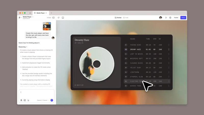
Say goodbye to cumbersome website development processes! How to Build Websites Using Gemini 3
2025/12/16 With the rapid advancement of AI technology, numerous powerful AI tools have emerged online, bringing unprecedented transformation to website development. Today, Arachne Group Limited highlights a powerful tool for everyone – Gemini 3. -

What Functions Does an Online Store Design Typically Include? Five Essential Core Functions, Each Indispensable!
2025/12/10 The following will guide you step-by-step from fundamental concepts to essential practical functions, and then to payment gateway options and advanced integrations, to master everything you need to know about building a successful online store.
