


- 首頁
- Blog
- Focusing the User's Visual Attention: How to Use "Red" to Unlock Higher Conversion Rates in Web Design
Focusing the User's Visual Attention: How to Use "Red" to Unlock Higher Conversion Rates in Web Design
2026 / 05 / 19
Among the many color schemes available for websites, red remains a highly controversial yet fascinating color. Used well, it can capture attention instantly, enhance brand recall, and convey passion, power, and urgency. Used poorly, it can overwhelm users and drive them away.
So, red in web design is never about "dare to use it or not" — it's about "how to use it just right."

To master red, we must first understand the chemical reactions it triggers in the human brain. In visual psychology, red carries unique symbolic meanings:
Red represents vitality, intensity, and undeniable confidence. It can subtly increase heart rate and blood pressure. When a brand injects red into its website color scheme, it unconsciously communicates a positive image of innovation and drive.
From ancient times to today, red has been linked to royalty, celebrations, and major decisions. In modern corporate design, deep reds like burgundy convey maturity, prestige, and unshakable professionalism.
Why do ecommerce sale tags, countdown timers, and "last chance" buttons love red? Because it triggers the fightorflight response, creating a subconscious "act now or miss out" cue — the core secret behind highconverting landing page color schemes.
In Asian cultures, red is inseparable from wealth, good fortune, and celebrations. It quickly lifts consumers' mood, making them more willing to engage — both emotionally and financially.
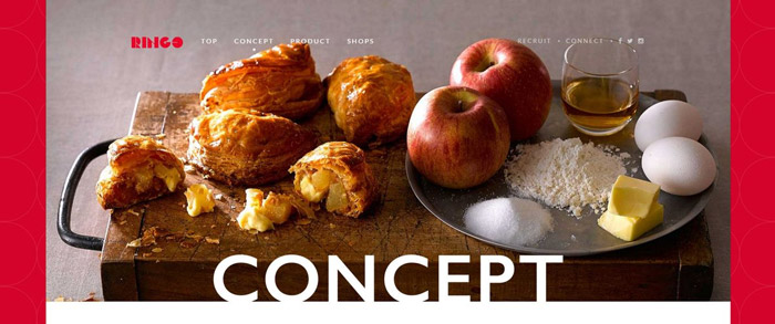
Not every website should use large areas of red. Based on years of design experience, these four scenarios maximize red's advantages:
1. LimitedTime Promotions & Ecommerce Landing Pages: Stimulate clicks and create a "last chance" feel. On conversionfocused pages, red as an accent color is almost like cheating. It precisely guides the user's eye to CTA buttons like "Buy Now" or "Claim Offer."
2. Food & Beverage Websites: Trigger hunger hormones and boost appetite. Color psychology research confirms that red and yellow effectively stimulate the brain's hunger signals. From global fast food chains to spicy hot pot and food delivery platforms, red is an excellent primary color.
3. Festival, Culture & Event Websites: Create a festive, energetic atmosphere. Whether for Lunar New Year, Christmas, New Year's Eve concerts, or ticketing platforms, red instantly ignites a sense of celebration and participation.
4. Brands Emphasizing Innovation & Disruption: Showcase boldness and marketchanging ambition. If your startup is entering a traditional, conservative market, using red boldly can announce your disruptive uniqueness and help you stand out from competitors.

How do you make a red website look stylish and globally sophisticated? It all comes down to choosing the right supporting colors. Here are 4 UI color formulas designers love:
The safest, highcontrast, fresh look. A large white or very light gray background dilutes the aggressiveness of red logos or CTA buttons while improving readability and breathing space.
Best for: Tech startups, news media, modern ecommerce
Luxurious, powerful, and dramatic. Pure black with vibrant red creates strong contrast and masculine energy. Reduce red's saturation and opt for dark "blood orange red" or "deep crimson" for a supremely elegant look.
Best for: Sports car brands, highend audio, gaming gear, streetwear
Modern, restrained, and professional. Gray is a natural neutralizer. Using it (e.g., offwhite, cement gray) to balance red's intensity keeps the eyecatching boldness while creating a rationalyetemotional visual style.
Best for: Architecture firms, personal portfolios, B2A corporate sites
Elegant and festive. Here, metallic usually means champagne gold, rose gold, or brushed copper. To avoid tackiness, use metallic sparingly — only on fine borders, typography details, or subtle icons.
Best for: Highend beauty, heritage brand redesigns, luxury goods, seasonal pages
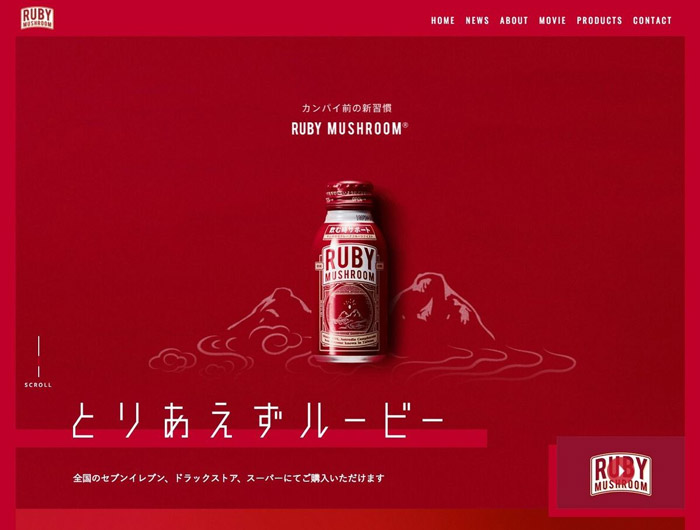
"Why does my red website look like an old warning sign?" If that sounds familiar, you've likely hit visual overload. Follow these principles when planning your web color scheme:
1. Avoid large areas of red: Large red areas cause headaches, visual fatigue, and instant exits. Stick to three or fewer interface colors, using red as an accent and letting white or gray dominate.
2. Control saturation and adjust hue: Using #FF0000 (pure red) in CSS often leads to disaster. Mature UI designers shift it slightly — add a touch of blue (elegant berry red, Bordeaux) or yellow (lively brick red, vermilion) to instantly elevate the overall quality.
3. Don't lose focus: If your headlines, buttons, background bars, and even hyperlinks are all red, users see only a bloody mess with no clear focal point. Red works best as an accent color.
4. Maintain brand consistency: A mismatch between website style and physical products erodes consumer trust. When considering red, extract the core red from your brand logo and precisely extend it to the UI via color codes to maintain consistency.

Scheme: Classic flame red + deep black + white text
Highlight: The nearly black background mimics a dark theater, making Netflix's red logo and "Join Now" CTA pop — strengthening brand identity and putting users in a "ready to watch" mindset.
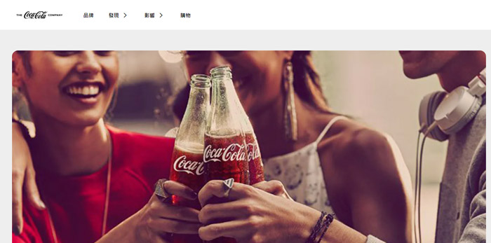
Scheme: CocaCola red + pure white + light gray
Highlight: A textbook example of red + white. Lots of white space balances the red, which appears only on product packaging, hero images, and core navigation.
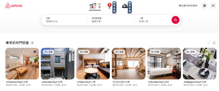
Scheme: Signature Rausch + warm dark gray + white background
Highlight: The proprietary Rausch shade — between red, pink, and coral — breaks away from cold travelsite blues and greens, building trust through warmth and belonging.
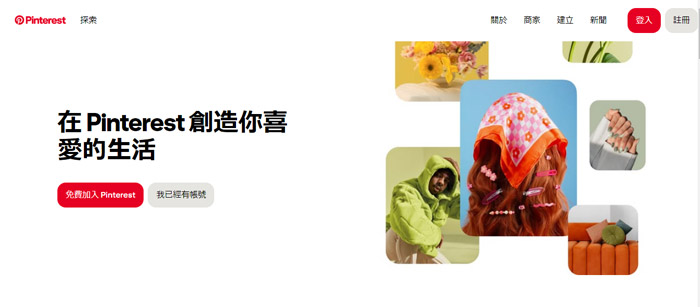
Scheme: Signature red + clean white + charcoal type
Highlight: Strong red appears only on the logo, Save button, and key interaction cues. The rest remains minimal white and gray, reinforcing the conditioned response of "see inspiration, save it instantly."
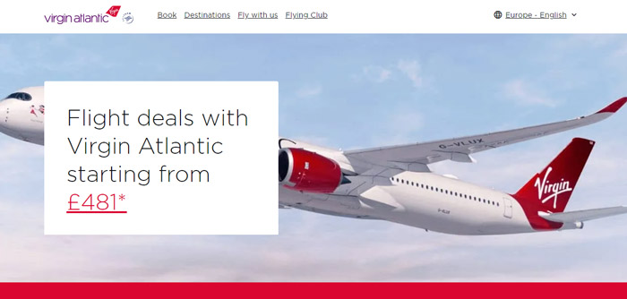
Scheme: Royal Virgin red + Elegant dark purple + silver gray
Highlight: A bold mix of red, purple, and silver gray conveys a stylish, partylike, premium flying experience. Highquality video backgrounds with subtle red accents attract highend business and vacation travelers seeking unique experiences.
When you learn to refine red from a broad brushstroke into a focused "key accent color" for conversions, your website transforms from a cold digital page into a 24/7 toptier digital salesperson that guides user emotions and buying behavior.
Web color schemes aren't just aesthetics — they're a marketing science combining data and psychology. Whether you're planning a brand‑new website or looking to boost performance through a redesign, our professional design team can create a customized brand color scheme for you.
Contact us now for a free oneonone consultation on web development and online promotion services. Let's unlock your brand's highconversion potential with the perfect color strategy.
So, red in web design is never about "dare to use it or not" — it's about "how to use it just right."
Tapping into Consumer Subconsciousness: The 4 Psychological Effects of Red Color Schemes
To master red, we must first understand the chemical reactions it triggers in the human brain. In visual psychology, red carries unique symbolic meanings:
1. Passion & Energy
Red represents vitality, intensity, and undeniable confidence. It can subtly increase heart rate and blood pressure. When a brand injects red into its website color scheme, it unconsciously communicates a positive image of innovation and drive.
2. Power & Authority
From ancient times to today, red has been linked to royalty, celebrations, and major decisions. In modern corporate design, deep reds like burgundy convey maturity, prestige, and unshakable professionalism.
3. Urgency & Action
Why do ecommerce sale tags, countdown timers, and "last chance" buttons love red? Because it triggers the fightorflight response, creating a subconscious "act now or miss out" cue — the core secret behind highconverting landing page color schemes.
4. Festivity & Joy
In Asian cultures, red is inseparable from wealth, good fortune, and celebrations. It quickly lifts consumers' mood, making them more willing to engage — both emotionally and financially.
Is Red Right for Your Industry? 4 Golden Scenarios for Using Red in Web Design
Not every website should use large areas of red. Based on years of design experience, these four scenarios maximize red's advantages:
1. LimitedTime Promotions & Ecommerce Landing Pages: Stimulate clicks and create a "last chance" feel. On conversionfocused pages, red as an accent color is almost like cheating. It precisely guides the user's eye to CTA buttons like "Buy Now" or "Claim Offer."
2. Food & Beverage Websites: Trigger hunger hormones and boost appetite. Color psychology research confirms that red and yellow effectively stimulate the brain's hunger signals. From global fast food chains to spicy hot pot and food delivery platforms, red is an excellent primary color.
3. Festival, Culture & Event Websites: Create a festive, energetic atmosphere. Whether for Lunar New Year, Christmas, New Year's Eve concerts, or ticketing platforms, red instantly ignites a sense of celebration and participation.
4. Brands Emphasizing Innovation & Disruption: Showcase boldness and marketchanging ambition. If your startup is entering a traditional, conservative market, using red boldly can announce your disruptive uniqueness and help you stand out from competitors.
Avoiding Tackiness: 4 Classic, HighQuality Red Color Formulas
How do you make a red website look stylish and globally sophisticated? It all comes down to choosing the right supporting colors. Here are 4 UI color formulas designers love:
Red + White
The safest, highcontrast, fresh look. A large white or very light gray background dilutes the aggressiveness of red logos or CTA buttons while improving readability and breathing space.
Best for: Tech startups, news media, modern ecommerce
Red + Black
Luxurious, powerful, and dramatic. Pure black with vibrant red creates strong contrast and masculine energy. Reduce red's saturation and opt for dark "blood orange red" or "deep crimson" for a supremely elegant look.
Best for: Sports car brands, highend audio, gaming gear, streetwear
Red + Gray
Modern, restrained, and professional. Gray is a natural neutralizer. Using it (e.g., offwhite, cement gray) to balance red's intensity keeps the eyecatching boldness while creating a rationalyetemotional visual style.
Best for: Architecture firms, personal portfolios, B2A corporate sites
Red + Metallic (Gold/Rose Gold)
Elegant and festive. Here, metallic usually means champagne gold, rose gold, or brushed copper. To avoid tackiness, use metallic sparingly — only on fine borders, typography details, or subtle icons.
Best for: Highend beauty, heritage brand redesigns, luxury goods, seasonal pages
Key Design Principles for Red: Avoiding a Visual Disaster
"Why does my red website look like an old warning sign?" If that sounds familiar, you've likely hit visual overload. Follow these principles when planning your web color scheme:
1. Avoid large areas of red: Large red areas cause headaches, visual fatigue, and instant exits. Stick to three or fewer interface colors, using red as an accent and letting white or gray dominate.
2. Control saturation and adjust hue: Using #FF0000 (pure red) in CSS often leads to disaster. Mature UI designers shift it slightly — add a touch of blue (elegant berry red, Bordeaux) or yellow (lively brick red, vermilion) to instantly elevate the overall quality.
3. Don't lose focus: If your headlines, buttons, background bars, and even hyperlinks are all red, users see only a bloody mess with no clear focal point. Red works best as an accent color.
4. Maintain brand consistency: A mismatch between website style and physical products erodes consumer trust. When considering red, extract the core red from your brand logo and precisely extend it to the UI via color codes to maintain consistency.
RealWorld Case Studies: 5 Top Websites That Successfully Use Red
1. Netflix – Ultimate immersive cinema aesthetic
Scheme: Classic flame red + deep black + white text
Highlight: The nearly black background mimics a dark theater, making Netflix's red logo and "Join Now" CTA pop — strengthening brand identity and putting users in a "ready to watch" mindset.
2. CocaCola – 100+ years of passion and joy
Scheme: CocaCola red + pure white + light gray
Highlight: A textbook example of red + white. Lots of white space balances the red, which appears only on product packaging, hero images, and core navigation.
3. Airbnb – Warm, welcoming pinkish red
Scheme: Signature Rausch + warm dark gray + white background
Highlight: The proprietary Rausch shade — between red, pink, and coral — breaks away from cold travelsite blues and greens, building trust through warmth and belonging.
4. Pinterest – Inspirational visual pinboard
Scheme: Signature red + clean white + charcoal type
Highlight: Strong red appears only on the logo, Save button, and key interaction cues. The rest remains minimal white and gray, reinforcing the conditioned response of "see inspiration, save it instantly."
5. Virgin Atlantic – Luxurious, rebellious, and supremely elegant
Scheme: Royal Virgin red + Elegant dark purple + silver gray
Highlight: A bold mix of red, purple, and silver gray conveys a stylish, partylike, premium flying experience. Highquality video backgrounds with subtle red accents attract highend business and vacation travelers seeking unique experiences.
Conclusion: Use Red Right to Make Your Brand Website Drive Revenue
When you learn to refine red from a broad brushstroke into a focused "key accent color" for conversions, your website transforms from a cold digital page into a 24/7 toptier digital salesperson that guides user emotions and buying behavior.
Web color schemes aren't just aesthetics — they're a marketing science combining data and psychology. Whether you're planning a brand‑new website or looking to boost performance through a redesign, our professional design team can create a customized brand color scheme for you.
Contact us now for a free oneonone consultation on web development and online promotion services. Let's unlock your brand's highconversion potential with the perfect color strategy.
MORE BLOG
-

Unsatisfied with AI Website Drafts? 5 Steps to Turn Initial Drafts into Effective Business Websites
2026/10/13 Stuck with a generic AI website? Follow our 5-step guide to turn AI initial drafts into effective, user-friendly business websites tailored to your brand. -

What to Do If Your WordPress Site Is Slow? Speed Diagnosis, Cause Identification, and Acceleration Steps
2026/10/09 Is your WordPress site running slow? Learn how to diagnose loading issues, fix Core Web Vitals, and optimize your website speed step-by-step to boost SEO. -

Hong Kong Web Design Guide: How to Build a High-Converting WordPress Site from Scratch
2026/09/30 Complete Hong Kong WordPress guide: domain, hosting, SEO, & pricing for HK SMEs. Learn DIY vs agency web design to build high-converting websites.

