


How to Keep Web Design “Balanced”? Visual Rhythm × User Experience in Web Design
2021 / 04 / 09
Hong Kong web design companies have found that many businesses, when considering website visuals, often pursue “eye‑catching” designs while overlooking the key metric of web design balance. Especially when information is overly crowded, visual focal points are too numerous, or the layout is in disarray, users may feel overwhelmed, leading to higher bounce rates and indirectly hurting the site’s SEO performance and conversion.
In a broader design context, visual balance refers to a state in which the perceived weight of elements—such as color, size, and position—feels stable and harmonious. This balance can be achieved through symmetry, asymmetry, or even dynamic compositions.
This means that true balance is making sure users, at first glance, don’t feel that any one side of the page is “too heavy” or “too empty,” but instead can naturally scan toward the most important information and functions.
Practical tips:
Keep a consistent number of columns (e.g., 3–4 columns) within the same layout, avoiding sudden shifts like 3 columns in one section and 5 in the next.
Maintain consistent line height and letter spacing to prevent fragmented visual rhythm caused by inconsistent paragraph spacing.
Therefore, one of the core ideas behind web design balance is controlling visual weight.
Practical tips:
In the hero section or main content block, keep only 1–2 visual focal points; render the rest of the elements smaller and visually weaker.
Use visual hierarchy:
- H1: largest font, strongest color
- H2: next level
- Body: lightest weight
This helps users scan the page like reading a table of contents, naturally finding the key points.
For example, using large dark areas with small bright accents, or a gray background with vivid CTA buttons, can keep the page visually balanced while guiding users toward key action points.
Practical tips:
Avoid using 4–5 highly saturated colors competing for attention on the same screen.
Ensure sufficient contrast between background and text, such as:
- Dark background with light text
- Light background with dark text
This benefits both user experience and SEO by improving readability and accessibility.
When a page is filled with images, text, buttons, and ads, users immediately feel a sense of “pressure,” which can increase bounce rates. In contrast, appropriate whitespace makes the text easier to read, buttons more visible, and the overall layout feel more refined.
Practical tips:
Reserve consistent spacing between paragraphs, buttons, headings, and images (for example, 16–24px).
Pay extra attention to whitespace on mobile layouts to avoid a “too crowded” feeling on small screens.
By using whitespace effectively, you are not “wasting” space; you are creating a more comfortable environment for reading and interaction.
Headings (H1–H3) are organized: Using H1 for the main topic, H2 for sub‑sections, and H3 for details helps both Google and users understand the page.
Paragraphs and content density: Instead of large blocks of text, use short paragraphs, subheadings, and bullet points to make content easier to scan and digest.
In this structure, keywords such as “web design,” “web design balance,” and “user experience” can appear naturally, without looking forced.
Add alt text to important images that is closely related to the page topic. This helps both accessibility and gives Google signals about the image content, which can drive additional traffic via image search.
Responsive design: When the screen shrinks, elements automatically adjust columns, font sizes, and layout order, but you must ensure that visual focal points remain visible.
Loading speed and layout stability: Overly large images or too much JavaScript can cause the page to “jump” after loading, breaking the carefully balanced layout.
By balancing visual balance and loading experience, users are more willing to stay on the site, increasing dwell time and engagement, which in turn benefits SEO.
By understanding that balance ≠ symmetry, mastering grids, proportions, color, and whitespace, and integrating SEO‑friendly structure and optimization, your website can look more professional and be better understood and “liked” by both Google and your users.
If you’re looking for a professional team that can handle both visual design balance and SEO performance, our company has years of practical experience in website development and web design. We specialize in:
Custom responsive web design: Ensuring a balanced, smooth visual experience across mobile, tablet, and desktop.
SEO‑friendly structure design: From heading hierarchy and content architecture to alt text and image optimization, supporting both search engines and user experience.
User‑oriented information architecture: Tailoring clear navigation and information layouts for corporate websites, e‑commerce platforms, blogs, and more to boost conversion.
Phone: 852‑3749 9734
Email: [email protected]
Website: https://hkweb.com.hk
What Is Web Design Balance?
To talk about “keeping balance,” we first need to break a common misconception: balance ≠ symmetry.In a broader design context, visual balance refers to a state in which the perceived weight of elements—such as color, size, and position—feels stable and harmonious. This balance can be achieved through symmetry, asymmetry, or even dynamic compositions.
This means that true balance is making sure users, at first glance, don’t feel that any one side of the page is “too heavy” or “too empty,” but instead can naturally scan toward the most important information and functions.
How to Keep Web Design “Balanced”? From Grids to Whitespace
1. Grid and Layout Structure: Bring Order to Design
In professional web design projects, designers almost always use a grid system to unify columns, spacing, and alignment, creating a set of invisible rules that keep even “free‑form” layouts orderly.Practical tips:
Keep a consistent number of columns (e.g., 3–4 columns) within the same layout, avoiding sudden shifts like 3 columns in one section and 5 in the next.
Maintain consistent line height and letter spacing to prevent fragmented visual rhythm caused by inconsistent paragraph spacing.
2. Element Size and Proportion: Keep 1–2 Visual Focal Points
In today’s information‑rich environment, human attention is extremely limited. If a single section contains three oversized elements, four hero images, and five CTA buttons, users quickly fall into a “too many focal points” state, not knowing where to look first.Therefore, one of the core ideas behind web design balance is controlling visual weight.
Practical tips:
In the hero section or main content block, keep only 1–2 visual focal points; render the rest of the elements smaller and visually weaker.
Use visual hierarchy:
- H1: largest font, strongest color
- H2: next level
- Body: lightest weight
This helps users scan the page like reading a table of contents, naturally finding the key points.
3. Color and Contrast: Use “Color Weight” to Create Balance
Color is not only part of brand identity but also a “weight scale” for visual balance.For example, using large dark areas with small bright accents, or a gray background with vivid CTA buttons, can keep the page visually balanced while guiding users toward key action points.
Practical tips:
Avoid using 4–5 highly saturated colors competing for attention on the same screen.
Ensure sufficient contrast between background and text, such as:
- Dark background with light text
- Light background with dark text
This benefits both user experience and SEO by improving readability and accessibility.
4. Whitespace and “Breathing Space”: Avoid Overcrowded Layouts
In design circles there’s a saying: “Whitespace is not emptiness; it’s breathing space for the user.”When a page is filled with images, text, buttons, and ads, users immediately feel a sense of “pressure,” which can increase bounce rates. In contrast, appropriate whitespace makes the text easier to read, buttons more visible, and the overall layout feel more refined.
Practical tips:
Reserve consistent spacing between paragraphs, buttons, headings, and images (for example, 16–24px).
Pay extra attention to whitespace on mobile layouts to avoid a “too crowded” feeling on small screens.
By using whitespace effectively, you are not “wasting” space; you are creating a more comfortable environment for reading and interaction.
The Relationship Between Web Design Balance and Search Engine Optimization
At first glance, web design and SEO may seem like separate fields, but once you bring “balance” into the conversation, you quickly see how closely they are connected.1. Good Structure Benefits SEO
A visually balanced, well‑structured page is usually also a well‑structured page in terms of SEO.Headings (H1–H3) are organized: Using H1 for the main topic, H2 for sub‑sections, and H3 for details helps both Google and users understand the page.
Paragraphs and content density: Instead of large blocks of text, use short paragraphs, subheadings, and bullet points to make content easier to scan and digest.
In this structure, keywords such as “web design,” “web design balance,” and “user experience” can appear naturally, without looking forced.
2. Image Alt Text Optimization: Visual and SEO Value
Images play a major role in visual balance, but they also act as key SEO elements.Add alt text to important images that is closely related to the page topic. This helps both accessibility and gives Google signals about the image content, which can drive additional traffic via image search.
3. Responsive Design and Load Experience
Nowadays, over 60% of website traffic comes from mobile and tablet devices. Therefore, testing web design balance cannot be done only on desktop.Responsive design: When the screen shrinks, elements automatically adjust columns, font sizes, and layout order, but you must ensure that visual focal points remain visible.
Loading speed and layout stability: Overly large images or too much JavaScript can cause the page to “jump” after loading, breaking the carefully balanced layout.
By balancing visual balance and loading experience, users are more willing to stay on the site, increasing dwell time and engagement, which in turn benefits SEO.
Conclusion: A Website That Balances “Beauty” and “Performance”
In the digital age, web design has gone beyond simply being “pretty”; it has become a comprehensive discipline of how to use visual rhythm and information architecture to improve user experience and conversion.By understanding that balance ≠ symmetry, mastering grids, proportions, color, and whitespace, and integrating SEO‑friendly structure and optimization, your website can look more professional and be better understood and “liked” by both Google and your users.
If you’re looking for a professional team that can handle both visual design balance and SEO performance, our company has years of practical experience in website development and web design. We specialize in:
Custom responsive web design: Ensuring a balanced, smooth visual experience across mobile, tablet, and desktop.
SEO‑friendly structure design: From heading hierarchy and content architecture to alt text and image optimization, supporting both search engines and user experience.
User‑oriented information architecture: Tailoring clear navigation and information layouts for corporate websites, e‑commerce platforms, blogs, and more to boost conversion.
Phone: 852‑3749 9734
Email: [email protected]
Website: https://hkweb.com.hk
MORE BLOG
-
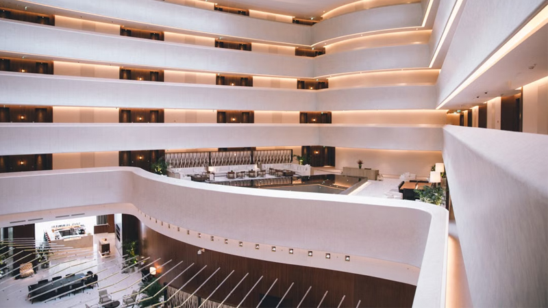
Hotel Website Has Traffic but No Bookings? 5 Key Web Design Strategies to Capture Travelers' Hearts in 10 Seconds
2026/07/17 Struggling with high traffic but no hotel bookings? Discover 5 web design secrets to bridge the 10-second trust gap, beat OTAs, and drive direct reservations. -
Enterprise-Grade Cloud Security Guide: How Hong Kong Companies Can Prevent Data Breach Crises
2026/07/14 Protect your HK business from cloud data breaches. Arachne Group shares essential security tips on compliance, 2FA, encryption & cloud provider choice. -

20-Minute Ultra-Simple Web Development Guide: How to Build Websites and Landing Pages Using Codex
2026/07/10 Learn how to use Codex and AI Agents to build custom, high-converting websites and landing pages in 20 minutes without coding. Guide by Arachne Group.
