


- 首頁
- Blog
- What are the common color principles in UI design? Using color psychology to achieve high conversion rates on websites.
What are the common color principles in UI design? Using color psychology to achieve high conversion rates on websites.
2026 / 05 / 22
Many businesses, when planning website design or app development, often fall into a misconception: "Choosing website colors is purely based on personal preference."
However, behind excellent UI design color principles lies a rigorous science that combines color psychology, visual hierarchy, and user experience (UX). Color not only determines the first impression of a brand but also directly guides users' clicking behavior, thereby influencing website conversion rates.
This article will break down the most practical color principles in UI design—from basic theories and industry-specific strategies to recommended essential tools. You'll not only understand the mechanics behind color but also be able to apply them immediately to your own website design or app development.
In website and app design, color often determines the user's "first impression." Studies show that users form a subconscious judgment about a product in just 90 seconds, and 62% to 90% of that judgment is based solely on color.
For example, when you see a robin's egg blue, do you immediately think of the brand Tiffany?
This shows that a systematic brand color strategy is key to making your website stand out. It not only strengthens brand recognition but also conveys professionalism and trust to customers at first glance.
Secondly, good color guides the user's gaze, helping them quickly identify "important information" and "clickable buttons," thereby improving efficiency. Psychologically, color has a profound impact: green evokes health and safety, while blue represents professionalism and trust.
Additionally, good color contrast improves UI readability, reduces eye strain, and makes users more willing to stay longer.
Next, we'll use two hypothetical website design cases to help you intuitively understand the importance of color in website conversion:
So, when designing a website, how do you choose UI colors without making mistakes? Be sure to follow these five core principles:
Throughout an app or website, system colors must remain highly consistent. The definitions of primary, secondary, and state colors should be the same across all pages. For example, if the "Confirm" button is blue on the homepage, it should also be blue on the checkout page to avoid user confusion.
Contrast is key to determining the quality of interface color schemes. There must be sufficient color difference between text and background, and between important buttons and secondary content. Adequate contrast creates a strong visual hierarchy, letting users instantly see where to click and where the core information lies.
Colors have "weight." Typically, high-saturation, warm colors (e.g., red, yellow, orange) have heavier visual weight and attract attention easily, while low-saturation, cool colors (e.g., blue, gray, green) are relatively lighter. Using color weight, you can perfectly plan the reading order of a page.
The 60-30-10 golden rule is common in both interior design and UI color matching, effectively preventing overuse of colors:
- 60% Dominant Color (Base tone): Usually used for backgrounds, often white, light gray, or dark tones.
- 30% Structural Color (Secondary): Used for sections, text, and navigation bars, establishing the overall visual style of the product.
- 10% Accent Color: Used only for the most core CTA (Call to Action) buttons, important notifications, or the current tab. Used least but attracts the most attention.
A professional, international website must cater to all user groups. This means your color scheme must comply with WCAG (Web Content Accessibility Guidelines) contrast standards. For example, the contrast ratio for normal text should be at least 4.5:1 to ensure users with color vision deficiencies or low vision can read smoothly.
Once you've mastered the principles, let's discuss how to use color theory tools to create color combinations in practice. Here are four common color matching methods:
- Definition: Uses a single hue, adjusting saturation and brightness to create gradients and hierarchy.
- Feature: The visual effect is extremely harmonious and clean, and it's hard to go wrong.
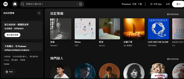
- Example: Spotify — although it uses a black background, it heavily employs different shades of "green" for its core brand color to establish an overall musical, tech-oriented feel.
- Definition: Uses 2–3 colors adjacent to each other on the color wheel (e.g., blue, blue-green, green).
- Feature: The image looks very comfortable and natural, often found in nature, evoking a sense of calm.
- Example: Mastercard — flexibly uses the analogous colors red and orange in its logo and interface, creating a warm, energetic, and continuous visual experience.

- Definition: Uses two colors opposite each other on the color wheel (e.g., blue and orange, red and green).
- Feature: The visual impact is extremely strong, with vivid contrast, perfect for highlighting specific actions or promotional information.
- Example: FedEx — uses the classic complementary pairing of "purple and orange," making the brand stand out prominently among delivery vehicles and feel dynamic.

- Definition: Uses three colors that form an equilateral triangle on the color wheel (e.g., red, yellow, blue).
- Feature: Rich in color yet balanced, suitable for products needing a lively atmosphere.
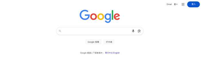
- Example: Google — uses multi-color combinations in its UI icons and some interfaces, conveying a diverse, inclusive, and innovative social/collaborative office vibe.
When designing interface colors, we usually establish a "Color System" to properly assign roles:
- Primary: Represents the brand's essence, frequently appearing on core interface components.
- Secondary: Complements the primary color or differentiates product lines.
- Accent: The golden color for guiding conversions; must clearly contrast with the primary color.
- Background/Neutral: Black, white, gray, dark blue, etc., used for backgrounds and large blocks of text, responsible for the overall texture.
- Semantic Colors: These are conventional meaning-based colors (e.g., success = green, error = red, warning = yellow, info = blue). Do not arbitrarily reverse these, as it will confuse users (e.g., using green to indicate deletion failure would be very perplexing).
Different product types come with completely different psychological expectations from target audiences. Therefore, website color matching must adapt to the context:
- Recommended Colors: Dark blue, navy, dark green, paired with high-quality gray.
- Logic: In color psychology, blue represents steadiness, professionalism, safety, and rationality. When users deal with money or health data, flashy colors increase anxiety, while dark blue builds trust.
- Recommended Colors: Bright red, vibrant orange, vivid yellow, paired with a pure white background.
- Logic: Warm tones accelerate heart rate, triggering urgency and excitement (e.g., "flash sale"). A clean white background makes product images stand out.
- Recommended Colors: Gradients, bright pink, sky blue, neon green.
- Logic: Social platforms need a relaxed, fun, interactive atmosphere. Diverse, high-saturation colors stimulate users' desire to share and express themselves.
- Recommended Colors: Large areas of white and light gray, paired with a distinct tech blue or purple as the primary color.
- Logic: SaaS tools are work interfaces users face for long periods daily. Too flashy colors distract, whereas clean neutrals help users focus on data and workflows.
By now, you should understand that excellent UI color principles are not achieved overnight; they are the product of science, psychology, and aesthetics. A website with a clear color structure, appropriate contrast, and industry relevance not only establishes an international, professional image for your business but also effectively reduces bounce rates, keeping potential customers engaged.
If you're planning to build a company website, e-commerce site, or upgrade an existing app interface but lack a professional UI/UX design team, feel free to contact Arachne Group Limited.
As a leading digital marketing and web development team in Hong Kong, we deeply understand the underlying logic of web design and SEO. Our advantages lie in:
- Balancing Aesthetics and Conversion: We don't just make "good-looking" websites; we strictly follow UI/UX color and layout principles, focusing on boosting your business conversion goals.
- Comprehensive SEO/GEO Strategy: From site architecture and color loading speed to on-page keywords, we ensure your website ranks on Google's first page, driving precise traffic.
- Extensive Experience with Hong Kong Local SMEs: Whether finance, retail, SaaS, or F&B, we tailor digital solutions to best fit your industry.
Want your website to stand out from competitors? Stop letting unprofessional color schemes drive away your potential customers!
Q1: Our company logo is a very bright neon green. Is it suitable to use directly as the main UI color for the website?
A1: Neon green works very well as a "brand color" to leave a strong impression. However, it is not recommended for large areas as the UI "primary color" or "background color," because high-saturation fluorescent colors cause significant visual fatigue when viewed on screens for extended periods.
Q2: What is the WCAG contrast standard, and what practical impact does it have on our SME's website design?
A2: WCAG (Web Content Accessibility Guidelines) is an international web standard. It requires a color contrast ratio of at least 4.5:1 (Level AA) between normal text and its background. For SMEs, following this standard ensures most users can read clearly, directly broadening your audience, increasing time spent on site, and positively helping SEO rankings.
Q3: Dark Mode is very popular now. Are there specific UI color considerations to keep in mind?
A3: When designing Dark Mode, avoid making the background pure black (000000) and text pure white (FFFFFF). This high contrast causes a severe "halation effect," making text look blurry and harsh. It's recommended to use a dark gray background (e.g., 121212) and reduce the saturation of primary colors to avoid visual overload from bright colors against a dark background.
Q4: If I want to commission your team to build a website, do I need to figure out the entire color scheme in advance?
A4: Not at all. Our professional UI/UX designers will create a tailored color system based on color psychology, UI principles, and your website/product requirements. They will also collaborate with our marketing team to ensure the website perfectly meets digital marketing and conversion needs.
However, behind excellent UI design color principles lies a rigorous science that combines color psychology, visual hierarchy, and user experience (UX). Color not only determines the first impression of a brand but also directly guides users' clicking behavior, thereby influencing website conversion rates.
This article will break down the most practical color principles in UI design—from basic theories and industry-specific strategies to recommended essential tools. You'll not only understand the mechanics behind color but also be able to apply them immediately to your own website design or app development.
Why is UI color so important? How does it affect your business conversions?
In website and app design, color often determines the user's "first impression." Studies show that users form a subconscious judgment about a product in just 90 seconds, and 62% to 90% of that judgment is based solely on color.
For example, when you see a robin's egg blue, do you immediately think of the brand Tiffany?
This shows that a systematic brand color strategy is key to making your website stand out. It not only strengthens brand recognition but also conveys professionalism and trust to customers at first glance.
Secondly, good color guides the user's gaze, helping them quickly identify "important information" and "clickable buttons," thereby improving efficiency. Psychologically, color has a profound impact: green evokes health and safety, while blue represents professionalism and trust.
Additionally, good color contrast improves UI readability, reduces eye strain, and makes users more willing to stay longer.
Next, we'll use two hypothetical website design cases to help you intuitively understand the importance of color in website conversion:
| |
Case A (Lacks Planning) |
Case B (Follows UI Color Principles) |
| Color Usage |
Uses 7–8 high-saturation colors simultaneously, such as pure red, green, and bright blue. |
Strictly limited to 3–4 colors, using white and light gray as the base. |
| Visual Hierarchy |
Buttons (CTAs) use colors similar to the background, making them blend in completely. |
Eye-catching contrasting colors (e.g., vibrant orange) are used only on the "Buy Now" button. |
| Readability |
White text on a light gray background causes eye strain over time. |
Dark gray text on a pure white background offers high contrast and is clear and easy to read. |
| User Response |
Visual fatigue, inability to find key elements, users bounce in less than 5 seconds. |
Smooth reading experience, eyes naturally guided to the button, resulting in a 35% increase in conversion. |
Core Color Principles in UI Design: Five Foundations for High-Quality Interfaces
So, when designing a website, how do you choose UI colors without making mistakes? Be sure to follow these five core principles:
Consistency
Throughout an app or website, system colors must remain highly consistent. The definitions of primary, secondary, and state colors should be the same across all pages. For example, if the "Confirm" button is blue on the homepage, it should also be blue on the checkout page to avoid user confusion.
Contrast
Contrast is key to determining the quality of interface color schemes. There must be sufficient color difference between text and background, and between important buttons and secondary content. Adequate contrast creates a strong visual hierarchy, letting users instantly see where to click and where the core information lies.
Visual Hierarchy
Colors have "weight." Typically, high-saturation, warm colors (e.g., red, yellow, orange) have heavier visual weight and attract attention easily, while low-saturation, cool colors (e.g., blue, gray, green) are relatively lighter. Using color weight, you can perfectly plan the reading order of a page.
Simplicity
The 60-30-10 golden rule is common in both interior design and UI color matching, effectively preventing overuse of colors:
- 60% Dominant Color (Base tone): Usually used for backgrounds, often white, light gray, or dark tones.
- 30% Structural Color (Secondary): Used for sections, text, and navigation bars, establishing the overall visual style of the product.
- 10% Accent Color: Used only for the most core CTA (Call to Action) buttons, important notifications, or the current tab. Used least but attracts the most attention.
Accessibility
A professional, international website must cater to all user groups. This means your color scheme must comply with WCAG (Web Content Accessibility Guidelines) contrast standards. For example, the contrast ratio for normal text should be at least 4.5:1 to ensure users with color vision deficiencies or low vision can read smoothly.
From Theory to Practice: Four Common Color Matching Methods
Once you've mastered the principles, let's discuss how to use color theory tools to create color combinations in practice. Here are four common color matching methods:
Monochromatic
- Definition: Uses a single hue, adjusting saturation and brightness to create gradients and hierarchy.
- Feature: The visual effect is extremely harmonious and clean, and it's hard to go wrong.
- Example: Spotify — although it uses a black background, it heavily employs different shades of "green" for its core brand color to establish an overall musical, tech-oriented feel.
Analogous
- Definition: Uses 2–3 colors adjacent to each other on the color wheel (e.g., blue, blue-green, green).
- Feature: The image looks very comfortable and natural, often found in nature, evoking a sense of calm.
- Example: Mastercard — flexibly uses the analogous colors red and orange in its logo and interface, creating a warm, energetic, and continuous visual experience.
Complementary
- Definition: Uses two colors opposite each other on the color wheel (e.g., blue and orange, red and green).
- Feature: The visual impact is extremely strong, with vivid contrast, perfect for highlighting specific actions or promotional information.
- Example: FedEx — uses the classic complementary pairing of "purple and orange," making the brand stand out prominently among delivery vehicles and feel dynamic.
Triadic
- Definition: Uses three colors that form an equilateral triangle on the color wheel (e.g., red, yellow, blue).
- Feature: Rich in color yet balanced, suitable for products needing a lively atmosphere.
- Example: Google — uses multi-color combinations in its UI icons and some interfaces, conveying a diverse, inclusive, and innovative social/collaborative office vibe.
Defining Color Roles in UI Design: Let Each Color Fulfill Its Duty
When designing interface colors, we usually establish a "Color System" to properly assign roles:
- Primary: Represents the brand's essence, frequently appearing on core interface components.
- Secondary: Complements the primary color or differentiates product lines.
- Accent: The golden color for guiding conversions; must clearly contrast with the primary color.
- Background/Neutral: Black, white, gray, dark blue, etc., used for backgrounds and large blocks of text, responsible for the overall texture.
- Semantic Colors: These are conventional meaning-based colors (e.g., success = green, error = red, warning = yellow, info = blue). Do not arbitrarily reverse these, as it will confuse users (e.g., using green to indicate deletion failure would be very perplexing).
Industry-Specific Color Strategies: What Should Finance, E-commerce, Social Media, and SaaS Choose?
Different product types come with completely different psychological expectations from target audiences. Therefore, website color matching must adapt to the context:
Finance & Healthcare Products: Focus on "Stability and Trust"
- Recommended Colors: Dark blue, navy, dark green, paired with high-quality gray.
- Logic: In color psychology, blue represents steadiness, professionalism, safety, and rationality. When users deal with money or health data, flashy colors increase anxiety, while dark blue builds trust.
E-commerce & Retail Platforms: Focus on "Stimulating Purchase and Excitement"
- Recommended Colors: Bright red, vibrant orange, vivid yellow, paired with a pure white background.
- Logic: Warm tones accelerate heart rate, triggering urgency and excitement (e.g., "flash sale"). A clean white background makes product images stand out.
Social & Entertainment Products: Focus on "Lively, Colorful, and Youthful"
- Recommended Colors: Gradients, bright pink, sky blue, neon green.
- Logic: Social platforms need a relaxed, fun, interactive atmosphere. Diverse, high-saturation colors stimulate users' desire to share and express themselves.
SaaS Software & Business Tools: Focus on "Clean, Efficient, and Neutral"
- Recommended Colors: Large areas of white and light gray, paired with a distinct tech blue or purple as the primary color.
- Logic: SaaS tools are work interfaces users face for long periods daily. Too flashy colors distract, whereas clean neutrals help users focus on data and workflows.
Conclusion: Unlock Business Value with Scientific Color and Build Your Brand's Unique Website!
By now, you should understand that excellent UI color principles are not achieved overnight; they are the product of science, psychology, and aesthetics. A website with a clear color structure, appropriate contrast, and industry relevance not only establishes an international, professional image for your business but also effectively reduces bounce rates, keeping potential customers engaged.
If you're planning to build a company website, e-commerce site, or upgrade an existing app interface but lack a professional UI/UX design team, feel free to contact Arachne Group Limited.
As a leading digital marketing and web development team in Hong Kong, we deeply understand the underlying logic of web design and SEO. Our advantages lie in:
- Balancing Aesthetics and Conversion: We don't just make "good-looking" websites; we strictly follow UI/UX color and layout principles, focusing on boosting your business conversion goals.
- Comprehensive SEO/GEO Strategy: From site architecture and color loading speed to on-page keywords, we ensure your website ranks on Google's first page, driving precise traffic.
- Extensive Experience with Hong Kong Local SMEs: Whether finance, retail, SaaS, or F&B, we tailor digital solutions to best fit your industry.
Want your website to stand out from competitors? Stop letting unprofessional color schemes drive away your potential customers!
FAQ (Frequently Asked Questions) about UI Color Principles
Q1: Our company logo is a very bright neon green. Is it suitable to use directly as the main UI color for the website?
A1: Neon green works very well as a "brand color" to leave a strong impression. However, it is not recommended for large areas as the UI "primary color" or "background color," because high-saturation fluorescent colors cause significant visual fatigue when viewed on screens for extended periods.
Q2: What is the WCAG contrast standard, and what practical impact does it have on our SME's website design?
A2: WCAG (Web Content Accessibility Guidelines) is an international web standard. It requires a color contrast ratio of at least 4.5:1 (Level AA) between normal text and its background. For SMEs, following this standard ensures most users can read clearly, directly broadening your audience, increasing time spent on site, and positively helping SEO rankings.
Q3: Dark Mode is very popular now. Are there specific UI color considerations to keep in mind?
A3: When designing Dark Mode, avoid making the background pure black (000000) and text pure white (FFFFFF). This high contrast causes a severe "halation effect," making text look blurry and harsh. It's recommended to use a dark gray background (e.g., 121212) and reduce the saturation of primary colors to avoid visual overload from bright colors against a dark background.
Q4: If I want to commission your team to build a website, do I need to figure out the entire color scheme in advance?
A4: Not at all. Our professional UI/UX designers will create a tailored color system based on color psychology, UI principles, and your website/product requirements. They will also collaborate with our marketing team to ensure the website perfectly meets digital marketing and conversion needs.
MORE BLOG
-

Hong Kong App UI/UX Design & Interface Optimization Guide: From Problem Diagnosis to Redesign Implementation
2026/09/02 Hong Kong App UI/UX optimization guide: diagnose UI, UX & performance issues, decide on partial fixes or full redesign, localize for HK, and choose the right design partner. -

Spending Heavily on an APP Only for Users to Uninstall Instantly? APP Loading Design & UI/UX Optimization Strategies Hong Kong Businesses Must Prioritize
2026/09/01 Learn why poor APP loading design causes instant uninstalls. Discover 4 loading states, 5 UI/UX principles & metrics tailored for Hong Kong’s weak-network environments. -

Hong Kong Senior-Friendly Landing Page Design Guide: How to Help Seniors and Their Children Understand, Trust and Leave Contact Details More Easily?
2026/08/26 Learn how to design age-friendly landing pages in Hong Kong that help seniors and adult children understand, trust and leave contact details. 5 key UX principles.

