


Design an Attractive and On-Brand Website: Try the 60:30:10 Color Rule
2021 / 07 / 19
When it comes to standout elements in website visual design, the "color scheme" undoubtedly holds a significant place. It not only imparts unique visual appeal to a website but also acts as a powerful, silent communicator of brand identity. However, faced with complex and intricate color theory principles, how can one precisely find the most suitable color palette for their website?
To design a website that is both aesthetically pleasing and aligned with your brand image, try applying the 60:30:10 rule.
What is the 60:30:10 Rule? The Golden Ratio for Website Color Design
The 60:30:10 rule is a widely used golden ratio principle, primarily applied for color pairing to ensure visual balance and hierarchy. It suggests that color distribution in web design should adhere to a 60:30:10 proportion, namely:
Dominant Color (60% of the visual space): Typically used for backgrounds. Given its extensive coverage, neutral colors are recommended, avoiding overly bright or vivid hues.
Secondary Color (30% of the visual space): Primarily serves to complement the dominant color, support it, and create harmony. Often derived from the brand's color palette, it's commonly used for important elements like headings.
Accent Color (10% of the visual space): Used to capture visitor attention and guide them towards conversion actions via CTA elements (such as buttons, slogans, etc.). Therefore, this color should strongly contrast with both the dominant and secondary colors.
● Website Design
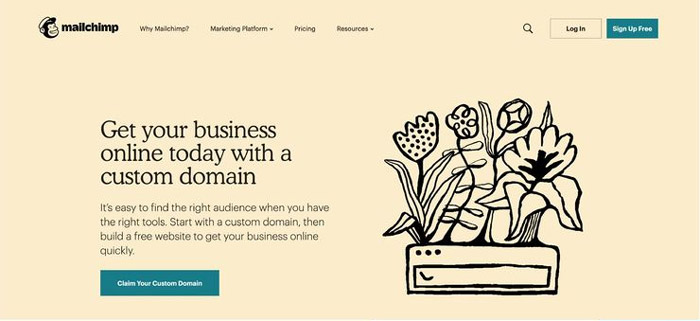
Take the renowned website MailChimp as an example. It skillfully uses light yellow as the dominant color, black as the secondary color, while buttons and similar elements employ a teal blue that strongly contrasts with the yellow. This color scheme creates a page that is both harmonious and distinctly layered, ensuring clear information delivery.
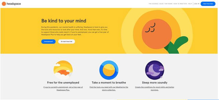
Another example is the online healthcare company Headspace, which uses light gray as the background, yellow as the secondary color, and blue as the accent color, creating a strong visual impact. Simultaneously, the large website banner, while using a different shade of orange, is actually a clever extension of the yellow hue. This not only preserves the interface's overall coherence but also maintains high consistency in the brand's design style.
● APP Design

In the realm of APP design, the 60:30:10 rule similarly demonstrates strong practicality. The Starbucks APP features an overall design that is simple yet stylish: white serves as the background color, gray as the secondary color, and for key call-to-action elements like "Join Starbucks Rewards," a striking green (the brand color) is used. This effectively highlights crucial information while reinforcing brand identity.
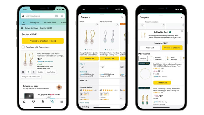
The design of the US shopping platform Amazon APP employs a clean white as the dominant background color, teal as the secondary color, and an orange-yellow that contrasts strongly with the teal as the accent color. The banner design draws inspiration from Headspace's concept, using colors derived from the orange-yellow and teal, making the entire visual composition coordinated and natural.
● Interior Design
The 60:30:10 rule is also highly favored in interior design. The dominant color (60%) is typically applied to large areas like walls, large furniture, carpets, and sofas. The secondary color (30%) is used for items such as curtains, bookshelves, and smaller furniture. The accent color (10%) is reserved for details like artwork, decorative accents, and small cushions.
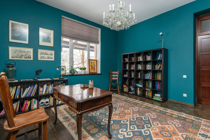
For instance, a space might use blue as the dominant color on the walls, brown for the floor and side tables, with gray used for accent pieces like paintings and curtains. This effectively balances the impact of the dominant color and reduces visual fatigue.
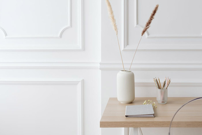
Another example is a space designed primarily with white walls, complemented by a beige desk and plants as accents, creating a simple and comfortable living environment.
Many designers, in the early stages of website design, can fall into the trap of "adding color too soon," leading to a loss of focus and wasted time on color selection. A recommended approach is to initially design the website using simple black, white, and gray. Once the overall structure and visual effect are established, colors can be gradually added. This method helps achieve a more harmonious and unified color scheme, allowing designers to focus more on layout and content presentation.
Limit Colors to Three: Simplicity is Key
Using too many colors can make a website look cluttered and prevent key information from standing out. Similar to a female lead in a Taiwanese idol drama being humorously called a "Christmas tree" by the male lead for wearing too many colors, website design should also adhere to the principle of simplicity. Generally, a web design should not use more than three colors. If more than three colors are necessary, it's advisable to differentiate by adjusting the shades and tints within the color palette, preventing the interface from appearing unfocused and confusing users.
Skillfully Use Color Schemes to Create Unique Styles
Common color matching techniques mainly include complementary, analogous, triadic, split-complementary, and tetradic (rectangular) schemes. Each technique can bring different visual effects to website design.
Complementary Color Scheme: Refers to two colors directly opposite each other on the color wheel (180°), such as red and green, yellow and blue, or orange and purple. This pairing creates strong contrast and, when used effectively, can produce a vibrant and lively atmosphere.
Analogous Color Scheme: Involves colors adjacent to each other on the color wheel. These combinations are very harmonious and can create a tranquil and comfortable feel.
Triadic Color Scheme: Uses three colors evenly spaced around the color wheel (120° apart), like red, blue, and yellow. This approach can make a visual composition rich and varied, especially when using less saturated hues.
Split-Complementary Scheme: An extension of the complementary scheme, it uses a base color plus the two colors adjacent to its complement. The effect is similar to complementary colors but softer, making it suitable for beginners.
Tetradic (Rectangular) Color Scheme: Comprises two pairs of complementary colors, offering rich variety. When using this scheme, care must be taken to choose one color as the dominant hue and balance cool and warm tones.
Balance Visual Weight to Guide User Focus
Visual weight is the inherent property of an element that attracts attention. Generally, the larger the object, the more negative space (whitespace) around it, and the higher its color contrast, the greater its visual weight. During web design, designers should strategically apply these three aspects to elements they wish to emphasize, creating the desired visual weight to guide the user's eye flow towards key information and enhance the user experience.
In summary, color schemes in website design are a profound and captivating art form. As a professional Hong Kong web design company, the team at Arachne Group Limited is not only proficient in various color matching techniques but also excels at tailoring unique color schemes based on different brands' personalities and target audiences. Whether for a trendy tech brand or an elegant lifestyle service brand, we can accurately harness the language of color to create highly distinctive and attractive website identities.
If you are seeking professional website design color services, please feel free to contact us. Let's collaborate to create an exceptional future for your website design!
Contact Us
Phone: 852-3749 9734
Email: [email protected]
Website: https://hkweb.com.hk
To design a website that is both aesthetically pleasing and aligned with your brand image, try applying the 60:30:10 rule.
What is the 60:30:10 Rule? The Golden Ratio for Website Color Design
The 60:30:10 rule is a widely used golden ratio principle, primarily applied for color pairing to ensure visual balance and hierarchy. It suggests that color distribution in web design should adhere to a 60:30:10 proportion, namely:
Dominant Color (60% of the visual space): Typically used for backgrounds. Given its extensive coverage, neutral colors are recommended, avoiding overly bright or vivid hues.
Secondary Color (30% of the visual space): Primarily serves to complement the dominant color, support it, and create harmony. Often derived from the brand's color palette, it's commonly used for important elements like headings.
Accent Color (10% of the visual space): Used to capture visitor attention and guide them towards conversion actions via CTA elements (such as buttons, slogans, etc.). Therefore, this color should strongly contrast with both the dominant and secondary colors.
Where is the 60:30:10 Rule Applicable? Widespread Use Across Multiple Design Fields
The application of the 60:30:10 rule is extensive. Beyond website design, it can be found in interior design, APP design, fashion coordination, and graphic design.● Website Design
Take the renowned website MailChimp as an example. It skillfully uses light yellow as the dominant color, black as the secondary color, while buttons and similar elements employ a teal blue that strongly contrasts with the yellow. This color scheme creates a page that is both harmonious and distinctly layered, ensuring clear information delivery.
Another example is the online healthcare company Headspace, which uses light gray as the background, yellow as the secondary color, and blue as the accent color, creating a strong visual impact. Simultaneously, the large website banner, while using a different shade of orange, is actually a clever extension of the yellow hue. This not only preserves the interface's overall coherence but also maintains high consistency in the brand's design style.
● APP Design
In the realm of APP design, the 60:30:10 rule similarly demonstrates strong practicality. The Starbucks APP features an overall design that is simple yet stylish: white serves as the background color, gray as the secondary color, and for key call-to-action elements like "Join Starbucks Rewards," a striking green (the brand color) is used. This effectively highlights crucial information while reinforcing brand identity.
The design of the US shopping platform Amazon APP employs a clean white as the dominant background color, teal as the secondary color, and an orange-yellow that contrasts strongly with the teal as the accent color. The banner design draws inspiration from Headspace's concept, using colors derived from the orange-yellow and teal, making the entire visual composition coordinated and natural.
● Interior Design
The 60:30:10 rule is also highly favored in interior design. The dominant color (60%) is typically applied to large areas like walls, large furniture, carpets, and sofas. The secondary color (30%) is used for items such as curtains, bookshelves, and smaller furniture. The accent color (10%) is reserved for details like artwork, decorative accents, and small cushions.
For instance, a space might use blue as the dominant color on the walls, brown for the floor and side tables, with gray used for accent pieces like paintings and curtains. This effectively balances the impact of the dominant color and reduces visual fatigue.
Another example is a space designed primarily with white walls, complemented by a beige desk and plants as accents, creating a simple and comfortable living environment.
Beyond the 60:30:10 Rule: What Other Color Matching Techniques Can Be Applied in Website Design?
Start with Black, White, and Gray for Greater HarmonyMany designers, in the early stages of website design, can fall into the trap of "adding color too soon," leading to a loss of focus and wasted time on color selection. A recommended approach is to initially design the website using simple black, white, and gray. Once the overall structure and visual effect are established, colors can be gradually added. This method helps achieve a more harmonious and unified color scheme, allowing designers to focus more on layout and content presentation.
Limit Colors to Three: Simplicity is Key
Using too many colors can make a website look cluttered and prevent key information from standing out. Similar to a female lead in a Taiwanese idol drama being humorously called a "Christmas tree" by the male lead for wearing too many colors, website design should also adhere to the principle of simplicity. Generally, a web design should not use more than three colors. If more than three colors are necessary, it's advisable to differentiate by adjusting the shades and tints within the color palette, preventing the interface from appearing unfocused and confusing users.
Skillfully Use Color Schemes to Create Unique Styles
Common color matching techniques mainly include complementary, analogous, triadic, split-complementary, and tetradic (rectangular) schemes. Each technique can bring different visual effects to website design.
Complementary Color Scheme: Refers to two colors directly opposite each other on the color wheel (180°), such as red and green, yellow and blue, or orange and purple. This pairing creates strong contrast and, when used effectively, can produce a vibrant and lively atmosphere.
Analogous Color Scheme: Involves colors adjacent to each other on the color wheel. These combinations are very harmonious and can create a tranquil and comfortable feel.
Triadic Color Scheme: Uses three colors evenly spaced around the color wheel (120° apart), like red, blue, and yellow. This approach can make a visual composition rich and varied, especially when using less saturated hues.
Split-Complementary Scheme: An extension of the complementary scheme, it uses a base color plus the two colors adjacent to its complement. The effect is similar to complementary colors but softer, making it suitable for beginners.
Tetradic (Rectangular) Color Scheme: Comprises two pairs of complementary colors, offering rich variety. When using this scheme, care must be taken to choose one color as the dominant hue and balance cool and warm tones.
Balance Visual Weight to Guide User Focus
Visual weight is the inherent property of an element that attracts attention. Generally, the larger the object, the more negative space (whitespace) around it, and the higher its color contrast, the greater its visual weight. During web design, designers should strategically apply these three aspects to elements they wish to emphasize, creating the desired visual weight to guide the user's eye flow towards key information and enhance the user experience.
In summary, color schemes in website design are a profound and captivating art form. As a professional Hong Kong web design company, the team at Arachne Group Limited is not only proficient in various color matching techniques but also excels at tailoring unique color schemes based on different brands' personalities and target audiences. Whether for a trendy tech brand or an elegant lifestyle service brand, we can accurately harness the language of color to create highly distinctive and attractive website identities.
If you are seeking professional website design color services, please feel free to contact us. Let's collaborate to create an exceptional future for your website design!
Contact Us
Phone: 852-3749 9734
Email: [email protected]
Website: https://hkweb.com.hk
MORE BLOG
-
How much does complex app development cost? A Hong Kong web design company teaches you how to accurately avoid pricing traps.
2026/06/03 Discover the cost of complex app development in HK. Avoid budget traps, learn breakdown costs, and find the right agency for TVP or startup projects. -
Why Is Your Website Showing SSL Communication Failure? A Website Security & SEO Rescue Guide for Hong Kong Business Owners
2026/05/27 Discover why SSL errors harm Hong Kong SMEs and eCommerce sites. Learn causes, fixes, and SEO impacts to restore trust, protect conversions, and secure your website for lasting business growth. -

What are the common color principles in UI design? Using color psychology to achieve high conversion rates on websites.
2026/05/22 Learn UI design color principles using psychology & contrast. Boost web conversions with proven strategies for finance, e-commerce, SaaS & more.
