


- 首頁
- Blog
- [Making UI Information Expression More Intuitive] Four Essential Website Design Principles for Card Design
[Making UI Information Expression More Intuitive] Four Essential Website Design Principles for Card Design
2022 / 12 / 26
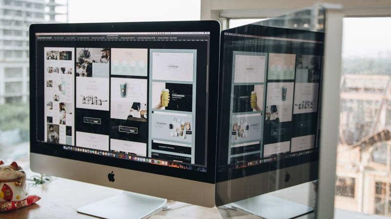
From Google's Material Design to major social platforms, card-based design has not only gained significant traction in the website design field due to its unique flexibility and intuitiveness but has also redefined how users interact with online content. So, what is Card Design? Which website design principles can be applied to create intuitive and eye-catching UI cards that are both aesthetically pleasing and functional?
![[Making UI Information Expression More Intuitive] Four Essential Website Design Principles for Card Design](/uploads/Blog/card-split-design-1.jpg)
Long before the internet became ubiquitous, cards were already deeply embedded in our daily lives. From business cards and membership cards to product labels, these physical cards carried specific information, conveying core content in a compact format. This "one card, one piece of information" design logic was naturally carried over into the digital realm, becoming a cornerstone of modern web design.
In website design, a card is a container that holds multimedia elements like images, text, and buttons. It groups related information together, forming visually independent units. This design not only makes information presentation more intuitive but also significantly enhances user operability.
The rise of card design as one of today's most popular website design trends is no accident. It successfully merges aesthetics with functionality, creating limitless possibilities within a confined space. Next, let's delve into the unique advantages of card design and understand why it has taken the digital world by storm.
![[Making UI Information Expression More Intuitive] Four Essential Website Design Principles for Card Design](/uploads/Blog/card-split-design-2.jpg)
The Art of Information Layering and Integration
Compared to traditional borderless designs or separator-based layouts, card design more effectively categorizes and integrates related content, establishing a clear hierarchical structure. This design approach simplifies complex content and strengthens the user's perception of content relationships.
Professional card design makes full use of white space and subtle shadow effects to enhance visual hierarchy. Appropriate white space not only guides the user's eye but also allows content to 'breathe,' creating a more comfortable reading experience. Well-designed shadows simulate real-world stacking relationships, making digital interfaces more intuitive and understandable.
The Perfect Partner for Grid-Based Layouts
Card design and grid systems are a match made in heaven. When UI elements like text and images are integrated into individual card containers, they naturally form a modular layout foundation. This modularity allows content to be easily expanded and contracted, ensuring consistency across different platforms and devices.
Responsive design is essential in modern web development, and card design is the ideal choice for achieving responsive layouts. Whether users browse on desktops, tablets, or mobile phones, cards can automatically adjust their size and arrangement, providing an optimal viewing experience.
Optimizing Space Utilization
Traditional list designs often only support vertical scrolling, limiting the dimensions for content display. Card design breaks this constraint, allowing content to extend and overlap in the X, Y, and Z axes, greatly enhancing space utilization.
Within a vertical content feed, users can swipe horizontally to reveal more related content, while layered card effects create a sense of depth, encouraging users to explore further. This multi-dimensional content presentation allows more information to be housed within limited screen space while maintaining a clean and organized interface.
Enhancing Interface Operability and User Engagement
As independent design modules, cards can incorporate various interactive methods, providing users with a more natural and intuitive operational experience. From clicks and swipes to hover effects, cards offer immediate feedback to user actions, enriching the interface's visual dynamics while boosting the user's sense of engagement and control.
Carefully crafted interactive effects not only add to the enjoyment of use but also guide users to discover more features, reducing the learning curve and making web products more usable and engaging.
![[Making UI Information Expression More Intuitive] Four Essential Website Design Principles for Card Design](/uploads/Blog/how-to-design-a-good-card-design-1.jpg)
Having understood the advantages of card design, let's explore how to apply core website design principles to create card designs that are both beautiful and practical.
Principle 1: Carefully Set Margins to Create Visual Breathing Space
The ultimate purpose of card design is to hold content, making margin settings crucial. Appropriate margins create a sense of 'breathing room' in the interface, enhancing content readability and visual comfort.
When card content is dense, use narrower margins, allowing the card sufficient space to display all content while maintaining a compact layout. When card content is sparse, consider using wider margins to create an open, spacious feel, preventing the content from appearing sparse or empty.
Margin settings should be consistent and regular. It's generally recommended to use a base unit (e.g., 4px, 8px) for spacing to establish a unified visual rhythm. This consistency not only enhances the design's professionalism but also makes users feel comfortable and familiar while browsing.
Principle 2: Base Designs on a Grid System to Establish Standards
The grid system is the backbone of website design, solving fundamental layout issues and enhancing design standardization and consistency. Applying a grid system to card design makes layouts more orderly and aesthetically pleasing.
Using a grid system not only helps designers arrange elements more methodically but also enables developers to implement the design more efficiently. Typically, a 12-column grid system is the most common choice, offering sufficient flexibility for various layout needs.
In card design, the grid system should be applied to both the spacing between cards and the arrangement of elements within cards. This consistent application, both internal and external, creates a harmonious and unified visual effect, making the interface easier for users to understand and navigate.
Principle 3: Strategically Set Card Titles to Reinforce Information Hierarchy
Titles are indispensable elements in card design, quickly communicating the core theme of the card's content. However, should the title be placed inside or outside the card? How should the font size be set? These questions often puzzle designers.
Generally, when the card content is an independent module or the module contains only one main heading, it's advisable to place the title inside the card, making it look like a complete whole. Conversely, if the card content is presented as part of a series or has continuity, placing the title outside the cards as an overarching master title is recommended.
Regarding font size, when card content is minimal, a reasonable layout can make even a smaller font size function effectively as a title. However, when card content is extensive, the font size difference between the title and the body text should be increased appropriately to establish a clear visual hierarchy, helping users quickly scan and understand the content structure.
Principle 4: Fine-tune Card Corners to Convey Brand Personality
Corner radius might seem like a minor detail, but it significantly impacts the card's overall style and emotional appeal. Different radii convey different visual languages: large radii often express softness and approachability; small radii appear more rigorous and professional; while square corners convey a modern, minimalist feel.
In practice, avoid blindly following trends. Instead, set the corner radius based on the product's style and actual usage scenarios. For example, educational apps for children might suit larger radii, conveying friendliness and safety, while financial apps might be better suited to small radii or square corners, emphasizing professionalism and reliability.
Corner radius settings should also consider consistency within the overall design system. It's generally recommended to maintain a uniform corner specification throughout the product or use a limited set of radius sizes in specific cases to create a rhythmic visual system.
![[Making UI Information Expression More Intuitive] Four Essential Website Design Principles for Card Design](/uploads/Blog/card-split-design-3.jpg)
After mastering the fundamental design principles, let's explore advanced techniques to make your card designs stand out.
Micro-interactions: Bringing Cards to Life
Micro-interactions are key to enhancing user experience in modern website design. In card design, appropriate micro-interactions can guide user attention, provide operational feedback, and increase engagement.
For example, when a user hovers over a card, adding a subtle shadow change or lift effect can simulate a real object's response. When a user clicks a card, adding a ripple animation or color change confirms the action has been received. These subtle dynamic effects make the interface more lively and create a memorable user experience.
Accessible Design: Ensuring Usability for All
Accessible design is an indispensable part of professional website design. In card design, ensure sufficient color contrast so users with visual impairments can read content clearly. Also, provide adequate tap target sizes for interactive elements to assist users with motor disabilities.
For users relying on screen readers, ensure the card's semantic structure is correct and heading levels are clear, allowing all users to understand and navigate the content. Accessible design is not only a moral responsibility but also a legal requirement in many regions and should be given due importance.
The rapid adoption and enduring popularity of card design are largely due to its unparalleled flexibility and adaptability. As a professional web design company in Hong Kong, Arachne Group Limited deeply understands the art and science of card design. Our design team is not only proficient in various website design principles but also excels at integrating these principles with our clients' brand identity and business objectives to create website experiences that are both beautiful and high-performing. We believe that excellent website design is not just a visual treat but a powerful tool for business growth.
Contact Us:
Phone: 852-3749 9734
Email: [email protected]
Website: https://hkweb.com.hk
What is Card Design? The Evolution from Physical to Digital
Long before the internet became ubiquitous, cards were already deeply embedded in our daily lives. From business cards and membership cards to product labels, these physical cards carried specific information, conveying core content in a compact format. This "one card, one piece of information" design logic was naturally carried over into the digital realm, becoming a cornerstone of modern web design.
In website design, a card is a container that holds multimedia elements like images, text, and buttons. It groups related information together, forming visually independent units. This design not only makes information presentation more intuitive but also significantly enhances user operability.
The rise of card design as one of today's most popular website design trends is no accident. It successfully merges aesthetics with functionality, creating limitless possibilities within a confined space. Next, let's delve into the unique advantages of card design and understand why it has taken the digital world by storm.
Why Are Cards Almost Everywhere? The Four Core Advantages of Card-Based Design
The Art of Information Layering and Integration
Compared to traditional borderless designs or separator-based layouts, card design more effectively categorizes and integrates related content, establishing a clear hierarchical structure. This design approach simplifies complex content and strengthens the user's perception of content relationships.
Professional card design makes full use of white space and subtle shadow effects to enhance visual hierarchy. Appropriate white space not only guides the user's eye but also allows content to 'breathe,' creating a more comfortable reading experience. Well-designed shadows simulate real-world stacking relationships, making digital interfaces more intuitive and understandable.
The Perfect Partner for Grid-Based Layouts
Card design and grid systems are a match made in heaven. When UI elements like text and images are integrated into individual card containers, they naturally form a modular layout foundation. This modularity allows content to be easily expanded and contracted, ensuring consistency across different platforms and devices.
Responsive design is essential in modern web development, and card design is the ideal choice for achieving responsive layouts. Whether users browse on desktops, tablets, or mobile phones, cards can automatically adjust their size and arrangement, providing an optimal viewing experience.
Optimizing Space Utilization
Traditional list designs often only support vertical scrolling, limiting the dimensions for content display. Card design breaks this constraint, allowing content to extend and overlap in the X, Y, and Z axes, greatly enhancing space utilization.
Within a vertical content feed, users can swipe horizontally to reveal more related content, while layered card effects create a sense of depth, encouraging users to explore further. This multi-dimensional content presentation allows more information to be housed within limited screen space while maintaining a clean and organized interface.
Enhancing Interface Operability and User Engagement
As independent design modules, cards can incorporate various interactive methods, providing users with a more natural and intuitive operational experience. From clicks and swipes to hover effects, cards offer immediate feedback to user actions, enriching the interface's visual dynamics while boosting the user's sense of engagement and control.
Carefully crafted interactive effects not only add to the enjoyment of use but also guide users to discover more features, reducing the learning curve and making web products more usable and engaging.
Four Essential Website Design Principles for Card Design
Having understood the advantages of card design, let's explore how to apply core website design principles to create card designs that are both beautiful and practical.
Principle 1: Carefully Set Margins to Create Visual Breathing Space
The ultimate purpose of card design is to hold content, making margin settings crucial. Appropriate margins create a sense of 'breathing room' in the interface, enhancing content readability and visual comfort.
When card content is dense, use narrower margins, allowing the card sufficient space to display all content while maintaining a compact layout. When card content is sparse, consider using wider margins to create an open, spacious feel, preventing the content from appearing sparse or empty.
Margin settings should be consistent and regular. It's generally recommended to use a base unit (e.g., 4px, 8px) for spacing to establish a unified visual rhythm. This consistency not only enhances the design's professionalism but also makes users feel comfortable and familiar while browsing.
Principle 2: Base Designs on a Grid System to Establish Standards
The grid system is the backbone of website design, solving fundamental layout issues and enhancing design standardization and consistency. Applying a grid system to card design makes layouts more orderly and aesthetically pleasing.
Using a grid system not only helps designers arrange elements more methodically but also enables developers to implement the design more efficiently. Typically, a 12-column grid system is the most common choice, offering sufficient flexibility for various layout needs.
In card design, the grid system should be applied to both the spacing between cards and the arrangement of elements within cards. This consistent application, both internal and external, creates a harmonious and unified visual effect, making the interface easier for users to understand and navigate.
Principle 3: Strategically Set Card Titles to Reinforce Information Hierarchy
Titles are indispensable elements in card design, quickly communicating the core theme of the card's content. However, should the title be placed inside or outside the card? How should the font size be set? These questions often puzzle designers.
Generally, when the card content is an independent module or the module contains only one main heading, it's advisable to place the title inside the card, making it look like a complete whole. Conversely, if the card content is presented as part of a series or has continuity, placing the title outside the cards as an overarching master title is recommended.
Regarding font size, when card content is minimal, a reasonable layout can make even a smaller font size function effectively as a title. However, when card content is extensive, the font size difference between the title and the body text should be increased appropriately to establish a clear visual hierarchy, helping users quickly scan and understand the content structure.
Principle 4: Fine-tune Card Corners to Convey Brand Personality
Corner radius might seem like a minor detail, but it significantly impacts the card's overall style and emotional appeal. Different radii convey different visual languages: large radii often express softness and approachability; small radii appear more rigorous and professional; while square corners convey a modern, minimalist feel.
In practice, avoid blindly following trends. Instead, set the corner radius based on the product's style and actual usage scenarios. For example, educational apps for children might suit larger radii, conveying friendliness and safety, while financial apps might be better suited to small radii or square corners, emphasizing professionalism and reliability.
Corner radius settings should also consider consistency within the overall design system. It's generally recommended to maintain a uniform corner specification throughout the product or use a limited set of radius sizes in specific cases to create a rhythmic visual system.
Beyond the Basics: Advanced Card Design Techniques
After mastering the fundamental design principles, let's explore advanced techniques to make your card designs stand out.
Micro-interactions: Bringing Cards to Life
Micro-interactions are key to enhancing user experience in modern website design. In card design, appropriate micro-interactions can guide user attention, provide operational feedback, and increase engagement.
For example, when a user hovers over a card, adding a subtle shadow change or lift effect can simulate a real object's response. When a user clicks a card, adding a ripple animation or color change confirms the action has been received. These subtle dynamic effects make the interface more lively and create a memorable user experience.
Accessible Design: Ensuring Usability for All
Accessible design is an indispensable part of professional website design. In card design, ensure sufficient color contrast so users with visual impairments can read content clearly. Also, provide adequate tap target sizes for interactive elements to assist users with motor disabilities.
For users relying on screen readers, ensure the card's semantic structure is correct and heading levels are clear, allowing all users to understand and navigate the content. Accessible design is not only a moral responsibility but also a legal requirement in many regions and should be given due importance.
The rapid adoption and enduring popularity of card design are largely due to its unparalleled flexibility and adaptability. As a professional web design company in Hong Kong, Arachne Group Limited deeply understands the art and science of card design. Our design team is not only proficient in various website design principles but also excels at integrating these principles with our clients' brand identity and business objectives to create website experiences that are both beautiful and high-performing. We believe that excellent website design is not just a visual treat but a powerful tool for business growth.
Contact Us:
Phone: 852-3749 9734
Email: [email protected]
Website: https://hkweb.com.hk
MORE BLOG
-

Hotel Website Has Traffic but No Bookings? 5 Key Web Design Strategies to Capture Travelers' Hearts in 10 Seconds
2026/07/17 Struggling with high traffic but no hotel bookings? Discover 5 web design secrets to bridge the 10-second trust gap, beat OTAs, and drive direct reservations. -
Enterprise-Grade Cloud Security Guide: How Hong Kong Companies Can Prevent Data Breach Crises
2026/07/14 Protect your HK business from cloud data breaches. Arachne Group shares essential security tips on compliance, 2FA, encryption & cloud provider choice. -

20-Minute Ultra-Simple Web Development Guide: How to Build Websites and Landing Pages Using Codex
2026/07/10 Learn how to use Codex and AI Agents to build custom, high-converting websites and landing pages in 20 minutes without coding. Guide by Arachne Group.
