


- 首頁
- Blog
- [Building Brand Trust] How to Use Images to Highlight the "Experiential" Quality in Website Design?
[Building Brand Trust] How to Use Images to Highlight the "Experiential" Quality in Website Design?
2021 / 08 / 09
In the digital age, customers have already browsed your "digital storefront" — your official website — before stepping through your physical door. A website that is merely a pile of information can easily get lost in the vast ocean of the internet. How can you make visitors feel your profound expertise and extensive experience within just a few seconds?
The answer lies in the "Experiential" quality of your website!
For a brand website, "Experiential" is not just a feeling; it is a key element that can be concretely communicated through strategic web design, particularly the skillful use of "images."
Experience Equals Conversion: Why Your Website Needs to Highlight "Experiential" Quality
In a highly competitive market, highlighting experiential quality is not an added bonus but a strategic core determining business success or failure. A website that successfully conveys experiential quality will bring the following irreplaceable benefits to your online promotion:
Rapidly Builds Trust, Lowers Decision Barriers: Potential customers are naturally wary of unfamiliar brands. When they can intuitively sense your professional history, success stories, and deep industry involvement through your website, trust naturally arises. This trust directly lowers their guard, shortening the decision path from "browser" to "inquirer."
Shapes Professional Authority, Widens the Gap with Competitors: Experience is an asset that cannot be easily replicated. Effectively showcasing experience through website visuals positions you as an expert and thought leader in your field, rather than just one of many suppliers. This authoritative image gives you more leverage in price negotiations and attracts quality clients who value quality more.
Enhances Brand Value, Supports Premium Pricing Strategies: Customers are willing to pay for "experience." A website full of a sense of experience demonstrates your past problem-solving ability and accumulated knowledge capital, which itself embodies high value. It makes clients recognize that your quotes are based on profound accumulation, thus making them more accepting of higher prices.
Strengthens Content Persuasion, Promotes Word-of-Mouth: When your case studies, team introductions, or company history are supported by strong visual evidence, every achievement you state becomes more three-dimensional and credible. Satisfied clients are more likely to become your brand ambassadors, actively providing word-of-mouth referrals.
Optimizes SEO and User Experience, Creates a Positive Feedback Loop: Search engines like Google increasingly value a website's "Expertise, Authoritativeness, and Trustworthiness" (E-E-A-T). An experiential website with substantial content and rich case studies is more likely to be judged as high-quality, thereby improving its ranking. Simultaneously, good visual storytelling significantly increases user dwell time and engagement rates, which are signals favored by search engines.
[Building Brand Trust] How to Use Images to Highlight the "Experiential" Quality in Website Design?
Having understood the strategic importance of highlighting experiential quality, let us now become visual alchemists. Through ten sophisticated image techniques, we can transform cold image data into warm and persuasive stories of experience.
Background Narrative: Using Atmosphere Images to Create an Immersive Experience
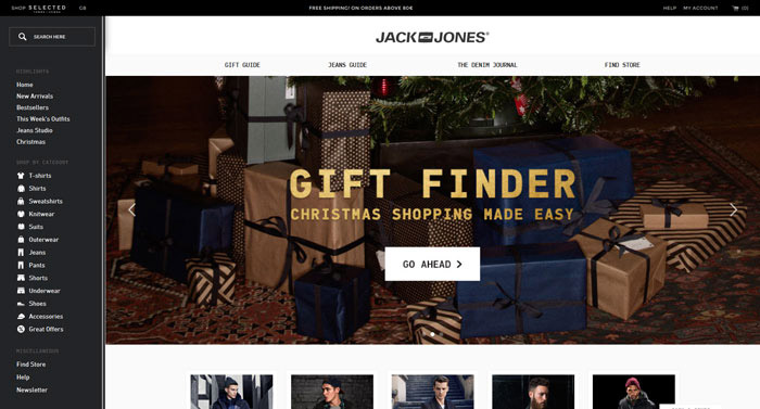
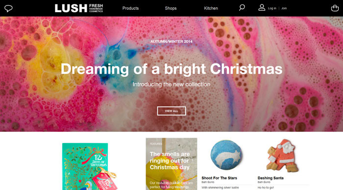
Instead of using plain color blocks, choose a high-quality image that fits your brand tone and industry attributes as an interface background. For example, a company specializing in high-end restaurant space design could use a real scene image of a successfully completed project with excellent lighting ambiance as its homepage background. This instantly transports visitors into the scene you have created. The key is to ensure sufficient contrast between the foreground text/controls and the background, achievable by adding a semi-transparent color layer behind the text or adjusting the background brightness, balancing aesthetics and readability.
Seamless Integration: Making Design Elements and Background Blend into One
This is a more advanced technique. It goes beyond using an image as a background; it involves clever composition and design making icons, buttons, and other interface elements appear to naturally "grow" out of the background. For example, a mountain guide service website could design its "Book Now" button in the shape of a rock, seamlessly embedded into a background mountain photo. This design creates a wonderful sense of immersion, showcasing the design team's attention to detail and superior integration skills, which in itself demonstrates experience.
Symphony of Information: Tightly Stitching High-Quality Images
A single image has limited power, but seamlessly stitching multiple high-quality images representing different aspects of your experience (e.g., team discussions, product close-ups, client testimonial scenes, award moments) with no gaps or very narrow margins creates a visual "information flow." This arrangement tells visitors: "Our experience is so rich, it can't be contained in a single frame." It creates a rhythm of information, guiding the eye to flow between density and sparsity, stimulating the desire to explore.
Master of Layers: Adding Color Blocks and Shadows to Images
In graphic and web design, this is a timeless classic technique. Adding a color block with a subtle shadow beneath or around an image instantly "lifts" the image from the background, adding depth and dimensionality to the layout. This not only reduces layout monotony but also symbolizes that your experience is not a flat narrative but an accumulation with multiple dimensions and layers. This simple action can quickly enhance the overall design sophistication.
The Finishing Touch: Adding Patterns and Shapes to Image Foregrounds/Backgrounds
Plain images and shapes might seem basic alone, but when combined, they create powerful chemistry. For instance, overlay a circular arrow graphic on a screenshot of your software interface, guiding the eye to an innovative feature; or have geometric shapes representing your core values faintly visible behind a team photo. These decorative elements quickly build unique visual tension and brand recognition, making your case studies more ingenious.
Boundary-Breaking Creativity: Misaligned Overlays of Text, Graphics, and Irregular Shapes
Breaking conventional frames often brings surprises. Try partially overlaying explanatory text, data charts, or irregular shapes onto case study images in a seemingly casual yet meticulously calculated way. This misaligned layout appears lively and interesting, quickly adding information hierarchy and guiding users to read in layers. It conveys confidence: we are not only experienced but also adept at presenting it in innovative, unconventional ways.
Statement of Form: Using Text or Shapes as Clipping Masks
This is a highly stylistic and modern technique. Fill your excellent case study images or team work scenes into a massive, bold brand slogan text or logo shape. This design makes the image itself carry dual information: the content of the image itself and the meaning of the text or shape it forms. It makes information delivery fun and memorable, ideal for the main visual banner on the homepage, powerfully declaring your brand proposition.
Cohesive Field: Narrowing Image Gaps
When you need to display numerous success cases, partner logos, or product collections, instead of arranging them loosely, boldly reduce the spacing between images. This compact aggregation forms a visual "information field," making the content appear extremely rich and cohesive. It conveys the subtext: "We have numerous successful experiences, and they are interconnected, collectively forming our solid professional foundation."
Emotional Color Palette: Overlaying Colors on Images
Experience is not just objective facts; it also includes the emotions and attitudes it embodies. By overlaying a semi-transparent tint of your brand color on images, or uniformly processing images into a specific color tone (e.g., vintage sepia, tech blue), you can create a strong sense of style and unify the visual atmosphere. This technique effectively evokes the desired "mood" — whether professional and calm, warm and caring, or innovative and bold. Color overlays ensure all your visual assets serve the overall brand atmosphere, presenting a unified feel that suggests careful consideration.
Visual Focus: Cropping Images into Unconventional Shapes
Why must images be strictly rectangular? Be bold and crop your case study images, team avatars into circles, diamonds, hexagons, or even irregular organic shapes! This act itself breaks conventions, making the interface instantly novel. More importantly, it naturally focuses the reader's attention on the subject of the image, avoiding distractions. A well-cropped circular avatar is more memorable than a square one, especially when introducing senior team members.
The beauty of a website lies not only in its visual harmony but also in its ability to accurately convey the brand's soul — the valuable experience you have accumulated along the way. Using the ten image techniques described above, you can transform your website from a static online brochure into a dynamic, persuasive "senior partner" that works 24/7 to build trust and demonstrate authority.
Arachne Group Limited firmly believes that "design" is a strategic tool for solving business problems. Our web design team excels at delving deep into each brand's unique experiences and stories, employing a series of professional visual strategies like those mentioned above to transform these intangible assets into the most impactful online competitiveness.
Contact Us
Phone: 852-3749 9734
Email: [email protected]
Website: https://hkweb.com.hk
The answer lies in the "Experiential" quality of your website!
For a brand website, "Experiential" is not just a feeling; it is a key element that can be concretely communicated through strategic web design, particularly the skillful use of "images."
Experience Equals Conversion: Why Your Website Needs to Highlight "Experiential" Quality
In a highly competitive market, highlighting experiential quality is not an added bonus but a strategic core determining business success or failure. A website that successfully conveys experiential quality will bring the following irreplaceable benefits to your online promotion:
Rapidly Builds Trust, Lowers Decision Barriers: Potential customers are naturally wary of unfamiliar brands. When they can intuitively sense your professional history, success stories, and deep industry involvement through your website, trust naturally arises. This trust directly lowers their guard, shortening the decision path from "browser" to "inquirer."
Shapes Professional Authority, Widens the Gap with Competitors: Experience is an asset that cannot be easily replicated. Effectively showcasing experience through website visuals positions you as an expert and thought leader in your field, rather than just one of many suppliers. This authoritative image gives you more leverage in price negotiations and attracts quality clients who value quality more.
Enhances Brand Value, Supports Premium Pricing Strategies: Customers are willing to pay for "experience." A website full of a sense of experience demonstrates your past problem-solving ability and accumulated knowledge capital, which itself embodies high value. It makes clients recognize that your quotes are based on profound accumulation, thus making them more accepting of higher prices.
Strengthens Content Persuasion, Promotes Word-of-Mouth: When your case studies, team introductions, or company history are supported by strong visual evidence, every achievement you state becomes more three-dimensional and credible. Satisfied clients are more likely to become your brand ambassadors, actively providing word-of-mouth referrals.
Optimizes SEO and User Experience, Creates a Positive Feedback Loop: Search engines like Google increasingly value a website's "Expertise, Authoritativeness, and Trustworthiness" (E-E-A-T). An experiential website with substantial content and rich case studies is more likely to be judged as high-quality, thereby improving its ranking. Simultaneously, good visual storytelling significantly increases user dwell time and engagement rates, which are signals favored by search engines.
[Building Brand Trust] How to Use Images to Highlight the "Experiential" Quality in Website Design?
Having understood the strategic importance of highlighting experiential quality, let us now become visual alchemists. Through ten sophisticated image techniques, we can transform cold image data into warm and persuasive stories of experience.
Background Narrative: Using Atmosphere Images to Create an Immersive Experience
Instead of using plain color blocks, choose a high-quality image that fits your brand tone and industry attributes as an interface background. For example, a company specializing in high-end restaurant space design could use a real scene image of a successfully completed project with excellent lighting ambiance as its homepage background. This instantly transports visitors into the scene you have created. The key is to ensure sufficient contrast between the foreground text/controls and the background, achievable by adding a semi-transparent color layer behind the text or adjusting the background brightness, balancing aesthetics and readability.
Seamless Integration: Making Design Elements and Background Blend into One
This is a more advanced technique. It goes beyond using an image as a background; it involves clever composition and design making icons, buttons, and other interface elements appear to naturally "grow" out of the background. For example, a mountain guide service website could design its "Book Now" button in the shape of a rock, seamlessly embedded into a background mountain photo. This design creates a wonderful sense of immersion, showcasing the design team's attention to detail and superior integration skills, which in itself demonstrates experience.
Symphony of Information: Tightly Stitching High-Quality Images
A single image has limited power, but seamlessly stitching multiple high-quality images representing different aspects of your experience (e.g., team discussions, product close-ups, client testimonial scenes, award moments) with no gaps or very narrow margins creates a visual "information flow." This arrangement tells visitors: "Our experience is so rich, it can't be contained in a single frame." It creates a rhythm of information, guiding the eye to flow between density and sparsity, stimulating the desire to explore.
Master of Layers: Adding Color Blocks and Shadows to Images
In graphic and web design, this is a timeless classic technique. Adding a color block with a subtle shadow beneath or around an image instantly "lifts" the image from the background, adding depth and dimensionality to the layout. This not only reduces layout monotony but also symbolizes that your experience is not a flat narrative but an accumulation with multiple dimensions and layers. This simple action can quickly enhance the overall design sophistication.
The Finishing Touch: Adding Patterns and Shapes to Image Foregrounds/Backgrounds
Plain images and shapes might seem basic alone, but when combined, they create powerful chemistry. For instance, overlay a circular arrow graphic on a screenshot of your software interface, guiding the eye to an innovative feature; or have geometric shapes representing your core values faintly visible behind a team photo. These decorative elements quickly build unique visual tension and brand recognition, making your case studies more ingenious.
Boundary-Breaking Creativity: Misaligned Overlays of Text, Graphics, and Irregular Shapes
Breaking conventional frames often brings surprises. Try partially overlaying explanatory text, data charts, or irregular shapes onto case study images in a seemingly casual yet meticulously calculated way. This misaligned layout appears lively and interesting, quickly adding information hierarchy and guiding users to read in layers. It conveys confidence: we are not only experienced but also adept at presenting it in innovative, unconventional ways.
Statement of Form: Using Text or Shapes as Clipping Masks
This is a highly stylistic and modern technique. Fill your excellent case study images or team work scenes into a massive, bold brand slogan text or logo shape. This design makes the image itself carry dual information: the content of the image itself and the meaning of the text or shape it forms. It makes information delivery fun and memorable, ideal for the main visual banner on the homepage, powerfully declaring your brand proposition.
Cohesive Field: Narrowing Image Gaps
When you need to display numerous success cases, partner logos, or product collections, instead of arranging them loosely, boldly reduce the spacing between images. This compact aggregation forms a visual "information field," making the content appear extremely rich and cohesive. It conveys the subtext: "We have numerous successful experiences, and they are interconnected, collectively forming our solid professional foundation."
Emotional Color Palette: Overlaying Colors on Images
Experience is not just objective facts; it also includes the emotions and attitudes it embodies. By overlaying a semi-transparent tint of your brand color on images, or uniformly processing images into a specific color tone (e.g., vintage sepia, tech blue), you can create a strong sense of style and unify the visual atmosphere. This technique effectively evokes the desired "mood" — whether professional and calm, warm and caring, or innovative and bold. Color overlays ensure all your visual assets serve the overall brand atmosphere, presenting a unified feel that suggests careful consideration.
Visual Focus: Cropping Images into Unconventional Shapes
Why must images be strictly rectangular? Be bold and crop your case study images, team avatars into circles, diamonds, hexagons, or even irregular organic shapes! This act itself breaks conventions, making the interface instantly novel. More importantly, it naturally focuses the reader's attention on the subject of the image, avoiding distractions. A well-cropped circular avatar is more memorable than a square one, especially when introducing senior team members.
The beauty of a website lies not only in its visual harmony but also in its ability to accurately convey the brand's soul — the valuable experience you have accumulated along the way. Using the ten image techniques described above, you can transform your website from a static online brochure into a dynamic, persuasive "senior partner" that works 24/7 to build trust and demonstrate authority.
Arachne Group Limited firmly believes that "design" is a strategic tool for solving business problems. Our web design team excels at delving deep into each brand's unique experiences and stories, employing a series of professional visual strategies like those mentioned above to transform these intangible assets into the most impactful online competitiveness.
Contact Us
Phone: 852-3749 9734
Email: [email protected]
Website: https://hkweb.com.hk
MORE BLOG
-

Hotel Website Has Traffic but No Bookings? 5 Key Web Design Strategies to Capture Travelers' Hearts in 10 Seconds
2026/07/17 Struggling with high traffic but no hotel bookings? Discover 5 web design secrets to bridge the 10-second trust gap, beat OTAs, and drive direct reservations. -

Enterprise-Grade Cloud Security Guide: How Hong Kong Companies Can Prevent Data Breach Crises
2026/07/14 Protect your HK business from cloud data breaches. Arachne Group shares essential security tips on compliance, 2FA, encryption & cloud provider choice. -

20-Minute Ultra-Simple Web Development Guide: How to Build Websites and Landing Pages Using Codex
2026/07/10 Learn how to use Codex and AI Agents to build custom, high-converting websites and landing pages in 20 minutes without coding. Guide by Arachne Group.
