


Web Design Upgrade Guide: Five Button Design Strategies to Achieve Ideal Conversion Results
2020 / 08 / 21
Have you ever experienced this: your website consistently gets decent daily traffic, the content layout and web design seem impeccable, yet the conversion rate remains persistently unsatisfactory?
In fact, this is likely related to the design and optimization of your webpage buttons.
Arachne Group Limited points out that although buttons might seem "insignificant" in web design, they actually carry the crucial mission of converting visitors into customers and guests into members.

Why are buttons so important in web design? Essentially, buttons are not just decorative elements on a page; they are key hubs connecting "user intent" with "business goals." Specifically, well-designed buttons play remarkable roles in four aspects:
● Navigators at Decision Points
Users often scan webpages rapidly. Buttons act like signposts, guiding users forward. Well-designed buttons reduce cognitive load by clearly answering the questions "Where am I?", "What can I do here?", and "What's the next step?", eliminating confusion and guiding users effortlessly towards the desired action.
● The Visual Cornerstone of Trust
In the virtual world of the internet, trust is the foundation of transactions. Buttons that adhere to design standards and exhibit refined craftsmanship convey the website's professionalism and meticulousness, enhancing the system's predictability. This makes users feel in control, thus increasing their willingness to proceed. For high-risk operations, solid, sturdy button designs can subconsciously reassure users and alleviate concerns about transaction security.
● The Spotlight for Visual Focus
Based on Gestalt psychology principles like "closure" and "good figure," buttons stand out amidst complex page information. Through color, size, and placement, buttons establish a visual hierarchy, distinguishing primary from secondary actions, guiding the user's gaze along a preset path, and ultimately resting on the crucial CTA button.
● The Final Call to Action
The text on a button represents the last opportunity to communicate with the user. Microcopy can create a sense of value and urgency, set clear expectations, and reduce user hesitation. A powerful, concise copy can directly translate into a higher click-through rate.
Thus, optimizing webpage buttons means clearing the most critical and narrowest segment of the business growth pipeline, potentially yielding impressive returns. This is why "button design" remains a core subject of great importance in professional web design and conversion rate optimization.

A page often features multiple buttons—like CTA buttons, text buttons, outline buttons, icon buttons, and disabled buttons—to establish a hierarchical relationship among page buttons:
1# CTA Button (Call-to-Action Button)
As the most prominent button type in an interface, CTA buttons typically have a conspicuous background color and high-contrast text, enabling them to quickly capture user attention and guide them towards key actions.
Note: Avoid an excess of CTAs within an interface, as this can cause visual clutter and distract user attention.
2# Outline Button
Outline buttons consist only of a border line without a fill color, giving them a lighter visual weight. They are commonly used for secondary actions or paired with CTA buttons to create a visual hierarchy.
Note: Compared to CTA buttons, outline buttons have lower recognizability and might be overlooked by users.
3# Text Button
Text buttons are composed solely of text, relying on color, font, size, and style to enhance their identifiability. They are particularly suitable for space-constrained contexts or actions with lower priority.
Note: Due to their low recognizability, users often struggle to quickly identify text buttons as clickable; if the button's text style resembles surrounding text, it can cause user confusion.
4# Icon Button
Icon buttons use an icon as the primary visual element, presented either alone or combined with text. They are often used for functionally specific actions where textual description might be verbose.
Note: Unclear icon design or icons that don't align with user mental models can negatively impact the overall website user experience and potentially lead to misunderstandings of the function.
5# Disabled Button
Disabled buttons are typically rendered in a uniform gray tone, significantly reducing the visual appeal of their background, text, and border, creating a stark contrast with surrounding clickable buttons. This intuitive visual degradation clearly communicates the "currently unavailable" status to users.
Note: If disabled buttons are not designed prominently enough or lack sufficient explanatory information, users might feel confused and frustrated about why the button is inactive.

In summary, rationally optimizing buttons essentially involves unclogging the channels of business growth, effectively converting visitor traffic into tangible business value (registrations, sales, inquiries), thereby achieving remarkable returns. So, which web design strategies can help enhance button conversion rates?
Follow Reading Habits, Strategically Place Buttons
When considering button presentation, many businesses fall into the trap of placing the CTA button first, attempting to grab user attention immediately. However, when users visit a page, they are attracted more by the button's style than its position alone. Therefore, merely placing the CTA in a prominent spot while neglecting other factors is unlikely to improve conversion rates.
Solution: Position CTA buttons according to user reading patterns and the relevance of the interface content. Simultaneously, design them as solid buttons with high-saturation colors to ensure users can spot them quickly and make decisions.
Utilize Shapes Wisely to Enhance Button Distinction
If text buttons are not designed prominently, they can easily confuse users, making it hard to discern whether it's a button or plain text. Additionally, an excessively small clickable area for text buttons can make users unsure where to tap, potentially leading to misclicks.
Solution: When the visual effect of a text button is insufficient, consider replacing it with an outline button. Use distinctive shapes or colors to differentiate it from body content and CTA buttons, guiding users to click.
Leverage Color Guidance to Highlight Button Priority
Compared to CTA buttons, secondary buttons should generally have lower recognizability and distinctiveness to avoid interfering with the user experience. However, it's important to note that when multiple secondary buttons appear in the same interface, we need to establish their hierarchical relationship through various means.
Example (Shopping App): "Checkout" is the CTA button. "Keep Shopping" and "View Cart" are secondary buttons. While they seem equal, "View Cart" has higher priority as it more directly guides users towards payment. Use colors of the same hue but different brightness levels—e.g., "View Cart" in dark blue with white text, "Keep Shopping" in light blue with dark gray text. This maintains interface harmony while emphasizing priority.
Adjust Button Text Weight to Reflect Hierarchy
Besides using color, we can also employ text of varying weights (boldness) to establish hierarchy among different buttons. Compared to color, this method avoids creating visually obtrusive effects and can better guide user clicks.
Example (Web Form): Use bold text for the "Submit" button and regular weight for the "Reset" button. Users can intuitively perceive the "Submit" button as more important and prioritize clicking it.
Add Icons to Make Buttons More User-Friendly
To make buttons more "humanized" and attract more user attention, consider adding relevant icons before the button text. This also helps users with visual impairments focus on the button.
Example (Music App): Add a triangular "play" icon before the "Play" button text. Users can more intuitively understand the button's function and quickly click to play the music.
In web design, buttons, though seemingly "minor" interface elements, are actually pivotal hubs that drive user behavior and impact conversion rates. Arachne Group Limited, as an experienced web design company in Hong Kong, is dedicated to refining every detail. Leveraging precise insights into user experience and business objectives, we ensure every aspect of our design creates tangible business value for our clients.
Contact Us:
Phone: 852-3749 9734
Email: [email protected]
Website: https://hkweb.com.hk
In fact, this is likely related to the design and optimization of your webpage buttons.
Arachne Group Limited points out that although buttons might seem "insignificant" in web design, they actually carry the crucial mission of converting visitors into customers and guests into members.
Buttons: The Invisible Commanders in Web Design!
Why are buttons so important in web design? Essentially, buttons are not just decorative elements on a page; they are key hubs connecting "user intent" with "business goals." Specifically, well-designed buttons play remarkable roles in four aspects:
● Navigators at Decision Points
Users often scan webpages rapidly. Buttons act like signposts, guiding users forward. Well-designed buttons reduce cognitive load by clearly answering the questions "Where am I?", "What can I do here?", and "What's the next step?", eliminating confusion and guiding users effortlessly towards the desired action.
● The Visual Cornerstone of Trust
In the virtual world of the internet, trust is the foundation of transactions. Buttons that adhere to design standards and exhibit refined craftsmanship convey the website's professionalism and meticulousness, enhancing the system's predictability. This makes users feel in control, thus increasing their willingness to proceed. For high-risk operations, solid, sturdy button designs can subconsciously reassure users and alleviate concerns about transaction security.
● The Spotlight for Visual Focus
Based on Gestalt psychology principles like "closure" and "good figure," buttons stand out amidst complex page information. Through color, size, and placement, buttons establish a visual hierarchy, distinguishing primary from secondary actions, guiding the user's gaze along a preset path, and ultimately resting on the crucial CTA button.
● The Final Call to Action
The text on a button represents the last opportunity to communicate with the user. Microcopy can create a sense of value and urgency, set clear expectations, and reduce user hesitation. A powerful, concise copy can directly translate into a higher click-through rate.
Thus, optimizing webpage buttons means clearing the most critical and narrowest segment of the business growth pipeline, potentially yielding impressive returns. This is why "button design" remains a core subject of great importance in professional web design and conversion rate optimization.
Five Key Button Types: How to Use Them Precisely to Boost Conversions?
A page often features multiple buttons—like CTA buttons, text buttons, outline buttons, icon buttons, and disabled buttons—to establish a hierarchical relationship among page buttons:
1# CTA Button (Call-to-Action Button)
As the most prominent button type in an interface, CTA buttons typically have a conspicuous background color and high-contrast text, enabling them to quickly capture user attention and guide them towards key actions.
Note: Avoid an excess of CTAs within an interface, as this can cause visual clutter and distract user attention.
2# Outline Button
Outline buttons consist only of a border line without a fill color, giving them a lighter visual weight. They are commonly used for secondary actions or paired with CTA buttons to create a visual hierarchy.
Note: Compared to CTA buttons, outline buttons have lower recognizability and might be overlooked by users.
3# Text Button
Text buttons are composed solely of text, relying on color, font, size, and style to enhance their identifiability. They are particularly suitable for space-constrained contexts or actions with lower priority.
Note: Due to their low recognizability, users often struggle to quickly identify text buttons as clickable; if the button's text style resembles surrounding text, it can cause user confusion.
4# Icon Button
Icon buttons use an icon as the primary visual element, presented either alone or combined with text. They are often used for functionally specific actions where textual description might be verbose.
Note: Unclear icon design or icons that don't align with user mental models can negatively impact the overall website user experience and potentially lead to misunderstandings of the function.
5# Disabled Button
Disabled buttons are typically rendered in a uniform gray tone, significantly reducing the visual appeal of their background, text, and border, creating a stark contrast with surrounding clickable buttons. This intuitive visual degradation clearly communicates the "currently unavailable" status to users.
Note: If disabled buttons are not designed prominently enough or lack sufficient explanatory information, users might feel confused and frustrated about why the button is inactive.
Five Practical Web Design Strategies: Transforming Buttons into Actual Conversion Rates
In summary, rationally optimizing buttons essentially involves unclogging the channels of business growth, effectively converting visitor traffic into tangible business value (registrations, sales, inquiries), thereby achieving remarkable returns. So, which web design strategies can help enhance button conversion rates?
Follow Reading Habits, Strategically Place Buttons
When considering button presentation, many businesses fall into the trap of placing the CTA button first, attempting to grab user attention immediately. However, when users visit a page, they are attracted more by the button's style than its position alone. Therefore, merely placing the CTA in a prominent spot while neglecting other factors is unlikely to improve conversion rates.
Solution: Position CTA buttons according to user reading patterns and the relevance of the interface content. Simultaneously, design them as solid buttons with high-saturation colors to ensure users can spot them quickly and make decisions.
Utilize Shapes Wisely to Enhance Button Distinction
If text buttons are not designed prominently, they can easily confuse users, making it hard to discern whether it's a button or plain text. Additionally, an excessively small clickable area for text buttons can make users unsure where to tap, potentially leading to misclicks.
Solution: When the visual effect of a text button is insufficient, consider replacing it with an outline button. Use distinctive shapes or colors to differentiate it from body content and CTA buttons, guiding users to click.
Leverage Color Guidance to Highlight Button Priority
Compared to CTA buttons, secondary buttons should generally have lower recognizability and distinctiveness to avoid interfering with the user experience. However, it's important to note that when multiple secondary buttons appear in the same interface, we need to establish their hierarchical relationship through various means.
Example (Shopping App): "Checkout" is the CTA button. "Keep Shopping" and "View Cart" are secondary buttons. While they seem equal, "View Cart" has higher priority as it more directly guides users towards payment. Use colors of the same hue but different brightness levels—e.g., "View Cart" in dark blue with white text, "Keep Shopping" in light blue with dark gray text. This maintains interface harmony while emphasizing priority.
Adjust Button Text Weight to Reflect Hierarchy
Besides using color, we can also employ text of varying weights (boldness) to establish hierarchy among different buttons. Compared to color, this method avoids creating visually obtrusive effects and can better guide user clicks.
Example (Web Form): Use bold text for the "Submit" button and regular weight for the "Reset" button. Users can intuitively perceive the "Submit" button as more important and prioritize clicking it.
Add Icons to Make Buttons More User-Friendly
To make buttons more "humanized" and attract more user attention, consider adding relevant icons before the button text. This also helps users with visual impairments focus on the button.
Example (Music App): Add a triangular "play" icon before the "Play" button text. Users can more intuitively understand the button's function and quickly click to play the music.
In web design, buttons, though seemingly "minor" interface elements, are actually pivotal hubs that drive user behavior and impact conversion rates. Arachne Group Limited, as an experienced web design company in Hong Kong, is dedicated to refining every detail. Leveraging precise insights into user experience and business objectives, we ensure every aspect of our design creates tangible business value for our clients.
Contact Us:
Phone: 852-3749 9734
Email: [email protected]
Website: https://hkweb.com.hk
MORE BLOG
-
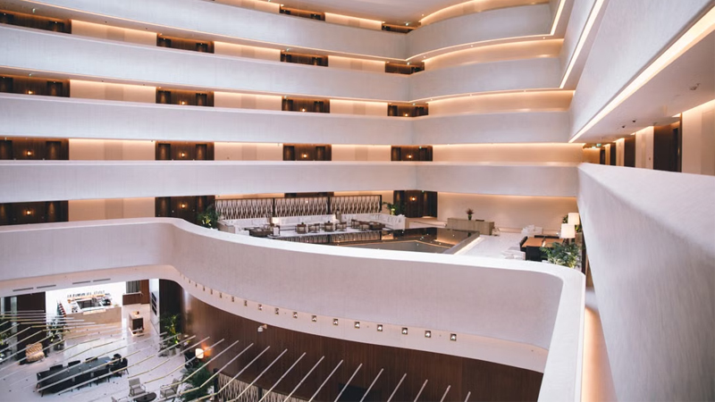
Hotel Website Has Traffic but No Bookings? 5 Key Web Design Strategies to Capture Travelers' Hearts in 10 Seconds
2026/07/17 Struggling with high traffic but no hotel bookings? Discover 5 web design secrets to bridge the 10-second trust gap, beat OTAs, and drive direct reservations. -
Enterprise-Grade Cloud Security Guide: How Hong Kong Companies Can Prevent Data Breach Crises
2026/07/14 Protect your HK business from cloud data breaches. Arachne Group shares essential security tips on compliance, 2FA, encryption & cloud provider choice. -
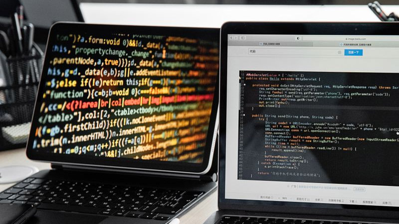
20-Minute Ultra-Simple Web Development Guide: How to Build Websites and Landing Pages Using Codex
2026/07/10 Learn how to use Codex and AI Agents to build custom, high-converting websites and landing pages in 20 minutes without coding. Guide by Arachne Group.
