


- 首頁
- Blog
- [Web Marketing Class ⑩] A Complete Guide to Mastering Navigation Bar Design: Significantly Boost Your Website's User Experience!
[Web Marketing Class ⑩] A Complete Guide to Mastering Navigation Bar Design: Significantly Boost Your Website's User Experience!
2023 / 07 / 21
In popular belief, a navigation bar is merely a simple horizontal bar composed of "Logo + Text/Icon URLs," often overlooked during the web design process. In reality, the core function of a navigation bar is to clearly inform users of their current location and provide a clear path to help them quickly reach their target pages.
In other words, the application of navigation bars in web design must be closely integrated with the website's hierarchical structure and align with users' browsing habits, thereby facilitating efficient information delivery and management.

The industry has long debated "whether to choose a top navigation bar or a side navigation bar," with many designers holding their own conclusions. However, in practice, there is no definitive answer; the choice depends more on specific circumstances.
Sidebar Navigation is Easier to Browse
Eye-tracking research from the Dutch ING Group indicates that users tend to browse websites using an "F"-shaped pattern. This suggests that a left-sided navigation bar offers relatively higher usability than a top navigation bar, enabling users to access the website quickly and efficiently.
Top Navigation Bar Saves More Space
Data shows that a side navigation bar occupies three times the space of a top navigation bar with equivalent content. This is primarily because side navigation bars often need to accommodate elements like horizontal titles and search functions, consequently narrowing the space available for page content.
Side Navigation Bar Supports Customizable Navigation Structures
When a website's information architecture involves numerous menu items, a side navigation bar can display twice as many entries as a top navigation bar. It can even directly present layered secondary menus and accommodate future needs for adding more entries.
Top Navigation Bar is Suitable for "Mega Menus"
If a side navigation bar uses hover-activated drawer-style dropdown menus, it might obscure part of the interface content, and its expansion can occupy significant space. Utilizing a top navigation bar, however, not only accommodates a large number of submenu entries at once but also reserves ample space for product displays and advertisements.

As a guidepost for users upon entering a website, the quality of the navigation bar directly impacts the overall user experience and can shape users' impressions of the site. Therefore, mastering these design techniques is crucial to prevent undermining the positive impressions accumulated through other aspects of the web design.
a. Incorporate a Prominent Search Box
During website visits, many users filter information via "search." Ensure the "search box" is integrated into the main navigation bar and appears on every page. This, firstly, allows users to obtain desired information faster and more directly; secondly, it significantly contributes to enhancing the website user experience and improving user retention rates.
b. Strategic Layout of Navigation Bar Items
Based on the "Serial Position Effect," when users recall a series of items, they tend to remember the first and last items more easily, often overlooking those in the middle. During the navigation bar design process, place the highest-priority items or elements at the beginning of the navigation bar to attract user attention and guide clicks.
c. Use a Sticky/Floating Navigation for Long-Scrolling Pages
For long-scrolling pages, employing a sticky navigation design helps users interact with the website easily and naturally at any time, thereby prolonging their dwell time on the site.

Most of the time, even the most meticulous web designers can inadvertently fall into the following navigation design traps. Recognizing these common issues helps avoid negatively impacting website conversion rates:
Pitfall 1: Too Many Menu Options
If users need to spend excessive time browsing through menu options in the navigation bar, it hinders their ability to make quick and accurate selections, potentially even leading them to abandon browsing the site altogether.
Pitfall 2: Insufficient Menu Options
While too many options can overwhelm users, too few options can make it difficult for users to comprehend the site's offerings and locate desired functions, causing them to lose patience and leave the site.
Pitfall 3: Using Hamburger Navigation
The primary issue with hamburger navigation design is that it "requires a click to reveal the menu," which can easily lead users to get "lost" on the website. When users cannot find the content or functions they want, they may start clicking or scrolling randomly, gradually becoming frustrated.
Pitfall 4: Redefining Standard Navigation Interaction Rules
Users are often accustomed to the position, presentation, and operation of certain elements or icons during website visits. Unconventional navigation rules, while seemingly creative, break these ingrained interaction patterns, significantly increasing the users' learning curve.
Pitfall 5: Not Displaying the User's Current Location
A navigation bar that consistently shows the user's current location helps them grasp the website's overall structure more easily, facilitates their next steps, and avoids unnecessary guesswork during their browsing journey.
Overall, an excellent navigation bar design must balance practicality and aesthetics, ensuring a comfortable and smooth website experience for users. An ill-conceived navigation bar design can severely harm the website's user experience and indirectly affect conversion rates and user retention!
Arachne Group Limited places special emphasis on the design and optimization of navigation systems. We not only possess extensive practical experience, enabling us to create intuitive and easy-to-use navigation structures tailored to your business needs and target audience characteristics, but we also have a deep understanding of user psychology and browsing habits. This allows us to strike the perfect balance between creative design and practical functionality, ensuring your website is not only visually outstanding but also effectively guides users toward conversion goals.
Whether for responsive design, e-commerce platforms, or corporate websites, we can provide customized web design solutions to help your site stand out in the competitive digital landscape. Let us assist you in creating a high-quality website that captures attention and boosts conversion rates!
Contact Us
Tel: 852-3749 9734
Email: [email protected]
Website: https://hkweb.com.hk
In other words, the application of navigation bars in web design must be closely integrated with the website's hierarchical structure and align with users' browsing habits, thereby facilitating efficient information delivery and management.
▌ The Web Designer's Dilemma: Top Navigation Bar or Side Navigation Bar?
The industry has long debated "whether to choose a top navigation bar or a side navigation bar," with many designers holding their own conclusions. However, in practice, there is no definitive answer; the choice depends more on specific circumstances.
Sidebar Navigation is Easier to Browse
Eye-tracking research from the Dutch ING Group indicates that users tend to browse websites using an "F"-shaped pattern. This suggests that a left-sided navigation bar offers relatively higher usability than a top navigation bar, enabling users to access the website quickly and efficiently.
Top Navigation Bar Saves More Space
Data shows that a side navigation bar occupies three times the space of a top navigation bar with equivalent content. This is primarily because side navigation bars often need to accommodate elements like horizontal titles and search functions, consequently narrowing the space available for page content.
Side Navigation Bar Supports Customizable Navigation Structures
When a website's information architecture involves numerous menu items, a side navigation bar can display twice as many entries as a top navigation bar. It can even directly present layered secondary menus and accommodate future needs for adding more entries.
Top Navigation Bar is Suitable for "Mega Menus"
If a side navigation bar uses hover-activated drawer-style dropdown menus, it might obscure part of the interface content, and its expansion can occupy significant space. Utilizing a top navigation bar, however, not only accommodates a large number of submenu entries at once but also reserves ample space for product displays and advertisements.
▌ Master These Navigation Bar Design Techniques to Greatly Enhance Website User Experience!
As a guidepost for users upon entering a website, the quality of the navigation bar directly impacts the overall user experience and can shape users' impressions of the site. Therefore, mastering these design techniques is crucial to prevent undermining the positive impressions accumulated through other aspects of the web design.
a. Incorporate a Prominent Search Box
During website visits, many users filter information via "search." Ensure the "search box" is integrated into the main navigation bar and appears on every page. This, firstly, allows users to obtain desired information faster and more directly; secondly, it significantly contributes to enhancing the website user experience and improving user retention rates.
b. Strategic Layout of Navigation Bar Items
Based on the "Serial Position Effect," when users recall a series of items, they tend to remember the first and last items more easily, often overlooking those in the middle. During the navigation bar design process, place the highest-priority items or elements at the beginning of the navigation bar to attract user attention and guide clicks.
c. Use a Sticky/Floating Navigation for Long-Scrolling Pages
For long-scrolling pages, employing a sticky navigation design helps users interact with the website easily and naturally at any time, thereby prolonging their dwell time on the site.
▌ Beware of These Navigation Bar Design Pitfalls to Avoid Indirectly Affecting Website Conversion
Most of the time, even the most meticulous web designers can inadvertently fall into the following navigation design traps. Recognizing these common issues helps avoid negatively impacting website conversion rates:
Pitfall 1: Too Many Menu Options
If users need to spend excessive time browsing through menu options in the navigation bar, it hinders their ability to make quick and accurate selections, potentially even leading them to abandon browsing the site altogether.
Pitfall 2: Insufficient Menu Options
While too many options can overwhelm users, too few options can make it difficult for users to comprehend the site's offerings and locate desired functions, causing them to lose patience and leave the site.
Pitfall 3: Using Hamburger Navigation
The primary issue with hamburger navigation design is that it "requires a click to reveal the menu," which can easily lead users to get "lost" on the website. When users cannot find the content or functions they want, they may start clicking or scrolling randomly, gradually becoming frustrated.
Pitfall 4: Redefining Standard Navigation Interaction Rules
Users are often accustomed to the position, presentation, and operation of certain elements or icons during website visits. Unconventional navigation rules, while seemingly creative, break these ingrained interaction patterns, significantly increasing the users' learning curve.
Pitfall 5: Not Displaying the User's Current Location
A navigation bar that consistently shows the user's current location helps them grasp the website's overall structure more easily, facilitates their next steps, and avoids unnecessary guesswork during their browsing journey.
Overall, an excellent navigation bar design must balance practicality and aesthetics, ensuring a comfortable and smooth website experience for users. An ill-conceived navigation bar design can severely harm the website's user experience and indirectly affect conversion rates and user retention!
Arachne Group Limited places special emphasis on the design and optimization of navigation systems. We not only possess extensive practical experience, enabling us to create intuitive and easy-to-use navigation structures tailored to your business needs and target audience characteristics, but we also have a deep understanding of user psychology and browsing habits. This allows us to strike the perfect balance between creative design and practical functionality, ensuring your website is not only visually outstanding but also effectively guides users toward conversion goals.
Whether for responsive design, e-commerce platforms, or corporate websites, we can provide customized web design solutions to help your site stand out in the competitive digital landscape. Let us assist you in creating a high-quality website that captures attention and boosts conversion rates!
Contact Us
Tel: 852-3749 9734
Email: [email protected]
Website: https://hkweb.com.hk
MORE BLOG
-
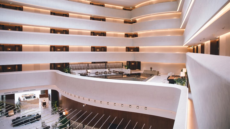
Hotel Website Has Traffic but No Bookings? 5 Key Web Design Strategies to Capture Travelers' Hearts in 10 Seconds
2026/07/17 Struggling with high traffic but no hotel bookings? Discover 5 web design secrets to bridge the 10-second trust gap, beat OTAs, and drive direct reservations. -
Enterprise-Grade Cloud Security Guide: How Hong Kong Companies Can Prevent Data Breach Crises
2026/07/14 Protect your HK business from cloud data breaches. Arachne Group shares essential security tips on compliance, 2FA, encryption & cloud provider choice. -

20-Minute Ultra-Simple Web Development Guide: How to Build Websites and Landing Pages Using Codex
2026/07/10 Learn how to use Codex and AI Agents to build custom, high-converting websites and landing pages in 20 minutes without coding. Guide by Arachne Group.
