- 首頁
- Blog
- The Secret to Skyrocketing Digital Marketing Conversion Rates: Mastering the 3 Key Focus Areas of Landing Page Above-the-Fold Design
The Secret to Skyrocketing Digital Marketing Conversion Rates: Mastering the 3 Key Focus Areas of Landing Page Above-the-Fold Design
2025 / 05 / 09
On your digital marketing journey, have you often encountered this puzzle: "The ad click-through rate is decent, but the conversion rate remains persistently low?"
Often, the reason likely lies in your landing page's above-the-fold design!
A landing page is the first specific webpage a user reaches after clicking on an ad, search engine result, social media link, etc. Its core purpose is to guide users to complete a specific action, such as purchasing a product, registering for membership, downloading an app, or filling out a form. When it comes to the most critical areas of landing page design, the "above-the-fold" section is undoubtedly paramount.
▌ Why is Above-the-Fold Design So Crucial for Improving Landing Page Conversion Rates?

As is widely known, user attention spans are extremely short, especially on mobile devices. Most users will give your website only about 3 seconds. Within this brief window, they quickly assess whether your page is worth staying on and relevant to their needs.
Research data indicates that over 70% of e-commerce landing page bounces occur on the above-the-fold section. This means that if the above-the-fold design is poor, a significant portion of your ad budget is effectively wasted.
Overall, in landing page design, the above-the-fold section serves three core functions:
Communicate Brand Value: Clearly and concisely tell users who you are and what value you provide.
Guide Continued Browsing: Use visual hierarchy and layout to encourage users to scroll down and explore more content.
Create a First Impression: The visual style, copy quality, and interactive elements above the fold directly influence users' trust and perception of the brand.
▌ The Three Key Focus Areas of Landing Page Above-the-Fold Design: Value Proposition, Trust Signals, and Action Path
1. Value Proposition: The "Soul" of Above-the-Fold Design
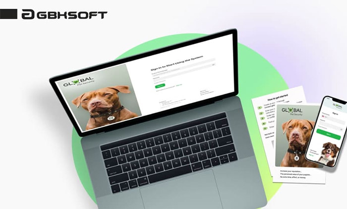
The above-the-fold area should directly and explicitly show what problem your product or service solves for the user and what benefits it brings. Avoid vague or overly complex language; ensure users understand instantly.
Design Techniques:
Clear Headline + Subheading Combo: Avoid ambiguous statements. E.g., shift from "We provide quality service" to "30-Minute Express Delivery, Free if Late!"
Highlight Core Pain Points: Address user needs directly. E.g., for a financial product: "8% Annual Return, 5x Higher Than Banks!"
Visual Reinforcement: Use icons, illustrations, or product images to aid understanding; avoid overwhelming text.
2. Trust Elements: The "Foundation" for Building Trust
When users first arrive, they often lack trust due to unfamiliarity. Displaying social proof—such as customer testimonials, awards, certifications, or media mentions—helps build credibility.
Design Techniques:
Social Proof: Customer testimonials, media logos (e.g., "Featured on TechCrunch"), partner endorsements.
Quantifiable Results: E.g., "Chosen by 100,000+ Users," "98% Satisfaction Rate."
Security Badges: Payment security certifications, privacy protection seals (especially crucial for e-commerce and finance).
3. Action Path: The "Compass" Guiding Conversion
The Call-to-Action (CTA) Button prompts users to take a specific action (e.g., register, buy, download). It's typically designed with prominent colors, copy, and placement to clearly indicate the "next step."
Design Techniques:
Prominent CTA Button: Use high-contrast colors (e.g., orange, green). Avoid passive verbs like "Submit"; use action-oriented copy: "Get Your Discount Now," "Start Free Trial."
Minimize Form Fields: On the first screen, collect only essential information (e.g., email or phone number); request additional details later.
Create Urgency: E.g., "Limited Time Offer," "Only 10 Spots Left."
▌ Reviewing Four Common Landing Page Above-the-Fold Design Pitfalls: Elevate Your Digital Marketing Results
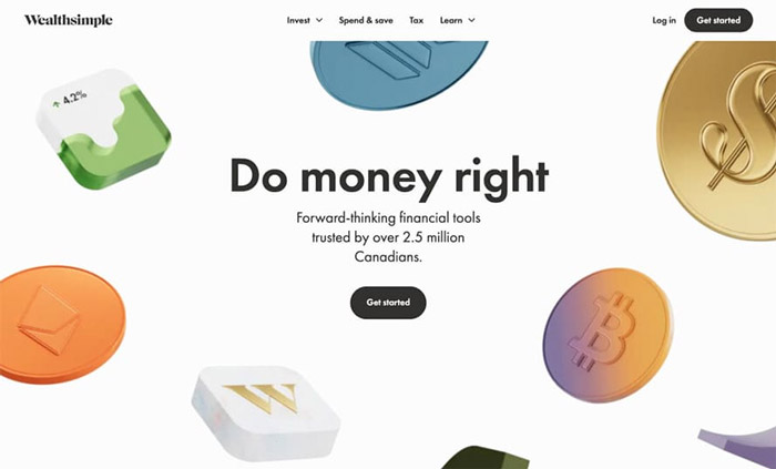
While many brands recognize the importance of the above-the-fold section, common pitfalls persist in practice:
1. Visually Stunning but Lacking Critical Information
As noted, users have limited patience. If the above-the-fold area only contains visual elements without clear explanatory copy, users may leave out of confusion. This is especially true for innovative products lacking market awareness. Focusing solely on flashy visuals and animations without explaining the product's concept and features will baffle users.
Optimization Suggestions:
Add a concise headline next to visuals. E.g., for a fitness app: "7 Minutes a Day for Easy Weight Loss."
Unless the brand is universally recognized, prioritize communicating tangible value on the first screen.
2. Information Overload, Lack of Visual Hierarchy
Cramming too much information clutters the interface, impairing user experience. It makes finding key information difficult, potentially burying core messages and obscuring the main selling points. Users struggle to make decisions on chaotic pages, hindering the conversion path.
Optimization Suggestions:
Identify Core Message: Adopt a "one core message per screen" principle.
Enhance Readability: Use ample whitespace to separate elements and prevent key information from being overshadowed.
Logical Layout: Utilize F-pattern or Z-pattern reading models to guide users through the content step-by-step.
3. Absence of Clear CTA Guidance
If the CTA button is missing, inconspicuous, or poorly designed, users may not know what to do next, increasing friction. Even interested users might hesitate or leave if the next step isn't obvious.
Optimization Suggestions:
Clear CTA Button: Place it prominently. Use contrast, animation, etc., to make it stand out and boost click-through desire.
Multiple CTAs Strategy: Consider two buttons (e.g., "Free Trial" + "View Case Study"), but avoid too many options that could cause decision paralysis.
4. Neglecting Mobile Optimization
Users clicking from ads often access pages via in-app browsers on social media, making mobile traffic significant. While returning users might use PCs for detailed research, ensuring a seamless experience across devices is vital.
Optimization Suggestions:
Responsive Design: Ensure the page displays and functions well on all device sizes.
Improve Load Speed: Optimize images and resources to enhance mobile loading performance.
Landing Page Optimization (LPO), particularly above-the-fold optimization, is one of the most cost-effective and fastest-acting strategies in digital marketing. A meticulously designed above-the-fold section can captivate users instantly, conveying the brand's appeal and inspire their purchase intent, ultimately leading to a surge in conversion rates.
Often, the reason likely lies in your landing page's above-the-fold design!
A landing page is the first specific webpage a user reaches after clicking on an ad, search engine result, social media link, etc. Its core purpose is to guide users to complete a specific action, such as purchasing a product, registering for membership, downloading an app, or filling out a form. When it comes to the most critical areas of landing page design, the "above-the-fold" section is undoubtedly paramount.
▌ Why is Above-the-Fold Design So Crucial for Improving Landing Page Conversion Rates?

As is widely known, user attention spans are extremely short, especially on mobile devices. Most users will give your website only about 3 seconds. Within this brief window, they quickly assess whether your page is worth staying on and relevant to their needs.
Research data indicates that over 70% of e-commerce landing page bounces occur on the above-the-fold section. This means that if the above-the-fold design is poor, a significant portion of your ad budget is effectively wasted.
Overall, in landing page design, the above-the-fold section serves three core functions:
Communicate Brand Value: Clearly and concisely tell users who you are and what value you provide.
Guide Continued Browsing: Use visual hierarchy and layout to encourage users to scroll down and explore more content.
Create a First Impression: The visual style, copy quality, and interactive elements above the fold directly influence users' trust and perception of the brand.
▌ The Three Key Focus Areas of Landing Page Above-the-Fold Design: Value Proposition, Trust Signals, and Action Path

1. Value Proposition: The "Soul" of Above-the-Fold Design
The above-the-fold area should directly and explicitly show what problem your product or service solves for the user and what benefits it brings. Avoid vague or overly complex language; ensure users understand instantly.
Design Techniques:
Clear Headline + Subheading Combo: Avoid ambiguous statements. E.g., shift from "We provide quality service" to "30-Minute Express Delivery, Free if Late!"
Highlight Core Pain Points: Address user needs directly. E.g., for a financial product: "8% Annual Return, 5x Higher Than Banks!"
Visual Reinforcement: Use icons, illustrations, or product images to aid understanding; avoid overwhelming text.
2. Trust Elements: The "Foundation" for Building Trust
When users first arrive, they often lack trust due to unfamiliarity. Displaying social proof—such as customer testimonials, awards, certifications, or media mentions—helps build credibility.
Design Techniques:
Social Proof: Customer testimonials, media logos (e.g., "Featured on TechCrunch"), partner endorsements.
Quantifiable Results: E.g., "Chosen by 100,000+ Users," "98% Satisfaction Rate."
Security Badges: Payment security certifications, privacy protection seals (especially crucial for e-commerce and finance).
3. Action Path: The "Compass" Guiding Conversion
The Call-to-Action (CTA) Button prompts users to take a specific action (e.g., register, buy, download). It's typically designed with prominent colors, copy, and placement to clearly indicate the "next step."
Design Techniques:
Prominent CTA Button: Use high-contrast colors (e.g., orange, green). Avoid passive verbs like "Submit"; use action-oriented copy: "Get Your Discount Now," "Start Free Trial."
Minimize Form Fields: On the first screen, collect only essential information (e.g., email or phone number); request additional details later.
Create Urgency: E.g., "Limited Time Offer," "Only 10 Spots Left."
▌ Reviewing Four Common Landing Page Above-the-Fold Design Pitfalls: Elevate Your Digital Marketing Results

While many brands recognize the importance of the above-the-fold section, common pitfalls persist in practice:
1. Visually Stunning but Lacking Critical Information
As noted, users have limited patience. If the above-the-fold area only contains visual elements without clear explanatory copy, users may leave out of confusion. This is especially true for innovative products lacking market awareness. Focusing solely on flashy visuals and animations without explaining the product's concept and features will baffle users.
Optimization Suggestions:
Add a concise headline next to visuals. E.g., for a fitness app: "7 Minutes a Day for Easy Weight Loss."
Unless the brand is universally recognized, prioritize communicating tangible value on the first screen.
2. Information Overload, Lack of Visual Hierarchy
Cramming too much information clutters the interface, impairing user experience. It makes finding key information difficult, potentially burying core messages and obscuring the main selling points. Users struggle to make decisions on chaotic pages, hindering the conversion path.
Optimization Suggestions:
Identify Core Message: Adopt a "one core message per screen" principle.
Enhance Readability: Use ample whitespace to separate elements and prevent key information from being overshadowed.
Logical Layout: Utilize F-pattern or Z-pattern reading models to guide users through the content step-by-step.
3. Absence of Clear CTA Guidance
If the CTA button is missing, inconspicuous, or poorly designed, users may not know what to do next, increasing friction. Even interested users might hesitate or leave if the next step isn't obvious.
Optimization Suggestions:
Clear CTA Button: Place it prominently. Use contrast, animation, etc., to make it stand out and boost click-through desire.
Multiple CTAs Strategy: Consider two buttons (e.g., "Free Trial" + "View Case Study"), but avoid too many options that could cause decision paralysis.
4. Neglecting Mobile Optimization
Users clicking from ads often access pages via in-app browsers on social media, making mobile traffic significant. While returning users might use PCs for detailed research, ensuring a seamless experience across devices is vital.
Optimization Suggestions:
Responsive Design: Ensure the page displays and functions well on all device sizes.
Improve Load Speed: Optimize images and resources to enhance mobile loading performance.
Landing Page Optimization (LPO), particularly above-the-fold optimization, is one of the most cost-effective and fastest-acting strategies in digital marketing. A meticulously designed above-the-fold section can captivate users instantly, conveying the brand's appeal and inspire their purchase intent, ultimately leading to a surge in conversion rates.
MORE BLOG
-
Say goodbye to cumbersome website development processes! How to Build Websites Using Gemini 3
2025/12/16 With the rapid advancement of AI technology, numerous powerful AI tools have emerged online, bringing unprecedented transformation to website development. Today, Arachne Group Limited highlights a powerful tool for everyone – Gemini 3. -
What Functions Does an Online Store Design Typically Include? Five Essential Core Functions, Each Indispensable!
2025/12/10 The following will guide you step-by-step from fundamental concepts to essential practical functions, and then to payment gateway options and advanced integrations, to master everything you need to know about building a successful online store. -
Do Individual Studios Need a Website? Sharing Five Key Areas of Web Development and Online Promotion Focus
2025/12/03 This requires entrepreneurs to consider creating a professional website and developing an effective online promotion strategy to ensure their individual studio stands out in a competitive market.


